Finally moving off the back burner.
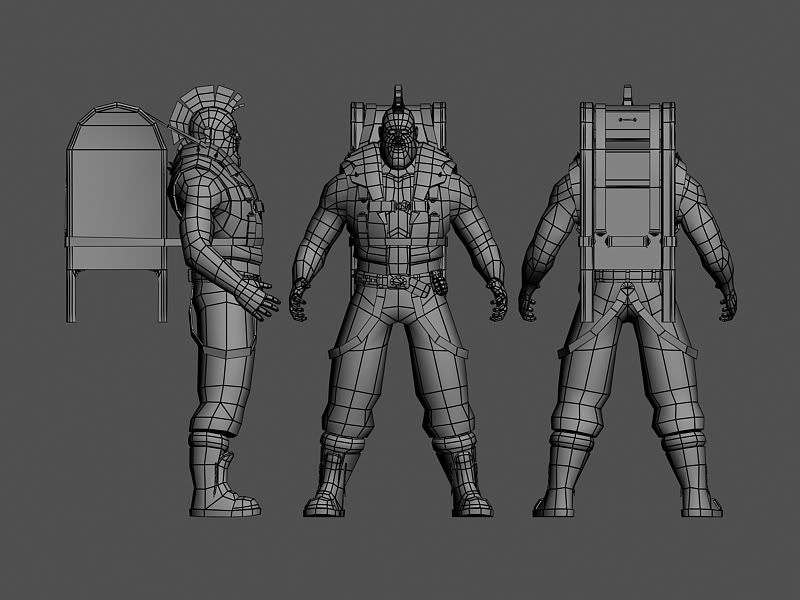
Hey guys. So I've had this thing sitting on my harddrive for a couple months, and a few days ago I finally picked it back up. Standing in around 3900 polys, he is supposed to be a Post-Apocalyptic mailman.
Oh.. a few of the buckles and spare shell's arnt on the low poly just yet. I will duplicate and place them once I finish uvin this guy. Im going to be working 24/7 to finish this guy up before the dominance war.
[Low] obvisouly :P

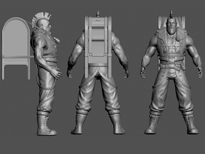
[High]

[Original Concept]
http://img.photobucket.com/albums/v651/matt22181/madmax.jpg
Crits Please. Should finish uving and getting the normals out tonight.
Thanks.
Oh.. a few of the buckles and spare shell's arnt on the low poly just yet. I will duplicate and place them once I finish uvin this guy. Im going to be working 24/7 to finish this guy up before the dominance war.
[Low] obvisouly :P

[High]

[Original Concept]
http://img.photobucket.com/albums/v651/matt22181/madmax.jpg
Crits Please. Should finish uving and getting the normals out tonight.
Thanks.
Replies
He looks pretty cool overall, but I don't like that thing on his back. Is it a mailbox?
beside that: great character! I especially like the face.
Looks waaay cooler than Kevin Costner...
[/ QUOTE ]
lmao
le' p0stman
Will he have a weapon besides two grenades?
Allyx- Yeah it is a crazy big chizzled out chin... hehe.. and yeah its a mailbox.
Xysdf - Your definately right about the anatomy issues. I reworked the triceps, they're still not comming up high enough... The Deltoid area is comming down way to low but.. i dunno..
[Screen Grabs]
Jaco- Hrm.. You might be right.. but I think once I move the post box to a more natural postion, instead of just floating behind him, it might work.. Definately something I could have to rework though thanks. Oh and for a weapon right now im thinking chain saw/magnum. But any ideas you all have to costume / weapon arsenal would be appriciated.
Thanks
Oh just a little thing I have been wondering. Does anyone know how I would render with an outline like the one in this screen.
http://boards.polycount.net/showflat.php?Cat=0&Number=174952&an=0&page=1#Post174952
I've seen it all over the place I just can't figure out a way to do it.
Thansks
Model looks pretty cool, although I'd have put more polys into his belt-looping things, they're looking really low-res at the moment.
Also the transition between scalp and hair could be smoother.
I'm not entirely sure how the huge chin thing is working, I guess it's just the style you want, but it doesn't seem to fit with anything else (like the torso, arms, legs and clothing all seem to be a mainly realistic style, as do all the features of the head) so the chin looks out of place, since there are no other elements being styled in a similar way.
Overall it's a pretty cool and eccentric character though, could look very nice with a good texture.
Keep it up!
[WIP] Still lots to do.
Any thoughts on a color scheme?
Thanks.
[Edit] Ah shoot sry Mop forgot to fix those belt loops.. I'll get those tomorrow.
[Render]
[Flats - Original 1024x1024]
[Edit] Gd I just looked at this thing on another monitor... looks freakin bleached. ;/
[Beauty Shot] I dont think i did it right mop..
[Ortho]
[Turnaround[14mb]]
www.strawspapers.com/stuff/turnround2.avi
[Flats]
-Diffuse
http://img.photobucket.com/albums/v651/matt22181/PostApocDiffuse-4.jpg
-Specular
http://img.photobucket.com/albums/v651/matt22181/PostApocSpec.jpg
Thanks.
PCP!
The spec map looks fine to me, although it looks too regular on the arms. Maybe add some highlights on the forearms to simulate hair?
Oh and it looks like something wasn't aligned properly when you did the stroke filter.