Catacomb
polycounter lvl 18
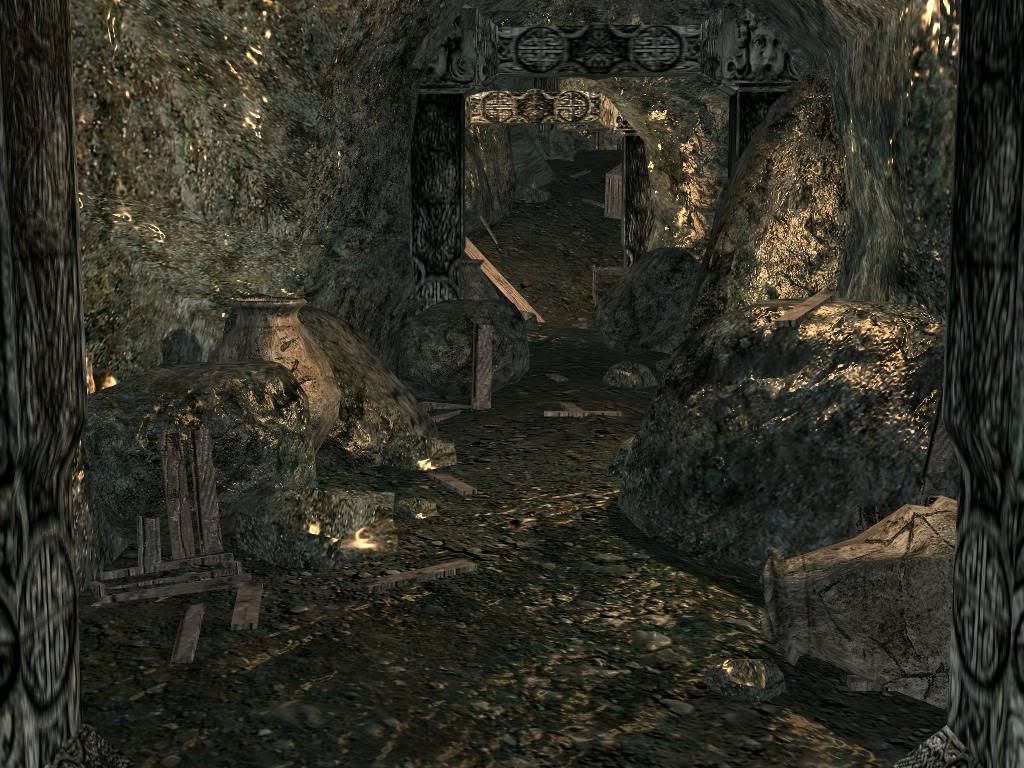
i figured its about time to make a topic for this. this is the underground portion of my fortress level. here the players will fight for two goals. the first being to cutoff the water supply to the magic crystal powering the fortress, which will cause it to overheat and destory the fortress. the second is to take control of the fortress by going into a capture and hold point. the capture goal is initially worth more to the team, however after a certain amoutn of time destorying the fortress is worth more. the level consist of 8 people per team, one team is the barbarians and the other is the imperials. the fortress belonged to an ancient culture, long gone, but left the fortress intact. the fortress becomes a strategic target in the war between the two factions.
because of this background story i was forced to remove the wooden supports i had previously modeled and replaced them with stone pillars. i have also added in some pottery and removed all completly intact crates. i am focusing mainly on the area in the screenshot right now, however i have other parts built but not finalized. after i complete the look i am after in this section i'll move on to finalize the rest.
again, lighting is not final. about 7,000 tris are viewable in the screenshot, and the engine is portal based so only one section will be rendered at a time.
if you wish to help, we're trying to get another environment artist
Replies
Otherwise, it looks pretty good to me. Everything is a little too glossy, even for wet stone, and there's some bad stretching on the left side.
That wooden crate in the background looks unusual to me too. If this place is really that slick, why has it rested uphill?
I don't know, the pillars really aren't doing it for me. I liked the old wooden supports a lot.
Otherwise, it looks pretty good to me. Everything is a little too glossy, even for wet stone, and there's some bad stretching on the left side.
That wooden crate in the background looks unusual to me too. If this place is really that slick, why has it rested uphill?
[/ QUOTE ]
lol, i agree with all of your points. i am working on the stretching, i turned down the specular and it looks better, and the crate is left over from what i had previouly, i forgot to delete it. as for the pillars, what could i do to make them "work" for you? as said, my game designer refuses to allow me to use wooden supports.
what could i do to make them "work" for you?
[/ QUOTE ]"
I don't think I can really offer much help in this regard, I'm no expert on this sort of thing.
They don't really look like they fit, though. I'm not sure why (or how) someone would build stone supports in what looks like a mostly natural and at the very least really roughly hewn cave/tunnel, and I don't think the carved detail really seems plausible in this context.
Textures & Lighting are where you need to work. You need to make the background & foreground elements pop out against eachother so we can tell what we're looking at, and drawing our eyes into the rest of the cave.
looks better yet still it looks very unapealing, are those rocks underground, aparently yes so there should be a bit of moist on the walls and other details besides grey and yellow .
[/ QUOTE ]
moist or moss? if you mean moist, the main complaint i recived was that the specular was too high, i lowered it to make those people happy. however, shoul it be more moist looking?
edit: edited post, read above reply more clearly.
I think the ambient light is maybe too high and its washing out details, try and get some nice contrast of pools of torchlight and darkness (are you going to add the torches btw?), aim to get some good light against dark areas to pick out the rock shapes. Also with more less ambient and more focussed areas of lighting the normal maps should be put more to use
[/ QUOTE ]
well, i must keep the ambient light high enough to where the player cna see where there are no torches (which i am adding in a little bit). but give me a little bit and i'll try lowering the ambient light.
http://s28.photobucket.com/albums/c208/jarrod1937/?action=view¤t=prev_lighting_med.jpg
dark ambient light:
http://s28.photobucket.com/albums/c208/jarrod1937/?action=view¤t=prev_lighting_dark.jpg
should i up the speclar exponent some for that increase moist look?
The spec is too high, I would cut it out all together. I've never been a big fan of moist cave walls. It looks a little too much like plastic wrap, in the in game shot and you might want to take the spec out and go with dry dirt walls. With that much moisture on the walls you would expect to see puddles and drips, thats a new problem, one I would rather sidestep than hit head on.
I would have thickened the supports on the old version and just changed the texture to rusty iron.
- The pillars now look very "one piece of geometry set inside another" some good carved detail is being clipped out by the rock. did the rock move, or did they just feel like carving half a face and making it look like it continues into the rock? Fix the supports or fix the cave geometry.
What is the history of this place? What period in time was it built and how much time has passed?
You call it a catacomb but I don't see any niches for bodies? Originally it looked more like a mine tunnel and seemed to work better than what you have now.
If this is for a multi player FPS style map how big are the players? Is there enough room for 2 players to pass by each other easily? Or can someone be a dick and clog up the entire game by standing in the center choke point?
Forget what I just typed, here is how I would tackle this stop me if you heard this before.
- I would block out the level using simple shapes like box hallways laid out on a grid. Get some play tests done so you can get a sense for the pacing of the level before starting to worry about fine details like texture spec and the props scattered around.
- Then I would make a few sections that match the boxed grid pieces.
1-5 straight tunnel pieces. Create a separate library of these pieces that slant up and down.
2-3 L shapes, T and Y junctions.
- Then replace your box level with the new pieces.
- Do a rough texture pass.
- Light it using the in game lighting.
- Refine the textures paying attention to areas getting the most light, maybe bake some lighting in to help the ingame lighting engine.
- Place props.
- Get a few play tests out of the way to make sure the props are in the right places.
- A final lighting pass and you should be in good shape to start hunting down bugs and fix them =P
Yes I am actually staying start over from scratch. This was a good practice piece but I think you need to focus on practicality of the level and instead of tweaking this long into next month, cut your losses and start over. It will look better, it will look different. Don't be afraid you won't be able to capture that magic something this piece has, because you can. Loving something sometimes means having to say goodbye =P
Oh and punch your AD in the face the wood supports where great, maybe a touch thin but great.
do you think i should keep all assets/props? meaning all rock and whatnot models, textures, normal maps? and then just start over on the entire layout and actual level geometry?
and i must ask a personal question. do you feel my work is getting closer to bein industry worthy? i am only 18, been modeling for a close to two years now. however my skill, i feel, has dramatically increased since i've joined these forums. but the whole reason for me doing this game is to get more practice and experience. i am just wanting some feedback as to where i stand right now (don't sugar coat anything please).
thanks.
Now because it has been screwed with so much and so many mixed crits have been cobbled together I would start over. But thats me. I do that quite a bit actually, I try not to fall in love with one file and I try out a bunch of different things as I go. I almost always find that when I start over, I do things better from the ground up than what I was doing before. I'm not saying thats the best way but I do think it can hurt your
You have some good textures, and some good basic rock hull pieces but I'm not sure the scene is working together anymore. Maybe its just the supports that are throwing it off? I'll give it another look tomorrow with a fresh set of eyes and let you know what I think. I could just be tired and cranky. Sorry if I come off as a bit harsh.
for example- if you stuck a light behind that first pillar you come to youd get the light area behind it to see and the pillar and rocks would be silhouetted against the light, making the scene easy to read.
for realtime games its tricky to get these situations from all angles but I think itd help improve the general clarity
i just want a simple yes/no really.
While I am by no means on par with the level of critiquing these guys have, I'd suggest even trying to add a prop with a little vibrance to it. Obviously a great fantasy cave asset (I think this is going for the fantasy feel based on the pillars?) would be crystals. Have them protruding from rocks as if this place hasn't been mined in a while and mother nature began to re grasp itself. Green or blue plants with bulbs on the ends that give off a slight ambience could be another thing to experiment with.
Of course if you're under strict guidelines by the AD none of this may fly, but if you're looking to bring a little more life to scene, which I feel is it's biggest downfall, try adding somethings you would find interesting if you'd see in a cave you happened to be exploring. If you were going through and it was all rock and old wood, well, I guess that'd be logical and realistic. However, try thinking of all the really neat pictures of a cave that you've seen online or maybe in real life. This one wouldn't quite 'wow' you as a photograph just yet.
Again, this ties in with the whole ambient lighting getting a facelift as well, so the coloring will surely take a step in a different direction.
Just something to possibly experiment with I suppose, good luck on bringing this together!
i just want a simple yes/no really.
[/ QUOTE ]
I'm not in the industry yet either (and won't be for a while
Anyway, as for the tunnel: I'm still really not liking the pillars. Aside from missing the wood, the tunnel may actually look better with them removed altogether. Why not try out what some of the others said, riddle the place with glowing crystals and other fantasy standards for interest, lessen the manmade supports, and make it look like a mostly natural cave? Seems more appropriate for the 'magical tunnel' style, and would probably look great with the shapes and textures you've got already.
Look at the work of recently hired enviornment artists, and in commercial games, and decide for yourself how close you are.
[/ QUOTE ]
Maybe we should start a thread in which everyone who has a job as an environment artist, can post the work they used to get hired, as a way for the newer guys to gague themselves?
[ QUOTE ]
i just want a simple yes/no really.
[/ QUOTE ]
I'm not in the industry yet either (and won't be for a while
Anyway, as for the tunnel: I'm still really not liking the pillars. Aside from missing the wood, the tunnel may actually look better with them removed altogether. Why not try out what some of the others said, riddle the place with glowing crystals and other fantasy standards for interest, lessen the manmade supports, and make it look like a mostly natural cave? Seems more appropriate for the 'magical tunnel' style, and would probably look great with the shapes and textures you've got already.
[/ QUOTE ]
i'm thinking i may just restart the area. i can do a better job redoing it.
and the reason why i am asking about my quality is that it is better to get opinions from people in the industry, sort of like a professional development AD and how he would judge your work.
The problem I've had with this scene is that its all very generic and same-y. There doesn't seem to be any variation in surface materials... even the pots seem to be made of the same stuff as the walls and boulders. Its all very visually uninteresting and comes across as noise. It looks like you've got a good amount of details you're trying to work in on the arches, but they're all the same color and tone as the rocks and floor and wood.
I'd say no. Not yet. But you're on the right path.
The problem I've had with this scene is that its all very generic and same-y. There doesn't seem to be any variation in surface materials... even the pots seem to be made of the same stuff as the walls and boulders. Its all very visually uninteresting and comes across as noise. It looks like you've got a good amount of details you're trying to work in on the arches, but they're all the same color and tone as the rocks and floor and wood.
[/ QUOTE ]
well, they all actually had a different look and color when i started with the materials, but i felt that inorder for them to fit in the scene they should be near the same color and tone as the main wall tex... i am guessing that was a mistake. it won't be repeated again.
At this point I think your best bet is to re-evaluate the purpose/story of this cave.
You say it's an ancient culture that's long gone. Fine, that's good, and the stone pilars/pottery will serve that. But how is it used now? Is this still untouched? You say two factions are fighting for control over it. If this is an old dark cave, chances are one or both factions would have set up some sort of lights so they can find their way through it. Is the cave well traveled? Is it just a path? Is it used for anything else now (storage, etc.)? Where did the crates come from? Are those "ancient" crates, or are they brought in by the newer faction, what's in them and why are they there? Is the cave structurally sound? Would one or both factions have shored it up and made sure it won't collapse? and on and on and on. Figure out what this thing is actually being used for, and that will help guide you in the direction of how to light/texture it.
Like Sectaurs said the scene sufferers from monochromatic-ism. One thing that would help that is different colored lights. If you make your ambient lighting with very subtle, defused lights that use cool colors like blue, and purple you will give the illusion that areas are dark but still light them. It will also play off the torch light and help break up the monochromatic feel. If you can think about getting the lighting to help you build shapes. I'm not sure I can explain it without doing a paint over, but I don't have time for that =/
I would replace the ambient crap with stone/iron braziers that provide the main source of light. You don't need to have them filled with fire, you could use glowing coals.
What you can do with this:
Create dry areas around the braziers, since the heat would dry it out, almost no spec at all in these areas. Around the braziers you would have warm lights like oranges and reds.
Create dark wet areas like what you have but light them with purples and blues. If you can get these areas to play off each other well you can break up the monochromatic look with just lighting.
i've been redoing the fortress to be more authentic and better looking, but on the side i decided to tryout different lighting effects for the catacomb before i redo that too. below is an updated screenshot from within the engine.
i am trying to use a blue light to show darkness but still allow players to be able to see, however it looks more like something is glowing blue than darkness. any suggestions?
p.s. i finally got another environment artist t helpout with the game!
to get closer to the goal you're describing, I'd consider tightening the falloff of the orange fire light, and decreasing the intensity of the distant blue (as needed). so you can tune the firelight into being more localized, and being in higher contrast to the dark blue ambient feel.
Now copy that blue light, and move it to behind the camera (and off a ways) to just barely catch some blue hints on the shadows under the fire & others on this side.
Lookin better.
Now copy that blue light, and move it to behind the camera (and off a ways) to just barely catch some blue hints on the shadows under the fire & others on this side.
[/ QUOTE ]should i do that or just make the ambient light slightly blue?
its improving a lot man keep it up
Ambient light will wash all of your shadows out like Rooster said and really start to rob your normals of detail. Try your best to fake it with blue lights. You might want to experiment by using more dark purple light the farther away the light gets from the source. I'm not sure if your program or engine support it but often you can set the near/far of the falloff/attenuation "color" of the light so you are using less lights and getting more of a genuine effect. I would still use blue & purple lights as bump lights.
Here is a screen shot of an environment that I used a similar lighting conditions. I used 3 lights, 2 for the lava and 1 for the blue/purple. All of them using attenuation colors.
i have a quick question though. do you think i should completly kill the specular being given off by the blue lights or not?
and following your advice i have turned ambient light completly off.
edit: even though i asked the question, i feel it looks best with the specular still being on, however i would still like to hear your advice on the subject.
and it seems turning the ambient light all the way on does not completly kill the normal mapping detail but does make it highly toned down, reducing the overall effect it has largely.
edit#2: i apparently must also keep my limit to 4 lights per area since eahc light that hits geometry creates a new draw call per object. each light i add reduces my fps by 15 fps. although with the engine being a portal based engine this shouldn't be too bad.
We are starting to move out of generic light theory and into specific lighting info based on an engine I haven't worked with so I'm not sure how much more of a help I can be. I think you are on the right track. Don't forget you might be able to bake lighting for certain objects into the textures and exclude them from being lit or display them at 100% self illumination so the lighting is correct but the engine isn't calculating that lighting. IF you can work that way you might be able to pull off the appearance of more lights than what is in the scene.
But I'm not sure if you can tell the engine not to exclude objects from lighting but display them at 100% self illum?