#32 is BOARING! - Jaco
I couldn't resist, so I give you...
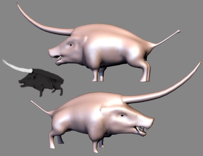
Unihog!!!
A genetically modified boar, created to prod the enemy where it hurts most:

Or what you get when you feed a boar a barrel of Viagra, you decide.
The teeth are ugly, I know. I plan on giving him some hair on his back, and some warpaint, scars etc.
Unihog!!!
A genetically modified boar, created to prod the enemy where it hurts most:

Or what you get when you feed a boar a barrel of Viagra, you decide.
The teeth are ugly, I know. I plan on giving him some hair on his back, and some warpaint, scars etc.
Replies
He's looking a little blobby right now, but this appears to just be the first pass on the hi-poly. Looking forward to seeing it get tightened up.
on a personal note, I'd like to see his big ass-sticker coming out of his mouth... maybe two of them? As tusks are really a selling point for boars... as much so as the piggy snout, I'd say.
I do like his proportions, he's got a good weight to him. might want to try bending his head a little further down for a more powerful pose.
The boar is now ready to play in the mud!
My first pass at the high-poly:
I had similar problems with the main masses of my model too, I wanted to the head and shoulders to be really huge and powerful, but it's difficult to do without losing balance. I'm still trying to find a set of proportions that's not natural but still looks believable, so good luck with that too!
Agreed MoP, balancing the boar can be troublesome, but your boar looks pretty damn good to me
Good point Sectaurs, I've used the move tool a bit and it looks much better now (?).
I still have to get rid of about 85 tris, and add some planes for the alpha mapped hair.
I'm going to add some zebra like red stripes going from the spine to the belly next. The teeth aren't textured yet.
The reason why Unihogs weren't successful in nature. Mating often resulted in death by anal penetration
Thanks for the replies guys!
And while its tempting to let the normal do all the work, don't be afraid to paint on the diffuse. Most noticeably is the horns, which looks like a simple noise filter or overlay. If you're going to stick with the green base on them, make the corresponding parts on the boar greenish as well, so it looks like a complete organic structure, rather than parts stuck together.
You've got it so close to the finish line, it'd be a shame not to put in the extra love it deserves!
I've fixed the lighting, and increased the saturation and intensity of the reds a bit.
I'm not finished yet though!
dont normal maps just rule!!
thanks for the crits
-just a thought about the blood, has it dried on and stained the horn over years of goring people/things? maybe there should be a little more variation from the different ages/splashes of blood and different animals/people etc, maybe scratches/areas peeling off? or if its fresh, a little more specular/specks of blood
I don't know how it would look in real life just a guess :]
1930 tris
1X 512 Diffuse, Specular, Normal
Thanks for all the crits and comments, they really helped.