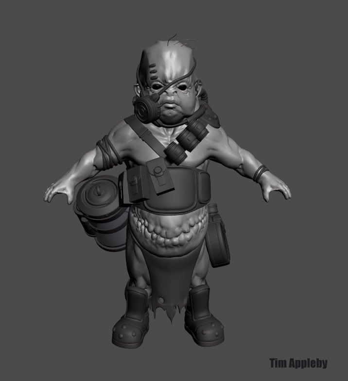
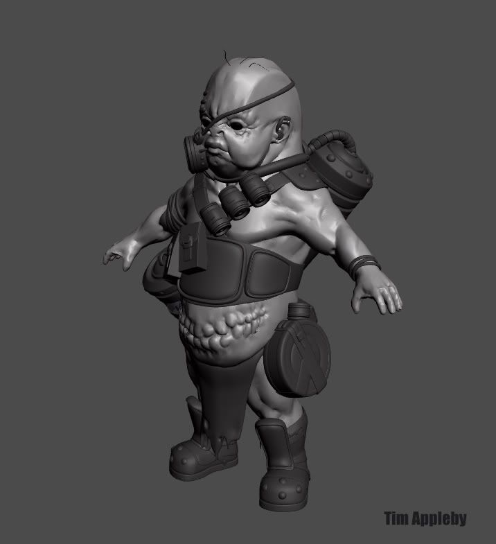
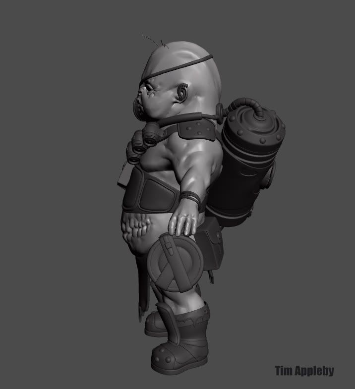
Merg is an explorer and monster hunter. Hunting small and exotic game, he prefers to capture beasts alive. His species originating from a high density world he stands at 3' tall!:D
I made the organic base in mud- I have a higher detail version which I am still working on, but I have been building his equipment in max. I plan to make his weapon soon, and a captured specimen for his jar.
Hey Spacemonkey, I like your model a lot. One point of critique from me would be regarding the really flat sides of the head. Allthough the skull concaves in at the temple area, there is a lot of muscle activity located there. Most people have bulged out temples rather then flat or concaved ones. I think it would make that area a lot more interesting to look at, estheticly.
and tell me.. how many polys do the tree hairs use hrhr
ok but serious.. the side of the head looks too flat.. it´s gives the head a wired look i think.. kind of unfinished ?!
and if you take a look at the hands from above they lack a bit of definition.. i don´t know if this is the aim bc the thing in a whole looks a bit like a fish.. but the rest of the body is very clear defined.. hmm..
but anyhow.. dont mind.. only my lil 2 c´t
and if this stuff is outdated bc of low-and-old-maximported-mud-mesh than forget what i wrote
love your freaky stuff
I guess NSFW on that, there is special fx gore on the page. It's Kuato from Total Recal the movie. Thought it looked similar since I just watched it.
[/ QUOTE ]
How's any of that NSFW?
[/ QUOTE ]
The uhm, baby like figure with the bullet wound in his head is relativly not a welcome image to be displayed in a professional environment outside of game development then.
This guy rocks! I totally love it, it has several qualities: the proportions and the three scraggly hairs give it a light/playful vibe (which is a winner in my book) and it's a bit creepy.
I like how he's laden with supplies, though some of his details are Meh... The rubber bands around the arms... meh... the loin cloth is a little out of place considering the rest of his techno-gear..
Just as personal preference, I liked the teeth on his stomach in the first shots.. nubby, boney.. Just felt better to me, but that's just my humble opinion..
Over all, this has been one of my fave's of recent work on polycount. Keep on rock'n man!
Yeah, i think he could do with a huge techy cod piece instead of the loincloth. Got to agree with Eric on the teeth as well. Something about the irregular nubby things made it look more convincing.
I did a painter over on a screengrab to get a good idea of direction before I really get started - added cheap rim light affect because it seems to be the new Global Illumination for cheesy renders
EDIT: the flag is bugging even tho I threw it in there for kicks.. its screwing the sense of scale for the lil guy - will correct that tomorrow..
The modeling is superb, but the belly teeth don't work IMO, the rest of it looks like it fits, together, the teeth looked better when they looked like an enormous scar on the stomach. A mouth like that on the stomach would need extensive musculature and bone structure, the concept doesn't work becose the rest of the model is so realistic.
yea but with how much of a bamf this character is you have to ask your self...do you really care? lol...this thing is just to awsome haha. rock on man, I Cant wait to see this thing finished...definatly my favorite character in a while.
as for crits, it all looks pretty cool, the flag saturation could be toned down when you actually texture it...really faded would help match it...and in that big orange tube thing, can you please put a fetus in there...ill send you a box of cookies if you do.
[ QUOTE ]
can you please put a fetus in there...ill send you a box of cookies if you do.
[/ QUOTE ]
I think a non-humanoid fetus would work nicely something alien. Maybe the belly mouth could have staples or stitches keeping it closed? Something kind of Odd-World-ish? Are the little protrusions around the jaw line going to be a beard or fishy, flappy type of skin? What kind of weapon(s) are there going to be? Maybe a staff with a bear trap hanging off he could use it like a fishing pole, hehe.
The flag- is supposed to communicate his rebelious/backwater nature, (Dukes of Hazard) I'll see how it goes.. I dont want to communicate the wrong message with it..
verybad - good point, I do agree that the belly mouth is a weak aspect of design, especailly from a realistic perspective. Still I like it enough that I dont feel it detracts from this guy
Vig - the staff with a bear trap is a good idea, I did start making the weapon and then decided it would have to wait till this guys gets done. :P
cool!
have to see the next step, but I think a bit like CMB, could maybe have more contrast.. your previous paintover looked better in this way imho.. Now, the purple/pink skin seems less dark and less saturated than before..
anyway, good job
I'm liking the texture so far, I think the purple/cream skin tones are great and open up for some good color contrast on the character. The "stripes" over the right eye could be reformed a little bit to give it a more internal look, like a link to his brain or whatevs, rather than patches. With the paintover, I would just comment on the glowy canister. Feels like your just trying to add a place to use a glow shader. I could be wrong, maybe you were leaning that way from the start, but I would just say that this character doesn't need any 'OmgZ gLOW ShaDerz' to be a strong concept. I would opt for something that gives him more depth as a hunter, rather than random bling. Just my 2 cents.
I hate to sound like I have a lot of negative crits, but the Stars'n'Bars really takes the fun and humor out of this character for me. Which, I think the fun/light mood of this character is his strongest point.
Replies
But for a guy who goes for small game, that is one big scar he's got on his tummy!
and tell me.. how many polys do the tree hairs use hrhr
ok but serious.. the side of the head looks too flat.. it´s gives the head a wired look i think.. kind of unfinished ?!
and if you take a look at the hands from above they lack a bit of definition.. i don´t know if this is the aim bc the thing in a whole looks a bit like a fish.. but the rest of the body is very clear defined.. hmm..
but anyhow.. dont mind.. only my lil 2 c´t
and if this stuff is outdated bc of low-and-old-maximported-mud-mesh than forget what i wrote
love your freaky stuff
...although if i saw it in the dark id probably be compelled to kick it in the face and run.
i like the details on the equipment. How do you do the high poly for that? is it Sub-D?
I guess NSFW on that, there is special fx gore on the page. It's Kuato from Total Recal the movie. Thought it looked similar since I just watched it.
otherwise posting wip´s would be unbelievable boring
Kweh?: http://membres.lycos.fr/marsetsf/tr_kuato.html
I guess NSFW on that, there is special fx gore on the page. It's Kuato from Total Recal the movie. Thought it looked similar since I just watched it.
[/ QUOTE ]
How's any of that NSFW?
[ QUOTE ]
Kweh?: http://membres.lycos.fr/marsetsf/tr_kuato.html
I guess NSFW on that, there is special fx gore on the page. It's Kuato from Total Recal the movie. Thought it looked similar since I just watched it.
[/ QUOTE ]
How's any of that NSFW?
[/ QUOTE ]
The uhm, baby like figure with the bullet wound in his head is relativly not a welcome image to be displayed in a professional environment outside of game development then.
Still not finished yet, but I apprecaite the comments!
Honestly? I want to see this guy hunting a cat on earth, like in the suburbs.
Spark
I like how he's laden with supplies, though some of his details are Meh... The rubber bands around the arms... meh... the loin cloth is a little out of place considering the rest of his techno-gear..
Just as personal preference, I liked the teeth on his stomach in the first shots.. nubby, boney.. Just felt better to me, but that's just my humble opinion..
Over all, this has been one of my fave's of recent work on polycount. Keep on rock'n man!
Other than that, great model.
-caseyjones
The bib was a good idea... tempting haha
I did a painter over on a screengrab to get a good idea of direction before I really get started - added cheap rim light affect because it seems to be the new Global Illumination for cheesy renders
EDIT: the flag is bugging even tho I threw it in there for kicks.. its screwing the sense of scale for the lil guy - will correct that tomorrow..
Spark
as for crits, it all looks pretty cool, the flag saturation could be toned down when you actually texture it...really faded would help match it...and in that big orange tube thing, can you please put a fetus in there...ill send you a box of cookies if you do.
can you please put a fetus in there...ill send you a box of cookies if you do.
[/ QUOTE ]
I think a non-humanoid fetus would work nicely something alien. Maybe the belly mouth could have staples or stitches keeping it closed? Something kind of Odd-World-ish? Are the little protrusions around the jaw line going to be a beard or fishy, flappy type of skin? What kind of weapon(s) are there going to be? Maybe a staff with a bear trap hanging off he could use it like a fishing pole, hehe.
Looking great Tim, as always =D
The flag- is supposed to communicate his rebelious/backwater nature, (Dukes of Hazard) I'll see how it goes.. I dont want to communicate the wrong message with it..
verybad - good point, I do agree that the belly mouth is a weak aspect of design, especailly from a realistic perspective. Still I like it enough that I dont feel it detracts from this guy
Vig - the staff with a bear trap is a good idea, I did start making the weapon and then decided it would have to wait till this guys gets done. :P
I think the skin needs some more contrast.
have to see the next step, but I think a bit like CMB, could maybe have more contrast.. your previous paintover looked better in this way imho.. Now, the purple/pink skin seems less dark and less saturated than before..
anyway, good job
I hate to sound like I have a lot of negative crits, but the Stars'n'Bars really takes the fun and humor out of this character for me. Which, I think the fun/light mood of this character is his strongest point.