Home 3D Art Showcase & Critiques

Fantasy Style BoatHouse

polycounter lvl 18
Offline / Send Message
commander_keen polycounter lvl 18
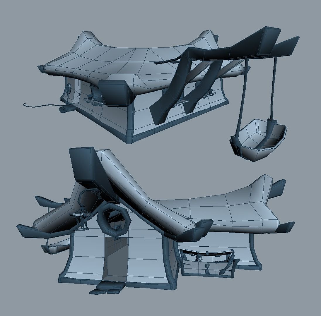
This is my first post on PolyCount. Working on a low poly stylized boat house scene. I am focusing on modeling on this and most likely will not texture it(at least not any time soon). So i want to make the most of my polygons, and keep a consistant theme/style so please let me know if there is anything out of place.
boathousewip4.jpg

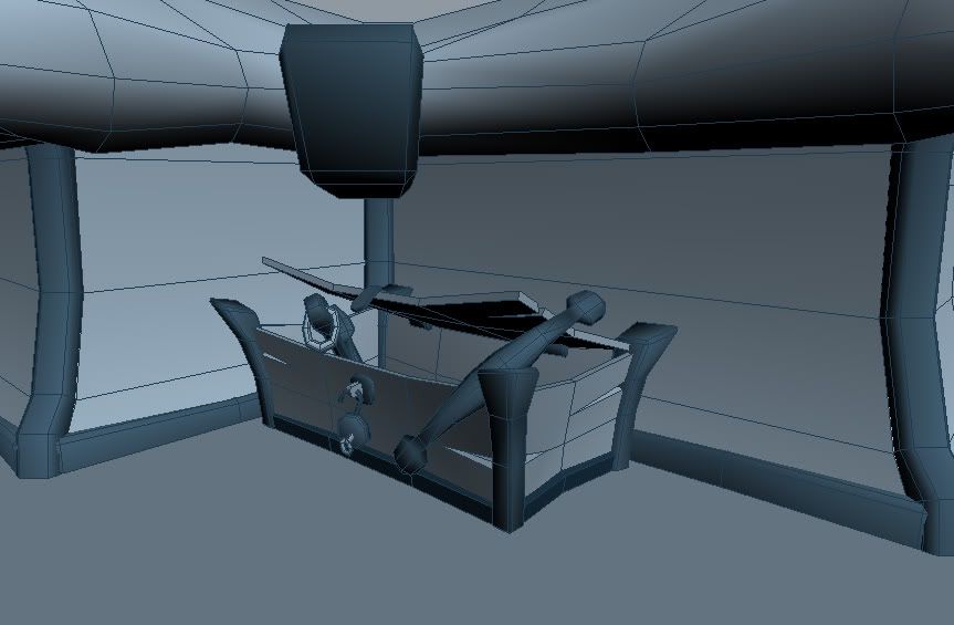
And a detail shot:
boathousewip3.jpg

Replies

  • Steve Schulze
    Offline / Send Message
    Steve Schulze polycounter lvl 18
    Nice. Has a rather World of Warcraft flavour. Maybe you could think about finishing it off and entering it in the comp that Blizzard are running at the moment.

    You've probably gone a bit heavy on the chamfer edge in a lot of places. The doorstep flagstones, the top edge of the boat and a lot of the skirting boards for example, could have the extra polygons stipped out without any real loss of form. You also appear to have a few tesselations on the walls of your building that aren't adding anything to the form.
  • pyromania
    Offline / Send Message
    pyromania polycounter lvl 18
    The boat hoist kind of bothers me because it isn't anchored firmly. The side of a house is not something that could support a large lift like that.
  • rooster
    Offline / Send Message
    rooster mod
    [ QUOTE ]
    You also appear to have a few tesselations on the walls of your building that aren't adding anything to the form.

    [/ QUOTE ]
    if its intended to be vertex lit then sometimes that is justifiable, but then again there are also large undivided polys there too which might create shading problems. I think the style kicks ass though, but agree about the unsupported hoist
  • noritsune
    Offline / Send Message
    noritsune polycounter lvl 17
    I'm guessing those cuts are for horizontally tiling textures? maybe?

    Looking nice so far, I would bust up the vertices even more. Irregularity!

    Also consider adding more sections to the 8-sided torus window.
  • commander_keen
    Offline / Send Message
    commander_keen polycounter lvl 18
    I dont think i will be entering it in the Blizzard comp, because as i said im not planning to texture it, and also i have already gone well over the poly limit without any detail in the surrounding area.

    About the heavy use of chamfer. The style im going for requires that i make my geometry look round and smooth. This would normally be done through textures, but because i do not plan to do any textures i must do it through geometry. If i did not use lots of chamfers i would either have hard edges everywhere or very bad smoothing.

    I will see what i can do about the hoist, i see what you mean about it not being structurely possible, but what im going for in the scene is that everything is sort of unstable and getting ready to fall apart. I guess this will become more obvious when i get more of the environment done.

    I am modeling it for current spec with pretty much everything being lightmapped, and no normal maps(if i were to texture it). So the tesseletions on the building are for the most part temporary as i have not optomized it yet, and there is still some detail to be added.
  • ironbearxl
    Offline / Send Message
    ironbearxl polycounter lvl 18
    Looks good commander_keen, I think the door way could use a chamfer inside and out, or a door frame that would fit with the theme.
  • Rhinokey
    Offline / Send Message
    Rhinokey polycounter lvl 18
    really like it,, and unlike a lot of folks here, i don't see many edges that do not help define shape.. the horiz cuts in the walls are obviously there to creat the curving wall shape. the chamfers on the thick boards may not be needed with a decent texture, but it doesnt look that bad or wastefull. only complaint is the door ,, looks like it could use some frame to keep its detaillevel up to the rest of the model
  • commander_keen
    Offline / Send Message
    commander_keen polycounter lvl 18
    Yeah, doors are just temporary cutouts for placement because i still dont have a good design for them.
  • adam
    Offline / Send Message
    adam polycounter lvl 19
    Looks cool. The doors need a frame like the windows.
  • commander_keen
    Offline / Send Message
    commander_keen polycounter lvl 18
    Getting some of the envrionment based in:

    boathousewip6.jpg
  • commander_keen
    Offline / Send Message
    commander_keen polycounter lvl 18
    I did some more on the dock area and built up the terrian more:

    boathousewip8.jpg

    boathousewip9.jpg

    Is the terrian looking good enough? or is it a bit too "mushy" right now. im thinking about stylizing it a bit more. I will add lots of vegitation and stuff to it too.
  • sumguy
    Offline / Send Message
    sumguy polycounter lvl 18
    good stuff, keep going.
  • rooster
    Offline / Send Message
    rooster mod
    looks sweet man, might be good to colour the materials a bit to give a closer idea to the final product. Are you sure about not texturing it? vegitation is going to be hard to read without colours (I reckon)
Sign In or Register to comment.