New website and Roland is done
So, I started a new site for a simpler url, and to maybe blog a little bit. I'm hoping to have some artwork to post and maybe some things to say about making games. So, hook me up on your links pages and rss feeds. 
http://lucas.hardi.org
I also finished Roland, but thought it would be better to start a new thread instead of digging up the old one. Here's some shots:
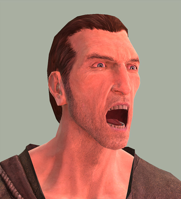
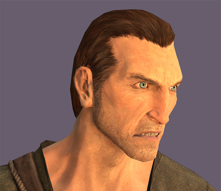
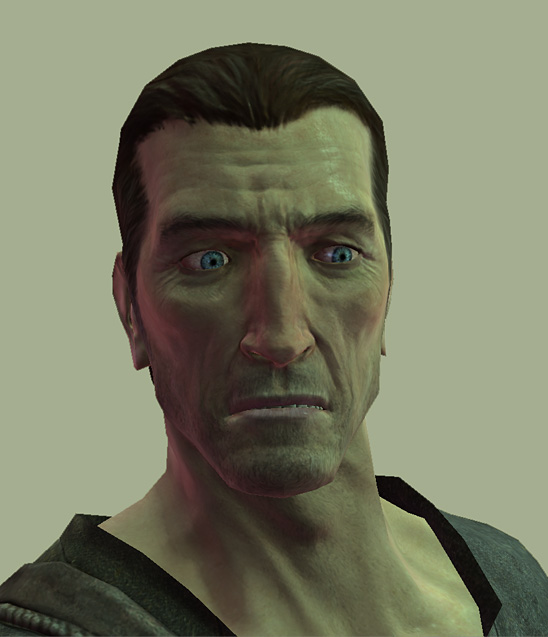

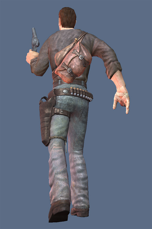
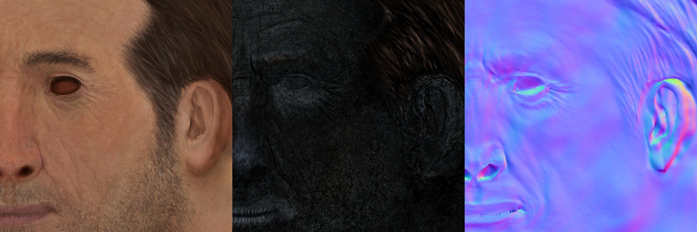
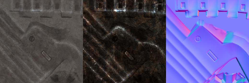
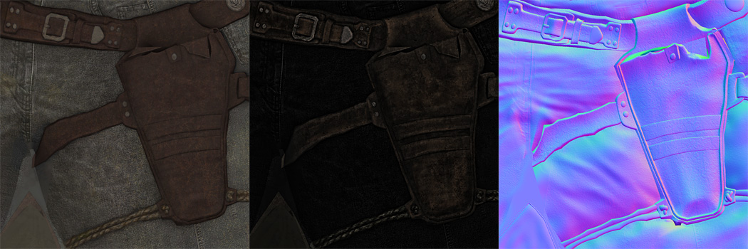
As before, many kudos to J.I. Styles for his awesome skin shader. These are all screengrabs from the Max viewport. Styles - you want to move to the States and work at Mythic? We're looking for artists and tech artists
I cut some edgeloops into the low poly head model to facilitate creasing in the expressions. It works pretty well, but I think a method of blending a wrinkle map for the normal and diffuse based on affected areas of an expression would work better.
Also, he's not currently being used in any game, so if anyone is interested in purchasing the assets I'm all ears

http://lucas.hardi.org
I also finished Roland, but thought it would be better to start a new thread instead of digging up the old one. Here's some shots:


As before, many kudos to J.I. Styles for his awesome skin shader. These are all screengrabs from the Max viewport. Styles - you want to move to the States and work at Mythic? We're looking for artists and tech artists

I cut some edgeloops into the low poly head model to facilitate creasing in the expressions. It works pretty well, but I think a method of blending a wrinkle map for the normal and diffuse based on affected areas of an expression would work better.
Also, he's not currently being used in any game, so if anyone is interested in purchasing the assets I'm all ears


Replies
My other crit, is that the gallery link at the top wasn't as prominent, and I had to hunt for it. One thing I noticed is that many times people don't go searching for a menu if it's not prominent, and they assume what's easily visible is all there is content wise. In your case someone might think only the cowboy jpegs are on your site. I am not sure how to draw more attention, but maybe if you can use that code to get an image to start popped up that points to the gallery and about sections, that is killed when you click anywhere. Anywho looks great, and gimme an 88x31 button so I can start sending people to your site by way of my links page.
Also, Can you make at least on render of the cowboy with fairly neutral lighting colors? The intense colors are killing it for me at the moment.
I think the speculars are too tight on the guy's face in the closeups, but it seems to hold up pretty well from afar so I guess that's not a problem. The work on his busted hand is truly disgusting.
Only thing that caught my eye was that the link to that deutschbag, Kurtis Smith, was wrong. I think it's http://kman.cottages.polycount.com
i really like the way he came out, i agree with ben, I think the key/fill lights are washing out alot of the detail, are you using JI Styles' shader? he definitely looks cool.
Great work, and I love the large-image showcasing. But it doesn't quite seem to work well in my browser. after clicking an image, it's impossible to scroll down the window to read the entire caption. I'm running Firefox 1.5.04, under a screen res of 1152x864 if that matters to you. I'm assuming it's because of my lower-than-average resolution.
I love love love your materials for the guy's clothing and accessories. That fourth render down (in the thread) is so sweet.
Good stuff!
Great work, and I love the large-image showcasing. But it doesn't quite seem to work well in my browser. after clicking an image, it's impossible to scroll down the window to read the entire caption. I'm running Firefox 1.5.04, under a screen res of 1152x864 if that matters to you. I'm assuming it's because of my lower-than-average resolution.
[/ QUOTE ]
I was thinking the same thing, except about the close button. You can't see it when the larger images appear. I'm running a 1024X768 screen at work, and the close links were below my browser frame. I was able to find the close by guessing where the link was, but you may want to address that.
I like the effect though... I did the same thing recently for a class project ( http://www.tacmod.com/final )
ben
http://codylindley.com/Javascript/257/thickbox-one-box-to-rule-them-all
http://jquery.com/demo/thickbox/
Also, somebody ported it to be a wordpress plugin, which is how I set it up:
http://www.dan-atkinson.com/wp/index.php/110/thickbox-plugin-for-wordpress/
Slum, one of the big reasons I put together the site is so that the blog interface would make posting much easier for me. I hope to have stuff up there much more often.
I might just put up the Max file and textures at some point, it's much more fun to rotate around a play with the lights than to look at images.
awsome work though man, you get 3 smilies
I really like your site too. It did take me a moment to find your gallery at the top though. I kept looking in the list on the left.
- BoBo
I really like the style, and the expressions of Roland are fun too.
One thing I'd critique is the amount of specular on his shirt - it's too much, and too even... the shirt shouldn't be shiny at all, really, and that (including the lighting possibly) is really flattening out the shirt and making the normal map fairly redundant. It's glossing over the contrast in the stitching and folds, which I think should be avoided.
Very nice stuff in general though!
Also, thanks for the link - I'll add your new site onto my links page too
http://www.huddletogether.com/projects/lightbox2/
Site looks nice and tidy, too bright for me tho.. Where's the BLACK?
That's not just unadulterated game art, that's certified pornography.
[ QUOTE ]
...As before, many kudos to J.I. Styles for his awesome skin shader. These are all screengrabs from the Max viewport. Styles - you want to move to the States and work at Mythic? We're looking for artists and tech artists...
[/ QUOTE ]
Don't know about living in the states... but maybe that's just my fear of the lack of kangeroos and koala bears