Contract Work - Vicious Engine
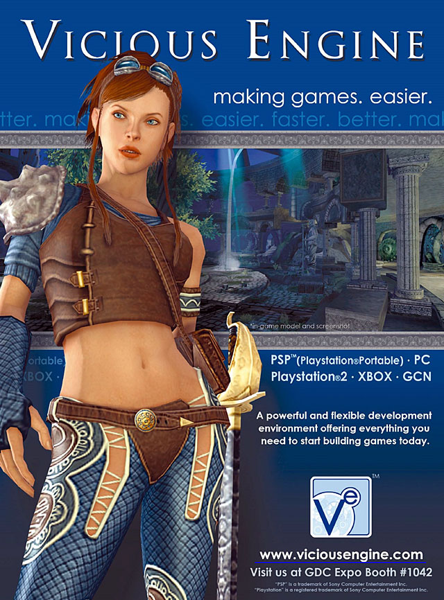
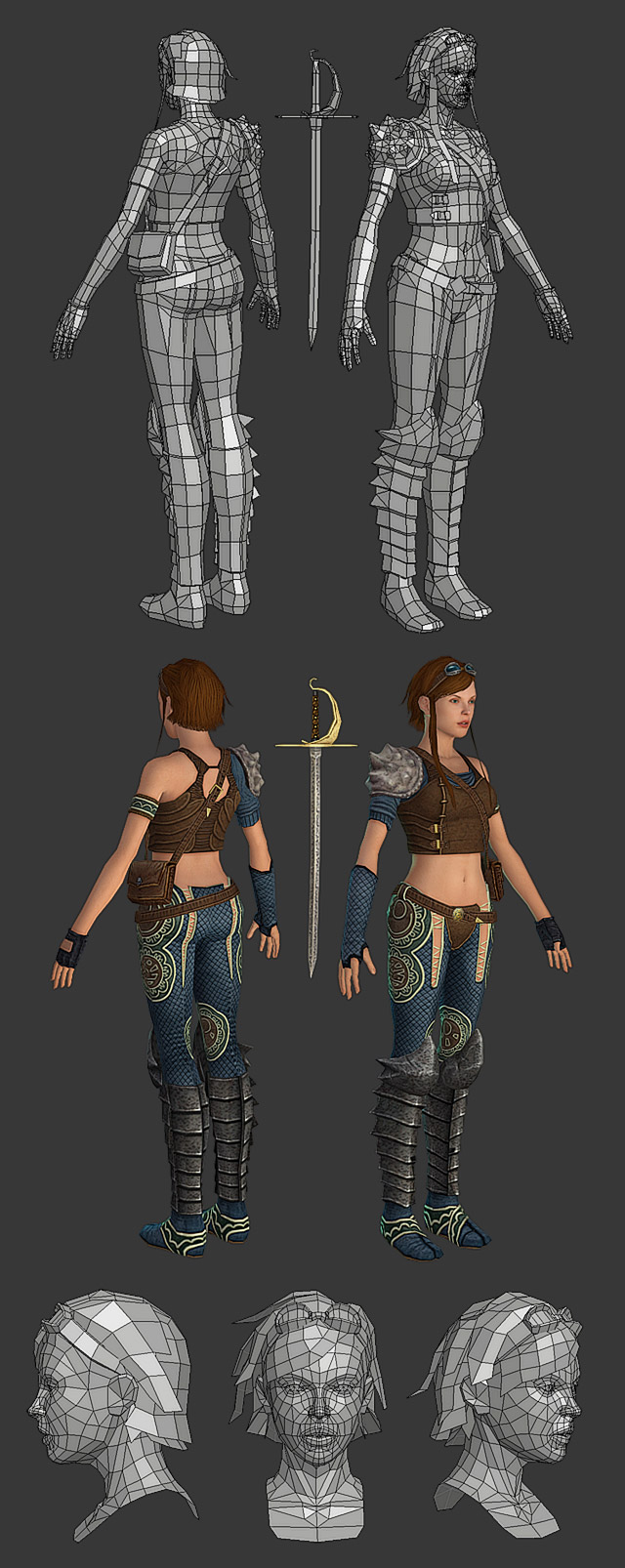
This is a piece I did a while back. I was contracted by Vicious Cycle to model and texture this character for the Vicious Engine http://www.viciousengine.com they are developing.
She recently appeared in an ad in Marchs issue of Game Developer Magazine.

She weighs in around 7,000 polies (heavy in the head for facial animations) and uses a 512x512 and 2 256x256 texture sheets (diffuse only).

Vicious Cycle is by far one of the most enjoyable contractors I have ever worked with and hopefully we will do more together in the future.
- BoBo
She recently appeared in an ad in Marchs issue of Game Developer Magazine.

She weighs in around 7,000 polies (heavy in the head for facial animations) and uses a 512x512 and 2 256x256 texture sheets (diffuse only).

Vicious Cycle is by far one of the most enjoyable contractors I have ever worked with and hopefully we will do more together in the future.
- BoBo
Replies
The boots seem a bit poly-heavy, given that people probably won't be looking at them as much as the torso. I think some of those polys could have been better spent adding those ridges on the sides of her jacket in silhouette - they're very heavily shaded on the texture, yet the silhouette is perfectly flat which looks a little odd.
Nice sharp texturing though. The lack of highlights in the diffuse indicate they'll be using specular in the engine? Some of the lack of detail in the diffuse (jacket front, shoulder pad) almost implies a normal-map should be used there though.
I remember seeing the concepts Massive Black did for this, you've made a nice job sticking to them.
Good work on the whole!
The pattern on her pants is a bit distracting from the design, but sounds like you didn't have much control over that.
Great model.
The face is beautiful.
- BoBo
OMG GIMME UR CONTRACTS NOW!
har har har
B1ll: I was contracted independently by Vicious Cycle to work off of a concept they acquired through Massive Black.
- BoBo
I agree that the tile/scale-like pattern on her legs is not very suited for lowpoly and gives away the angles of the geometry, but I assume that was in the concept already.
But that's just a small nitpick. Brilliant work like always
I guess all quads is more of a guideline than a rule
[/ QUOTE ]
You heard wrong. People really need to get this misnoma once and for all. 100% quad models are only necessary for subdivision models, NOT realtime.
My crit is also about the pattern on the pants. I like how it looks visually, but it makes the seam on the back of her legs VERY apparent. I would have expected, from an artist of your calibur, for that sort of thing to get painted out via ProjectionMaster/Zapplink or some similar process.
Now that I have an improved ability/tool to remove them I have a hard time letting texture seams go in anything I do.
love the skintones and clothing, boots and shoulder dealie not too wild about, but like others mentioned its begging for spec maps and other goodies.
my little crit would be detail distribution: her face so hot, the vest design is real nice on the back, and yet you put most detail in the lower body. it's a pretty repeatative detail and doesn't reveal that much sophisticated design to explore, so what give?
i'd still rampage her donkey kong style, preferably.
no normal poo maps only a cool diffuse
oh btw could you post the textures if you have the right to?
yet another inspiring work from you as always.
Someone pay bobo to do some high poly work.
Every one at work liked the model - no complaints at all. I'm sure that if you're available, you'll get another call from us - although I don't have anything to do with those decisions.
small world
Great work! All of it.
plus, shes sexy.