Anyone seen nutsy? A model I've been working on
Hey y'all...
This is an old model I've been revisiting as I get back into the whole 3d thing....it's a werewolf!!!!
I gotta say, I sometimes easily get lost in the whole edgelooping thing, but am really enjoying this so far. I won't be modelling the eyelids around the eyes, just gonna go with a couple of hemispheres so as I can keep him nice and "cartoony".
Hands not done, that's why you cant see them, still need to fill out the ears, and haven't really done much down through the abdomen and legs, all that and some other tweaks, and maybe I'll finish this one
Been a long time and I am hoping to remain active here once again, especially with polycount being home to my favoritest dirty hippy in all of Indianna.
Oh yeah, images!!
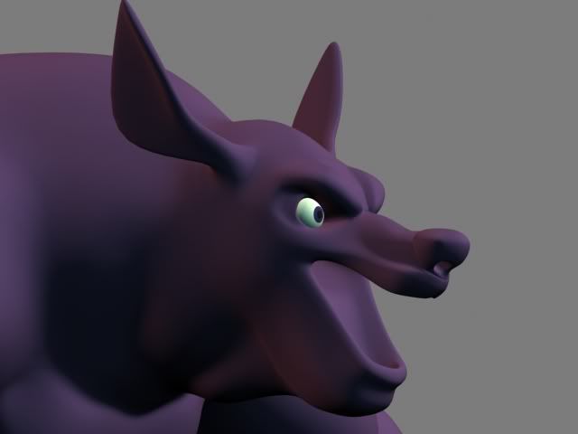
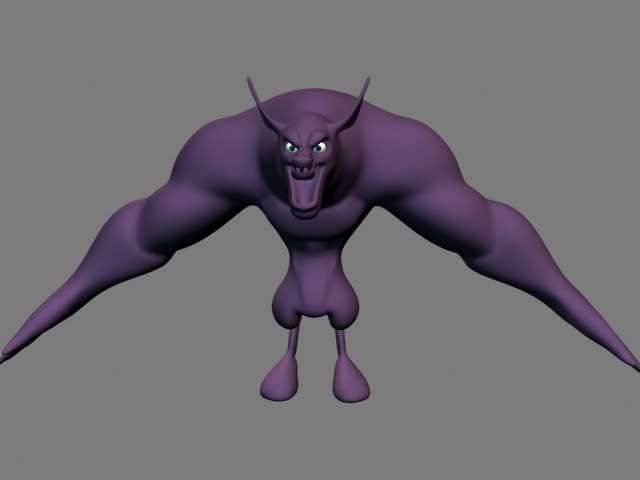
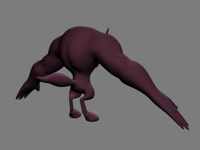
This is an old model I've been revisiting as I get back into the whole 3d thing....it's a werewolf!!!!
I gotta say, I sometimes easily get lost in the whole edgelooping thing, but am really enjoying this so far. I won't be modelling the eyelids around the eyes, just gonna go with a couple of hemispheres so as I can keep him nice and "cartoony".
Hands not done, that's why you cant see them, still need to fill out the ears, and haven't really done much down through the abdomen and legs, all that and some other tweaks, and maybe I'll finish this one

Been a long time and I am hoping to remain active here once again, especially with polycount being home to my favoritest dirty hippy in all of Indianna.
Oh yeah, images!!


Replies
However nutsy, seeing some control mesh might be good for crittin'!
As I told you in IRC, getting some harder edges and definition in here is definitely the way to go, and you already know that ... I think yeluis made a good point though, something about it is seeming more bull-like than wolfish at the moment, possibly it's the large lower jaw, or maybe just the huge upper torso proportion.
Keep working on it and we'll see how it goes
While it is true he is looking "too meshsmoothed" there is a certain look and feel I am trying to get with this. Take the shoulders/biceps/chest area. That is about as hard edged as I want it to be with the definition. Realistic isn't the goal. Now a lot of work does still need to be done, as you pointed out MoP, the upper arm to lower arm transition is not right, and as I go into the hands I can fix this.
My goal is not to create overly defined, extremely ripped, realistic musculature. I just want it to be a nice soft cartoony little dude.
And I can definitely see the "bullish" look to it, and hopefuly things like filling out the ears, and getting the feet (when I get to them)to more resemble paws than hooves will push it in the right direction. He will be keeping the huge upper body and the apish lengthed arms.
Looks great so far. In that ever so enticing way that nutsy brings.
msn me fool: hisdurness@hotmail.com
I'd personaly make the eyelids part of the model itself, it's a lot easier than you think and with sime simple rigging tricks you can get them to move along with the eyes automaticcally (it works great).
You said you had some problems with the edgeloops, but the key as I'm sure you've figured when working on a more cartooney character is to use as little as possible creating a clean result - but as mentioned before you might have used too little as some area's do have that overly meshsmoothed look, just add some more definition. More importantly, don't be afraid to just get rid of an entire area of topology, as lok as you keep the edges of that area intact, you can redraw it very fast. it helped me out a great deal. In any case, some wireframe screengrabs are a must if you want better critique on that. Extra edgeloops do not necassarily mean you lose the soft look, it can very well improve it.
As far as the character itself is concerned, I don't think it has a bullish look, especially when imaging a big set of teeth this is looking very werewolf to me.
If you want to I could send you the model I'm working on with a rig for reference purposes, it might give you some ideas on how to define and smooth, and some rig-reference might be useful.
Good to see you back, dude. =]
Duuuuuuuuurrrrrrr......thanks man. I'll hit you up tonight after work.
Skullbox, what's happenin'? Maybe you are right, I'll try dinking around with the eyelids.I am figuring out some things with the edgeloops yeah. I've already decided I need to relook at the nose and brows, particularly the brows.
As far as the physique of him, yeah it is going to remain, for the most part, including the big lower jaw, some things are more than likely to get tweaked as I progress.
Also Skullbox, I would love to see your rigged model if you don't mind, nutsy16athotmaildotcom.
I'll post some wireframes when I get home from work.
do you have a webpage with your stuff on it? i'd love to study some of your drawings now that i've done a bit of practice in the 2d dept.
as far as the model goes, it looks like you've got a good start. every section i'd crit looks like it's set up properly to be defined well so it looks great to me
I don't have a website, need to get to work on one. Lost my webspace when my ISP partered with Yahoo and all the webspace went Geocities. Once I get a site put together I'll get some webspace, but who knows when that will happen:)
Yes the hands are yucky, very, very yucky. Lots to do there yet.
I have reworked the face from what it originally was. Skullbox your reference was a great guide in figuring some things out, thanks a lot. Reworking meant a lot of cleaning up of polys in the face, and the mesh itself is still a bit of a mess. Originally I just had too much shit going on for what I was trying to acomplish, edges where they shouldn't be, and edges not where they should be.
I did some work on the face tonight, it is different from the original, but I do like it better. And yeah, Skullbox, I did steal your method of handling the brow, I just like it that much.
Two things, render a little brighter and don't forget to post wireframe shots on the next update. Looking forward to progress!
skully you need to be posting more, or at least just let me see what your doin;)
Front, smoothed and low poly cage with wire.
Head shots.
All kinds of images for ya to look at.
Hands and feet are blocked in and require a lot of loving still. Gotta tweak the ears a bit more, and a tweak or two to the corners of the lips. On Skullbox's suggestion I am probably going to add another loop through the cheek.
All in all I am very pleased with my progression on this model, and once again, have learned a lot. I am looking forward to taking these lessons and applying them to future models as well as past models.
Fire away.
Not much done on the model today, but I did do a quick and dirty face rig to check out deformation. I'm not unpleased with the results. Some work to do around the jowels to get it where I want. I also came up with a simple little controller that will cheat dilation of the pupils for the little fella.
You gonna do a very basic bump map or what not for him?
Dur, you seem to be more experienced with stylised characters, do you have any tips to get good and professional looking shading/materials for a style like this? I have no textureing experience at all, but I think for this very minimalistic stuff I might be able to pull something off.
IF you wanted to skull you could send me that lil sheep of yours and i would show you what i think should be done texture wise
THe hands are still rough, lots of verts need pulling. They were just quickly stitched on so I will need to work the polys through the wrist transition.
Also, I reworked the nose and snout a bit.
-nutsy
Looking hawt though.
honestly the only thing that looks "off" to me is the thickness of the chest in proportion to the size of the shoulders. I think he could have a bigger barrel chest to support those large arms, maybe?