The BRAWL² Tournament Challenge has been announced!
It starts May 12, and ends Oct 17. Let's see what you got!
https://polycount.com/discussion/237047/the-brawl²-tournament
It starts May 12, and ends Oct 17. Let's see what you got!
https://polycount.com/discussion/237047/the-brawl²-tournament

Replies
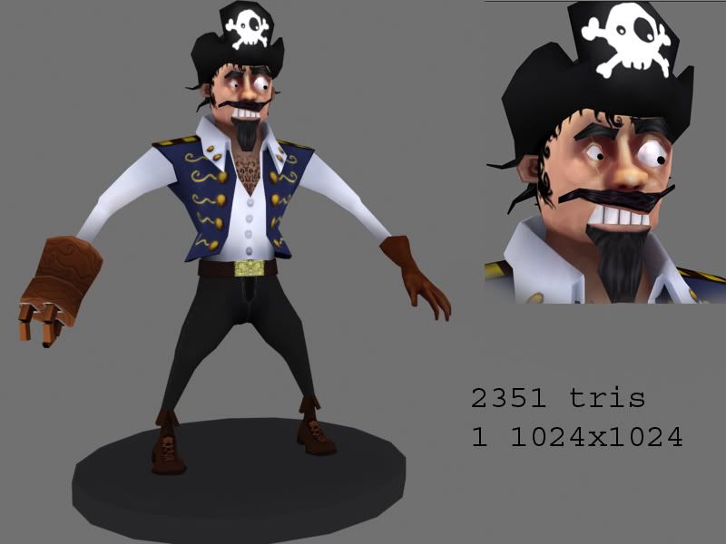
neck is a bit dark.
the ink blot test chest hair is... different.
i'd suggest a litle more space between the big eybrow and the hat. you're missing the line of skin color there and ruins the nice line of the hat.
The things that stand out to me the most are some of the details in the face. The yellow tinting of the nose seems odd to me, I think a red tint would be much more suited for the character. Yellow skin tends to make things look sickly. Also the shading of the eyes could use some refining, and are his pupils detached from his eyes? Seems a little odd.The teeth could use a little shadow from his beard and lip I think.
One other thing, I recommend trying to build up his mechanical arm thing. Right now it seems pretty basic even for a cartoon character, and doesn't read very well as mechainical. Adding just a gear or steam pipes would make it alot more obvious.
He's looking cool though, and you're absolutely right.... pirates rock.
oh, and brian, yea the pupils are seperate objects so I can move them around. Didnt want them textured in one place. Your other suggestions I will try and do some work on