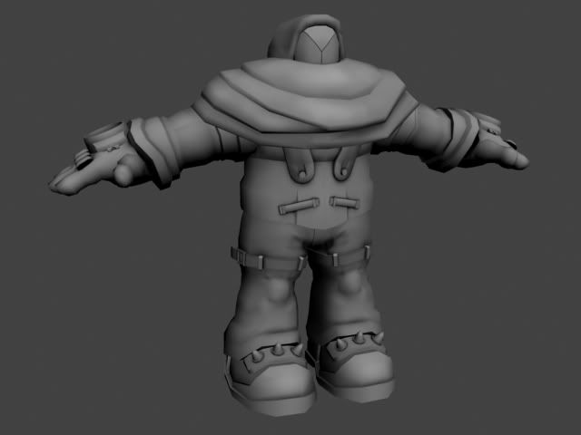
Dr. Quellik
Hey all. I recently finished this model (at 8880 tris) and have been torn about the colors I should use for him. I like Blues, and Blues with complimentary Oranges also make me happy. I also like Black and Yellow, but that "danger/construction/industrial" vibe may not be appropriate for him. Any crits or suggestion would be greatly appreciated, whether for the model OR possible colors.

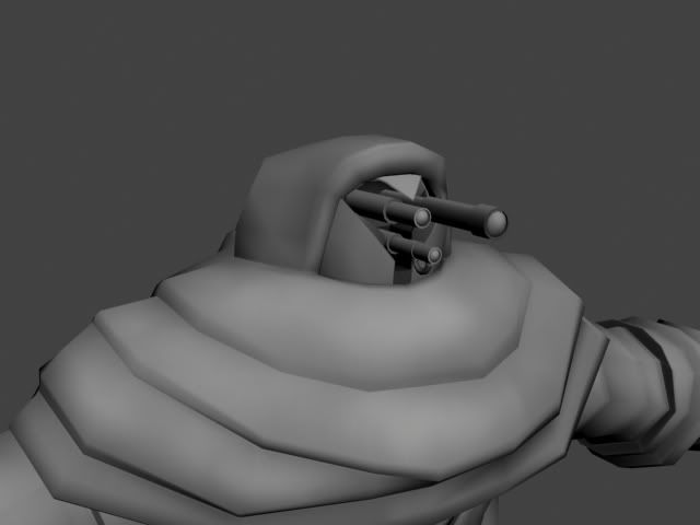
His face opens up to reveal three scopes that serve as his eyes.

Wires for those of you interested.

Thank you much.

His face opens up to reveal three scopes that serve as his eyes.

Wires for those of you interested.

Thank you much.

Replies
As for the color scheme, I would advise against black and yellow. The whole bumblebee look sounds wrong to me. Blue and orange also sounds pretty weird to me to... Try finding colors that complement eachother a bit better perhaps
Anyways, I love the design. Looking forward to your progress