Latest Character
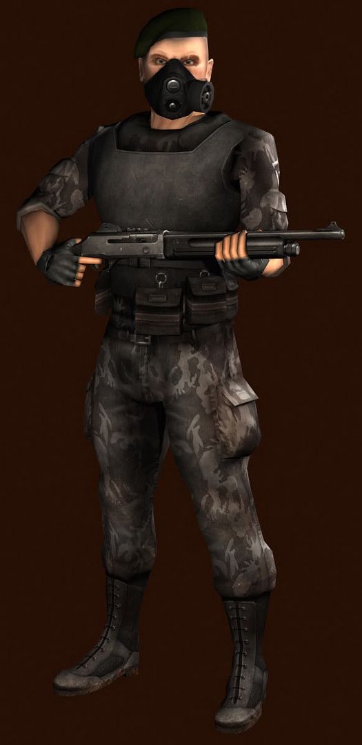
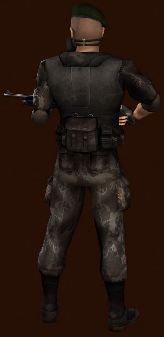
Finished this guy a couple days ago...


Head Flat
Body Flat
I'm kinda in a funk and i'm not really feeling like i'll make it in the game industry... bleh. Any of you in the industry think i have some potential or something? Just looking at some of the crazy work poop, soul, moose, roshach, rockstar, mop, pior, qubism, and many more because there is so much talent here, gets me down sometimes because its like... i'm just not ever going to be at that level... /pittyparty
hehe oh well, i guess it'll pass and i'll suck it up =p
Replies
the model looks great tho , and even tho ive never held a pump action shot gun it looks a tiny bit small ... or his hands are , love the camo texture tho , its really nice
The skin is cool but it seems a bit lifeless. You might want to make it sharper and give some more color to it
Keep it up
I like this piece btw .
you are being a bit impatient IMHO, took me years to get in the industry.
Perseverence is the key
CGPhil: Sharpness I can do... i'm so tired of working on this guy though. He's been quite a process There are a few unrefined places that i may go back in and sharpen up.
Ruz: Thanks.
Forgot to mention this, but the weapon was done by X-Con, a good friend of mine.
So, you are not a 'master' yet, but you are on the journeyman's road and with continued hard work and honesty about what are your strengths and which are not and confronting that will take you where you need to go.
Time is always the crucial factor.
Sometimes it is good to finish a piece. Don't show anyone, come back to it in a couple weeks and then refine it.
Or start with a much clearer design, have it worked out in thumbnail sketchs with little colour tests, have a bunch of reference, then think about little customizations you can make to standard designs that give a little flair.
Reference is god. The more you use it, the better you will get, the more you try to wing it, the more you will stagnate and have lows like you have now.
To me this looks like you are not sure what you want to do.
theres 2 routes, reality and stylization.
You seem to have chosen reality in this one. Seperatly the pieces hold up well, solid material, colour and shade control. Take together they don't hold up as well.
The problem with realism is that material definition is not enough, it is the interplay of materials and parts that break realism.
For instance, that neckpiece where the body armour sits upon. You didn't think that through, you were not sure how it attachs, so you couldnt show how it works to the viewer (and that is the artists job) and instead you tried to darken it out so that there was less information for us to read.
But , that area should not have shadow, and although most viewers couldnt tell you the exact reasons why, they will still know it looks wrong.
So give more thought and preperation to you designs, figure out how it really works and when you have that figured out, it will be easier for you to demonstrate that to whoever looks at it.
good luck. don't give up
i like the eyebrow scar thingy
I think you definately have what it takes to get in! good luck!
Now for the crits: (I only mention them to make it better)
-Design Flaws-
- The second mask strop shoul go above the ear or higher around the head. You want a tight seal that would not slip off in the heat of combat. Having both straps going around the bottom of the head it might just slip off around his neck. Take a look at the straps around most of the common types of gas masks. Most have a pretty elaborate set of straps that wrap around the upper part of the head. Granted this mask does not cover the eyes, like most gas masks.
- Which brings up the second point, gas can get in thru the eyes, tear gas, nerve gas, even dirt will get kick up in the eyes of a soldier when in combat. It would suck pretty hard if he gets put down like a chump because he gets some lint in his eye...
- He has a really wide torso, and broad shoulders/ The arms seem to be a bit skinny for someone with such a huge torso.
- Watch out for the wrist deformations, you might need to make some mesh adjustments so you can better animate the wrist. It seems to be pinching a bit in the render, which leads me to believe it will pinch more durring animations. If you post some wires we might be able to make some suggestions?
- The mask covers up the skin folds you did around the nose and cheeks. Did you not like the way it looked and decided to cover them up? Or mis calcuate when doing the skin? Either way I think there needs to be some shandows and highlights where the mask meets the face. Just to show that the mask is being pulled into the soft flesh of the face. Even the toughest tough guys have some squishiness to thier cheeks
I agree the second strap should go above his ears and i could probobly get away with just modifying the model and not have any bad stretching of the texture. The problem is in the original concept (which i didn't do) he is exactly as he is here. I agree about the eyes thing, but again the concept. This mod has a virus that has somewhat died out over time and these characters wear masks as extra protection.
The torso thing i guess was an accident. I'll have to watch myself on the next model.
I'll have to work on my rigging skills, they really... well... suck at the moment. I'll be working on them.
I didn't really cover up the folds in the skin, they are a little off the skinmap area that i had planned for, I'm just kind of messy when it comes to painting skin. From the side the folds are a little more prominant. I'll post some more shots of him tonight.
I don't get it. Unless it took you a month to create that or its over 5000 tris, it's awesome work and better then 80% of stuff I see in games today.
CameronC: You signed up to say that?
[ QUOTE ]
I don't think that the game industry is the kind of place where you can conduct a "focused" job search. You should be applying to a minimum of 100 companies per month, and expecting to hear back from only 5% of those at best. Of those 5 maybe 2 will become interviews. And over a course of maybe three months probably one will become a job. But that's all it takes is just one.
[/ QUOTE ]
Read the entire post here. Scroll down to about the middle of the page and look for the long post with all the great websites relating to getting a job in the industry.
Overall its interesting.
I feel the proportions are a let down, torso compare to legs doesnt feel right, The shoulder area feel poopish in the pose.
The face is Ok, The flat is allright, except that even tho you have good colors, they feel splash there for no reason, or not at the right placement on the skin. but its allright , it doesnt feel right applied to the head mesh tho, The mesh feel blocking ish.
Texture wise, U are good with material, but lack right highlight and shadow placement , except on the metal, that is cool. I feel more smaller detail would be much more interesting.
Overall you are getting better, Ur face are not as cartonny or dodgy then before, there is a way to go I feel, but u are Getting much better. IMO that is.
b1ll