aquaboy
Just started working on this while two guys were installing the new heating device at my flat. Showing them wings3D ins and outs was big fun 

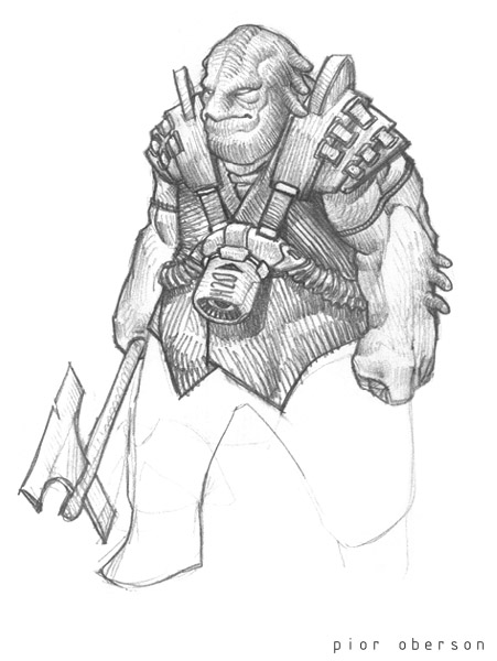
Roughly based on this sketch :

I'm giving him a more neutral/spirited away face expression to convey a fish look... Because fishes don't really have facial expressions, do they?
But he'll have big muscles anyway Crits welcome as usual...
www.pioroberson.com


Roughly based on this sketch :

I'm giving him a more neutral/spirited away face expression to convey a fish look... Because fishes don't really have facial expressions, do they?
But he'll have big muscles anyway
 Crits welcome as usual...
www.pioroberson.com

Replies
I like him. Cool style like always but I like the eyes on the scetch more. He looks a bit innocent and stupid with the round eyes, now I like that, but I think the more slicker eyes would make the char visually more interesting
Here's a pic of a random fish head to help out a tad.
I prefer the model to the sketch.
Illusions, it's going to be ingame someday for sure. The goal was actually to try out doom3 built-in normalmapping tools that seem faster and more reliable that both orb's and max's. Oh and the clay look comes from the dead easy material editor in silo 1.3. This app is powerful for sure
Thanks for the pic Neo, I definitely need to grab more refs like that. As for the mouth, it really depends on the fishtype : some have a kind of 'upperlip', a bit like this or this. Plus giving this part a dark and shiny look can increase the overall aqua look. But hey I'll also try what you suggest
Scooby, I used wings3D for the lowpoly subD cage only, smoothing and detailling has been done in Z2. Anyways if you push wings far enough you can get kickass results straight out of the app too. Its free, powerful and superfast to the use.
Hollow, now that I think of it it's true! Mangalords, right? I guess it comes from the little tentacles that look a bit like the Mangalords floppy ears. But in the end it's going to be fish tails/fins on the model
Poop, been trying to avoid too much 'plastic' stylisation on this one, hard edges and all, for a more natural fleshy look. And it's fun! Can't wait to model the rest, yeah. Next step, body roughing!
Haha thanks Moppius! You'll get weekly msn updates with this one
I'm with you ether! Can't wait either!
It's going to be great fun
Laterz
www.pioroberson.com
Show us more!
HAR HAR HAR
http://ruthlessreviews.com/pics/5thelement1.gif
closer
Can't wait to see this guppy done;)
P.S: T'es vraiment trop fort
Jama and Ramu, a little workflow collage for you here :
1. Once the idea is laid down on paper the model is quickly roughed in Wings3D (which is my weapon of choice when it comes to quick polygon modelling. You just have the tools you need, and the whole app is geared towards fast workflow).
At this stage I mainly care about building a clean yet simple quadratic base mesh with only the main facial features suggested. (you can actually push the mesh density higher if you have precise ideas at this early stage. It's just that what you gain in precision an control, you loose it in terms of potential and freedom).
2. The mesh is carried on to Z2 using the .OBJ format which offers nice export/import features and has great cross-application compatibility. I had to divide the mesh 5 times here to get enough density for detail modelling, but with a finer base mesh it could have been fine with 2 or 3 levels I guess... I try to add details along the main edgeloops because if you don't, you go 'against' the model and you'd need even more subD levels.
You can notice that if switched back to subD level 0 the model slightly differs from the original. The eyeline is smoother, the mouth is more horizontal... That the great thing with the intuitive ZBrush workflow, you fix things as they come along and you don't even notice it while doing it
3. The detailled mesh wireframe does not have the classic precise 'highpoly' look that comes when working on pure subD modelling. The details sortof shift along the isolines... See the eyesocket part for example.
4. All the 'hardware' modelling (tech parts, tubes, aso) is done with the usual subdivision method, just one level of division here. At this stage I prefer Max over Wings for it's solid tools such as dynamic symetry, grouping, hiding and all. The Zbrushed meshes are displayed as bounding boxes since they are simply too heavy for my computer to handle. Instead I display the level0 mesh wich provides good enough guidelines for modelling and proportions. I switch the head models visibility when rendering the scene.
I also enjoy using the 'turbosmooth' modifier in Max for it shows great optimisations over the standard meshsmooth. Realtime display of smoothed models is around 5 times faster... It saved my life for this model since my 1GHz cpu couldn't handle it otherwise.
Voila! Sorry for the long talk
Gunt, Ruz, thanks, and KP, where is that avatar from? I like his looks :P
it is from the second of two very well done flash animations by adam phillips. they are both worth watching, imo.
the first called "Bitey of Brackenwood" can be found, here. the second called "Prowlies at the River", here.
edit : Man my first try wasnt THAT bad you could see it was a face, but it was all smokey and bubbly and all, it looked like his skin was melted and it had no natural flow, how do you get such a CLEAN looking Zbrush object, which brushes do you use most, do you smudge everything into its form or ?
and Aqualad from TT has got nothing on Red X
Nice concept and realization.BRAVO.
Daz, I agree about the fingers... I'll shrink them domn later on as soon as I have the normalmapped lowpolygon model ready.
Pseudo, I thought about that too! It's kind of annoying but fun in a way
Badge, I note this down!
Dizzy, it's far from finished
..........
Been having sampling some realtime textures with normalmap photography yesterday. Works great! The fur andleather turned out surprizingly well.
divx5 vid :
http://www.pioroberson.com/files/normalmap_photo.avi
Vahl, yeah it's super easy and never fails. I've made some more samples using a camera stand, they are even sharper!
Hawk, tutorial here :
http://66.70.170.53/Ryan/nrmphoto/nrmphoto.html
I'm not following the exact same steps for the final compositing but you get the idea. All you need is 6 shots of the object : left, right, top, bottom, above, and diffuse lighting. I simply merge a negative version of the left shot in incrustation mode on top of the right shot and put that in the green channel of the final normalmap. Then do the same with top/bottom, in red channel. And the above shot is adjusted and used as blue.
Normalize.
And voila! Fully working normalmap, easy to use as a texture overlay. Works great!
I just want to bite that ass!
looks nice and crisp!
Anyways, top notch work !
but why does my zbrush dont do this kind of stuf?!?!
design, anatomy...all is great
I love it, can't wait to see it finished.
I like how you have used Zbrush here, you haven't gone and over-detailed everything ridiculously just because it's possible. And yeah, that's one toned gluteus maximus!