The BRAWL² Tournament Challenge has been announced!
It starts May 12, and ends Oct 17. Let's see what you got!
https://polycount.com/discussion/237047/the-brawl²-tournament
It starts May 12, and ends Oct 17. Let's see what you got!
https://polycount.com/discussion/237047/the-brawl²-tournament
Meatloaf, the packing troll
Hey, good to see the forums are back  . This character has done a good round around some forums, so I apologize if anybody is sick of looking at it, but some extra feedback would definitely help (any ideas on how not to make sucky ass uv maps?)
so, couple of collages witht the lights out, then some renders to see how his butt reflects some lights and the concept illustration and poop
anyways, hope you like it, feel free to rip it to pieces, etc
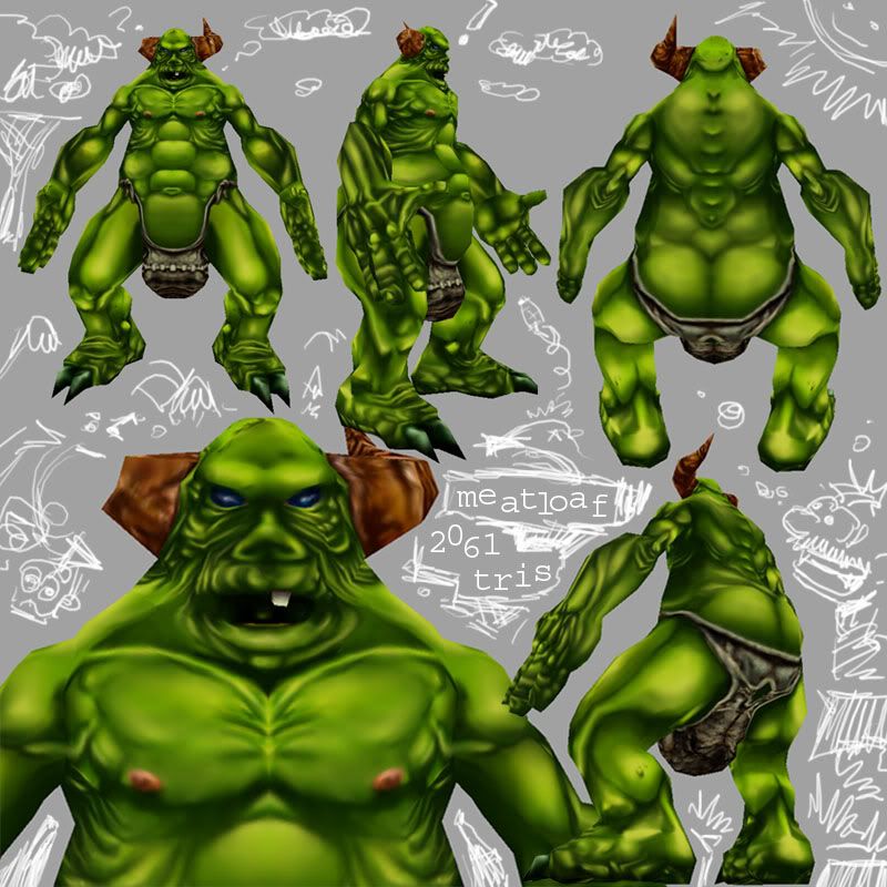
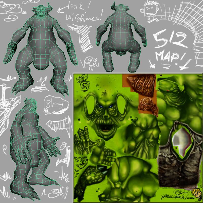
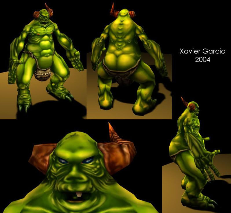

ah yeah, new character up in a couple of days... hopefully
 . This character has done a good round around some forums, so I apologize if anybody is sick of looking at it, but some extra feedback would definitely help (any ideas on how not to make sucky ass uv maps?)
so, couple of collages witht the lights out, then some renders to see how his butt reflects some lights and the concept illustration and poop
anyways, hope you like it, feel free to rip it to pieces, etc


ah yeah, new character up in a couple of days... hopefully

Replies
The concept is great and the model itself aint too shabby though the proportions seem more extreme than the concept.
The only real part that makes this model suffer is the texture work, jackablades more or less covered that though :]
My only crit is his rear shoulders... in the first pic, top row, second stance from the right, you can see his shoulders look a bit pinched...I think if you brought some more volume to the rear of his shoulders it will look as if he can actually lift his arms
I think my biggest critiqe is that you kept the contrast way too strong all over. its making it read as a muddy mess. Shadows that dark are appropriate in the under planes, but on the tops of the arms and legs, it just looks like he has dirt in those creases. Try to unify the lighting a bit more by making it specific to a certain light source. Also some color variation would be good like jackablade said. On uv maps, have you watched my video tutorials? www.poopinmymouth.com in the tutorials section i believe videos 6 and 7 are uvone and uvtwo. lemme know if they help.
looking good buddy.
poop, ill get to do some changes soon and ill check those tutorials as well
thanks again!
I'm scared
everything else has been covered, i'd say. great concept.