The BRAWL² Tournament Challenge has been announced!
It starts May 12, and ends Sept 12. Let's see what you got!
https://polycount.com/discussion/237047/the-brawl²-tournament
It starts May 12, and ends Sept 12. Let's see what you got!
https://polycount.com/discussion/237047/the-brawl²-tournament
Elemental - Illusions - Smoke/Fire
Alrighty, trying to bring this contest to life here at the temporary boards...well...heres my progress:
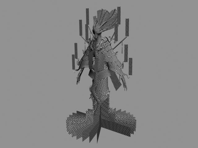
Checker distortion/proportion map...
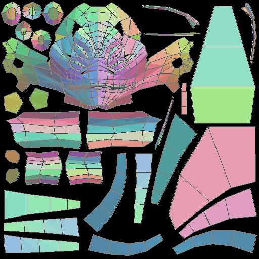
Head UVW layout
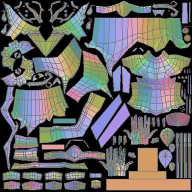
Body UVW layout. (Photobucket resized this one grr)...
Head will be 1024x1024, and Body will be 2048x2048
Alright, any suggestions or crits on work so far would be greatly appreciated, as would any suggestion/tutorials on texturing intersecting planes (like how his base is made up), that would employ alpha transparency as well.
Also looking for suggestions as to the best way to Normal map this guy...he's got numerous layers of clothing and armor...looks like its going to be a bitch...

Checker distortion/proportion map...

Head UVW layout

Body UVW layout. (Photobucket resized this one grr)...
Head will be 1024x1024, and Body will be 2048x2048
Alright, any suggestions or crits on work so far would be greatly appreciated, as would any suggestion/tutorials on texturing intersecting planes (like how his base is made up), that would employ alpha transparency as well.
Also looking for suggestions as to the best way to Normal map this guy...he's got numerous layers of clothing and armor...looks like its going to be a bitch...
Replies
yes. he could do that if it were not normal mapped. with normal mapping if the uvws are stacked it fubars the lighting on those pieces. everything has to be seperate and un-mirrored on the uvw map.
Illusions: looks great man. really want to see it textured
cant help you with the alpha mapped/intersecting planes bit though
Jackablade, any and all things that could be overlapped have been, which is only the "hair" and "base" smoke alpha planes...
I'm trying to use 3D Studio Max 7's Render to texture normal feature...following the tutorial and all...and guess what...it doesn't work. It renders a normal map and all, but the results are fricking weird and absurd. Its not the projection cage, I've tweaked that to hell to make sure it includes everything. All I can say is that when it renders a normal map for my model, it looks like it has distortion and artifacts all over the place...yet if I try the same method with a simple six sided sphere as the low poly, and a 32 sided sphere for the highpoly, it works just fine. Then theres also the issue where its constantly reseting my mouse position while rendering...grrr...anybody have any ideas of what I could be doing wrong?
Edit: Ok, it doesn't happen as bad if I try doing the entire model at once, but then I get overlap. If I try it for individual pieces (in their own seperate file), its completely screwed up...that...and my mouse is still foobard....grrr...
Edit 2: Scratch the mouse problem...apparently while I was waiting for the normal map to render...my tablet pen fell off a stack of papers and onto my pad...with the papers hiding it...grr...tech hates me today...
My finishing is riding partially on whether I get picked or not to go the Tuesday after Nov 14th to give my Senior thesis oral report...if I do, I'm probably not going to make the deadline...so I hope I don't get picked...
Crits and critiques are welcome as usual. I know he's a bit monochrome...but thats what I'm going for. His skin will end up being the contrast (white-ashen gray)...as natural smoke really isn't colorful...
good luck with all those alpha planes.
Another progress shot, more done this time...still got a lot to go. Crits and comments are appreciated as usual...and I didn't get picked for my oral report yet...woohoo...
Jeez that's some wicked detail going on. I can't wait to see some colors.
[/ QUOTE ]
Uhhh...colors...yeah...colors...umm...got any suggestions...lol cause I've never envisioned him with colors, and...I know he needs some...
I know it's too late for the contest (well, you've got all day), but color-wise I'd try some oranges and reds as Sectaurs said, in the hot spots, and purples and browns in the smokey areas.
I'm really loving how this one turned out.
Beautiful submission there. Any chance you could make a few of your textured renders bigger?
[/ QUOTE ]
Yep, could do that, will try that now. Going to see how co-operative Photobucket is with the naming conventions and such.
Edit: Done, they're at 1024x1024 now
[ QUOTE ]
I know it's too late for the contest (well, you've got all day), but color-wise I'd try some oranges and reds as Sectaurs said, in the hot spots, and purples and browns in the smokey areas.
I'm really loving how this one turned out.
[/ QUOTE ]
I will probably try that now that I've at least got something submitted for the deadline. I like your suggestion of colors and probably will try them out. Although there probably won't be any major changes to him, like rigging him etc, for now, as school projects are piling up (Senior Thesis oral report and 10 page paper to write, and a portfolio website need to be completed for the end of my semester in 5 weeks...ughhh...). Glad you like how he turned out