Request for Honest Critique – Realism Assessment on Octane Product Render
polycounter lvl 4
Hi everyone,
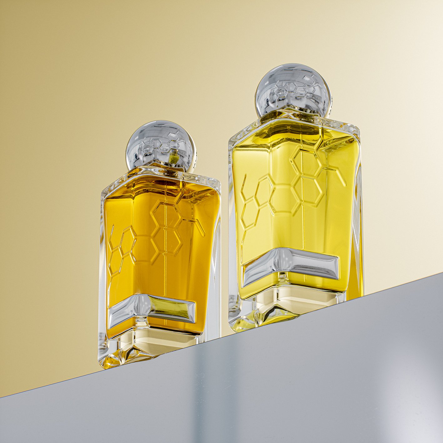
I’d really appreciate some fresh eyes on this render that was done in Octane. I’ve been staring at it for too long and have hit that point of familiarity fatigue and tunnel vision -- I can tell something feels off, but I can’t pinpoint exactly why.
When I compare it to other beautiful, moody, and realistic-looking product shots, it still reads as CG/fake, but I can’t tell if the issue lies mostly in the lighting setup and the camera angle/DOF, or if there are deeper problems with modeling, materials, colors, contrast, reflections, ... etc.
Any objective critique would be hugely helpful, thank you.
Replies
The angle is really odd.
Your lighting mainly seems to rely on an HDRI environment (of an empty office/industrial space?) rather than a studio setup. And if you did set lights, then the HDRI works against that.
Some of the reflections seem to have little or no Fresnel falloff when facing the camera.
The geometry might have too low resolution in some areas like at the bottom, but that might be due to other things.
The rectangular grey shape/inset at the bottom looks odd and too rounded (the shading bends across the whole surface). Also, are the indexes of refraction and reflection correct?
The containers are overfilled and the honey(?) only seems to tint rather than absorb or scatter light. Does apply less if it's a thinner fluid.
Overall, I'd go for a less busy environment and for lights and reflected elements that are set deliberately. Additionally, some minor imperfections in the glass and honey might give it a more realistic feel. Also, if you show two variants of the product, you also have the chance to show off two angles of the packaging.
In real photography, it's hard, sometimes impossible to break the norms, in CG it's easy and might even happen by accident. So if you do, decide if it's really necessary and make it count. (That sounds quite pompous and emotionally invested, so take it with a spoon of salt.)
Like AlexandrDm wrote, we are immediately prompted to wonder what the bottles are standing on and why, even if it might work as an overall composition.