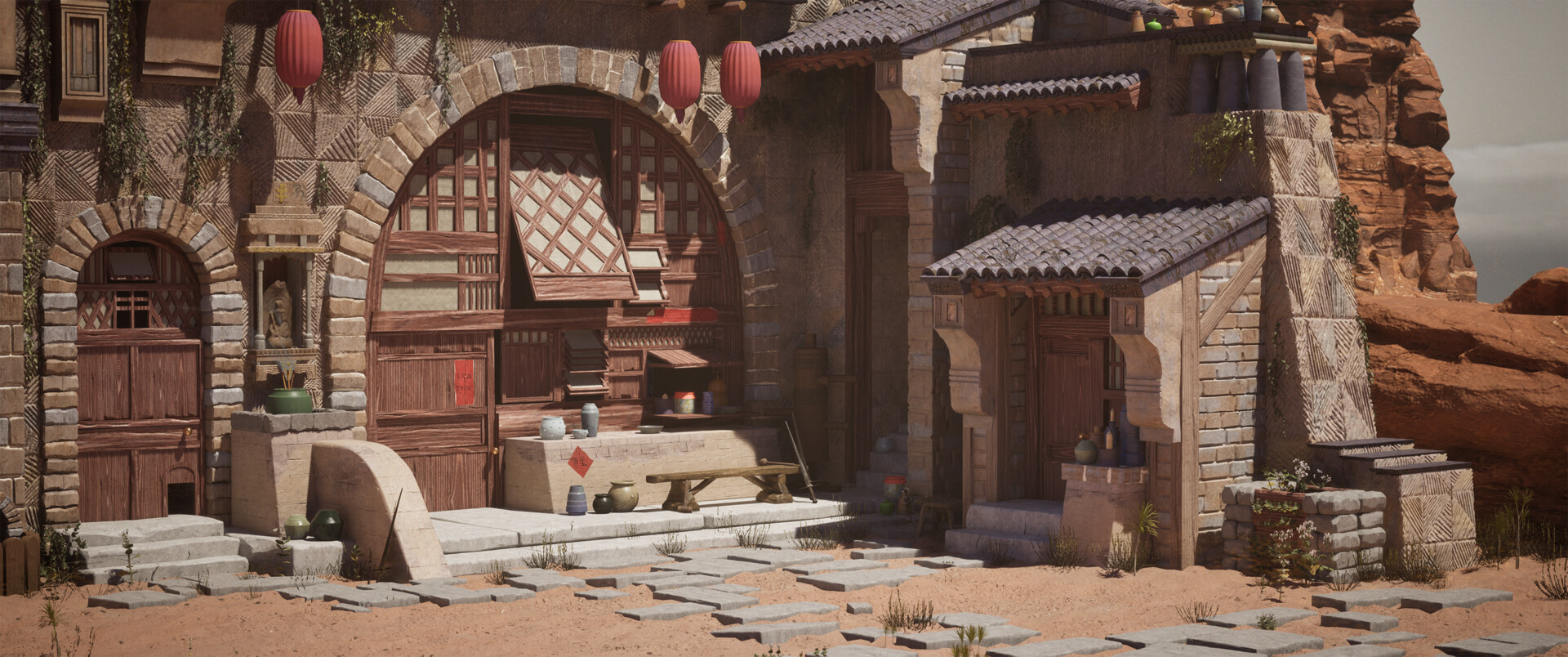
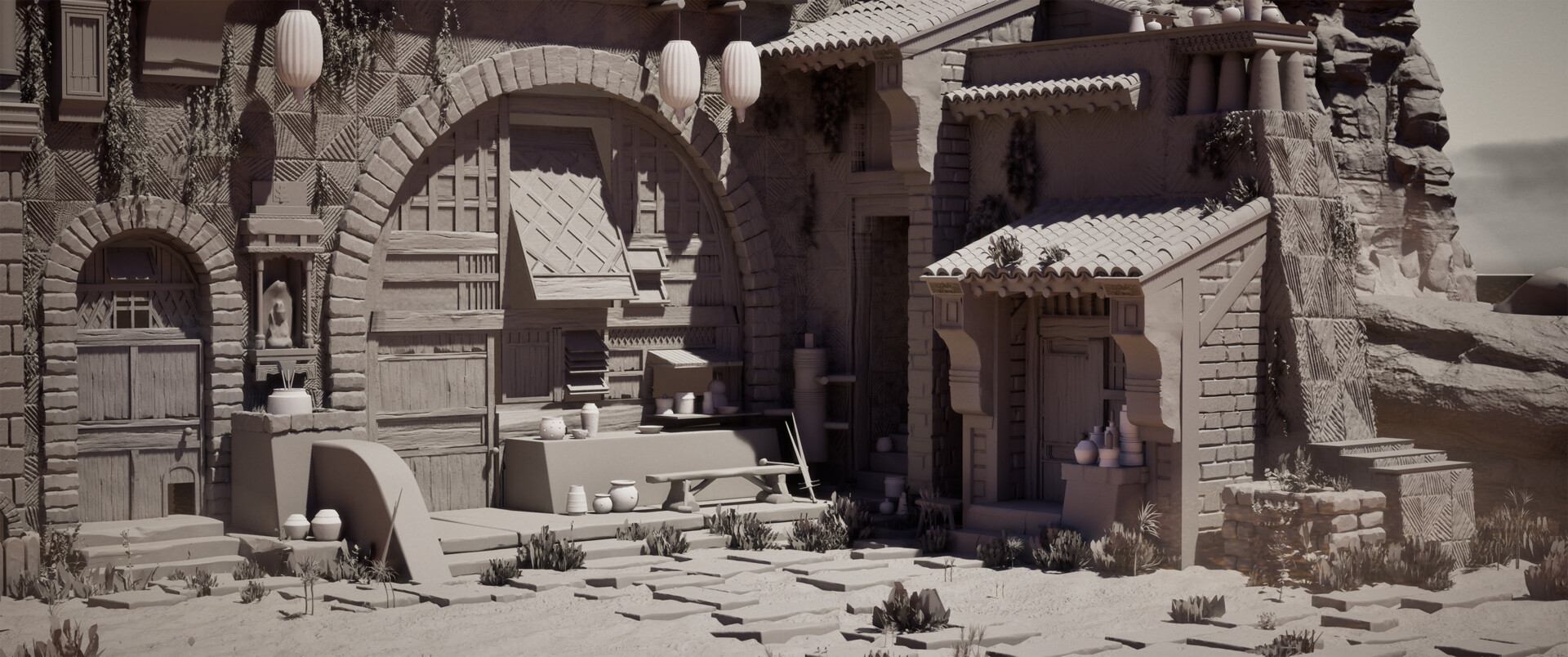
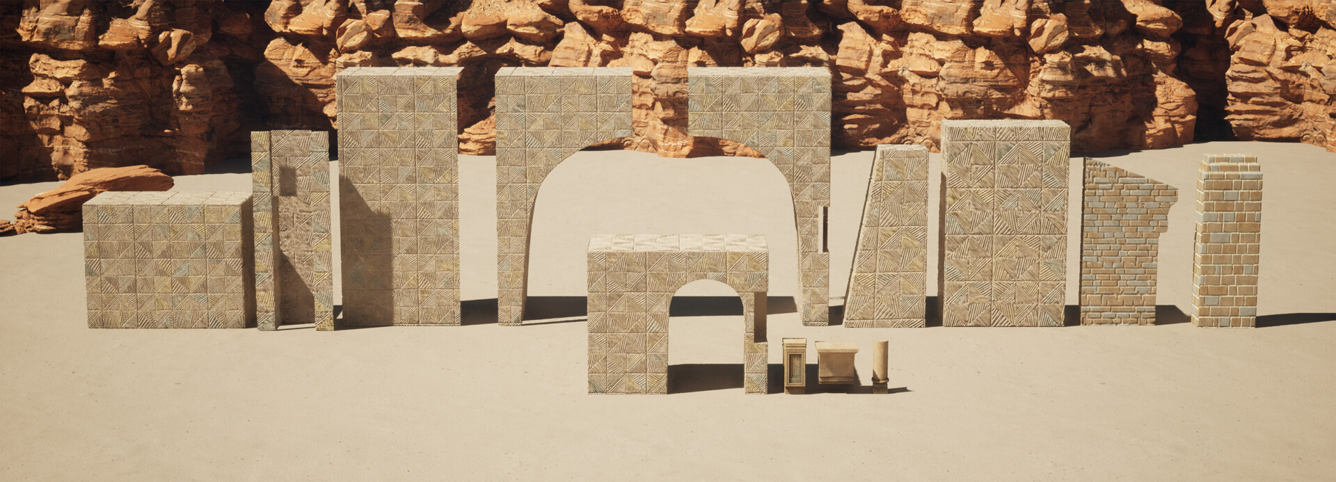
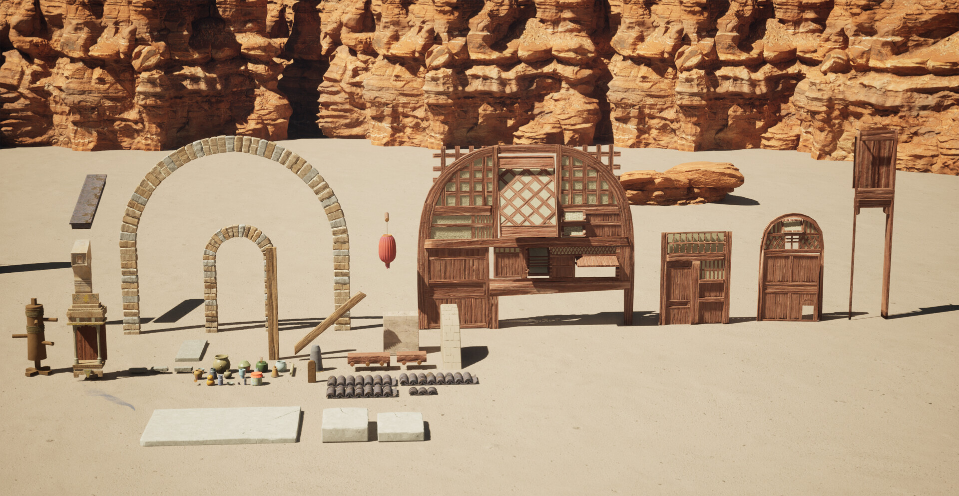
Looks nice, however id try do some post processing on the colors, also im not sure if the shot is framed the best, its a bit cropped on top right awkwardly
Here I added some blue/purple in the shadows, and some red and yellow in the midtones, highlights Something still feels slightly off maybe with bounce lighting or the exposure, the rocks seem slightly darker than id expect, maybe your textures are too bright, leading to the rest to compensate
Looks good !, The objects that you have created looks great, one thing that i noticed before everything else is the way the ground itself looks and i think that is something that can make your work look much better plus the stones on the ground can be of similar color pallet as the rest of the environment itself.
Another great addition would be these shades, In deserts the sun is really hot and people usually always use shades and its color and the shadow it creates could give the scene a bit more feel of being lived in...
I hope i make sense, english isn't my main language.
Thanks @Shrike I appreciate the adjusted image! For the color palate I was trying to keep everything a bit muted and desaturated, however I do see what your saying about the rocks. Those were something I added very early on and didn't really touch again. I wasn't really sure what was off about them but now I see the base color is off, so ill keep that in mind for next time! and thank you @Jalalzai as well! I love how those canopies look! This project is finished but I can see that in the future I should do more research on references that will help add to the realism of me environments. I did want the stones to stand out as sort of a compositional way to lead the eye to the building itself, but the may stand out too much haha
I will keep in mind both of your suggestions for my next environment!
As an image, i dont really get a sense of composition or thought put into a focal point, or anything to guide me through the image. It just feels like a lot of noise that together composes a scene. Not that theres anything wrong with that
I wouldnt have let the viewer see the rock and open section to the right, it draws my eye because its the simplest thing with a strong saturation beyond all the other muted things and i crave eye rest, so im drawn right out of your image.
I'd crop that image tighter and get rid of the background, or create an expanse, and pull the camera out.
imo - too much noise - no focal - mixture of styles - foliage is so small its barely noticeable - image is quite flat, all middleground
@shabba I appreciate your critique! I defiantly see what your pointing out, there were a lot of things that I struggled with here, especially the style. In my next personal project I'm going to try and improve on these points and the ones above as well, and ill probably try to get more critique earlier on so I can catch these things sooner. Thanks for you advice again!
@Larry I was going for a desaturated/ subtle sort of look for this project but I guess I didn't pull it off the way I had hoped, since this is the second comment along these lines I've received. Thank you for the comment! I need more ~drama~ for the future!
Replies
Here I added some blue/purple in the shadows, and some red and yellow in the midtones, highlights
Something still feels slightly off maybe with bounce lighting or the exposure, the rocks seem slightly darker than id expect, maybe your textures are too bright, leading to the rest to compensate
The objects that you have created looks great, one thing that i noticed before everything else is the way the ground itself looks and i think that is something that can make your work look much better plus the stones on the ground can be of similar color pallet as the rest of the environment itself.
Another great addition would be these shades, In deserts the sun is really hot and people usually always use shades and its color and the shadow it creates could give the scene a bit more feel of being lived in...
I hope i make sense, english isn't my main language.
and thank you @Jalalzai as well! I love how those canopies look! This project is finished but I can see that in the future I should do more research on references that will help add to the realism of me environments. I did want the stones to stand out as sort of a compositional way to lead the eye to the building itself, but the may stand out too much haha
I will keep in mind both of your suggestions for my next environment!
I wouldnt have let the viewer see the rock and open section to the right, it draws my eye because its the simplest thing with a strong saturation beyond all the other muted things and i crave eye rest, so im drawn right out of your image.
I'd crop that image tighter and get rid of the background, or create an expanse, and pull the camera out.
imo
- too much noise
- no focal
- mixture of styles
- foliage is so small its barely noticeable
- image is quite flat, all middleground
Or as I like to say, where's the drama!?!?!