Confused about topology for defined Muscles
Hello fellow peeps, I'm currently retopologizing my game character and I'm kind of puzzled how to structure the topology to display the muscles properly.
My goal would be something like this:
https://www.artstation.com/artwork/9md2RQ
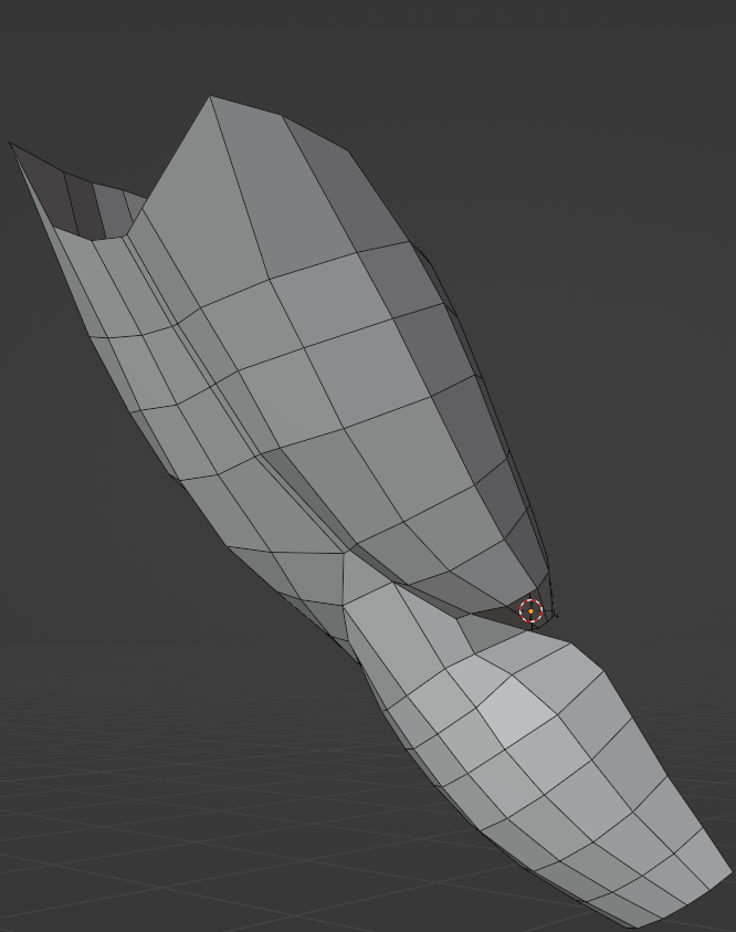
Current topology looks like this:


My goal would be something like this:
https://www.artstation.com/artwork/9md2RQ
Current topology looks like this:

For reference this is the high poly:

As you can see the muscle definition is not that high in the first picture, so i changed the topology so that it flows more according to the structure of the muscles.
This is how it looks at the moment:

This looks a lot better, but the edge flow is getting kind of disrupted, so im not sure if thats a good way to structure the topology.
Just a bit confused about how to go on to achieve the desired look.
Just a bit confused about how to go on to achieve the desired look.
Replies
I have found the middleground between my two initial ideas and now it looks like this:
Is it alright if the edges are a little bit pinched together, like in here?
Thank you in advance for any help.
Except there is a hard poly limit for the target game.
http://wiki.polycount.com/wiki/Topology
For example:
I must agree that the area around the scapula looked weird, but other than that I don't see anything wildly wrong. The clavicle looks a bit funny but its not super important that this part is perfect in the sculpture. The shoulder area is also a bit exaggerated with the lines showing each head of the deltoid but i can fix that later on.
My intended goal is an anime style body, something like the one of Ghostblade from the fighting Game DNF:Duel.
And thank you all for helping me out