Ancestral Blades | Stylized TPP game environment | UE5 [finished]

You can find the finished work and an attempt of making a breakdown here:

https://www.artstation.com/artwork/zD2rO2
Hi everyone!
I started working on my first stylized scene. I was encouraged to do so by a course from Stylized Station. Since it is still new to me, I present to you my iterations of the composition.
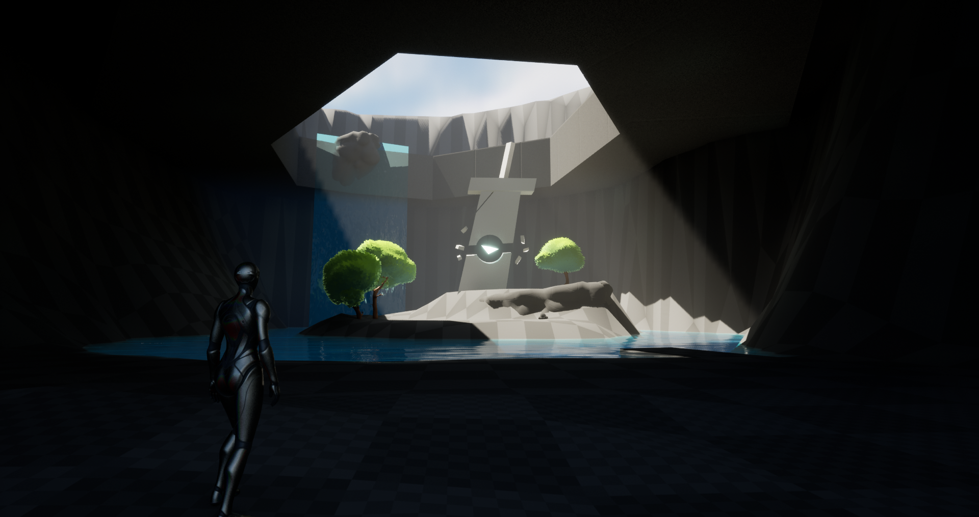
In this work, I wanted to focus the player's attention on a sword statue set on an island among the trees in a cave with light streaming in and waterfalls flowing down.
This is meant to be a stylized work, and I wanted to share my progress with you and kindly ask for feedback as to which of the presented compositions you think is the most interesting, or what you would change about it.
Requirements: Adventure game, third-person perspective, stylized
Refs:

Composition blockouts (some of them):
1st
2nd

3rd

4th

5th

Please share your thoughts and feedback, I would appreciate it very much
cheers!
Replies
working on grass. Right now It looks like Runtime Virtual Textures with color resets after closing Play mode
For the grass, since you use virtual texture to sample the landscape color I suggest to add more green variation in the terrain itself, I did exactly the same trick and these color variations really helped to have a more visible grass structure and an overall nice effect :) a simple hue variation will do the trick!
Thanks! I'll do that for the final scene, good advice :)
Right now I've been working on some flowers
A quick composition to see how the assets work with each other. I would still change a lot in the vegetation.
More attempts after I refine the blockout of one of the compositions in the first post. Probably 1st or 5th
test scene, just for fun
no more playing with this, time to get back to decent blockouts :)
I think the sky could be a bit more saturated and the clouds white to make the stone pop out more and fit the stylized look better.
[deleted duplicate]
Thank you. I'll work a little bit on this sky :) I've completely forgot about it.
Right now I'm working on the blockout for my final scene. I'd love to hear feedback how it looks and what could be improved. Black planes are representing waterfals.
https://youtu.be/3YprTMyNhcQ
I've upgraded materials, trees, grass, sculpts, added orbs, falling leaves, wind, floating rocks
Which composition fits better in your opinion? Or how could I further improve this composition?
scene update! I've like 50 screenshoots of the process but I'll post it after publishing this scene :)
please let me know what do you think about these 3 shots/compositions
https://youtu.be/gOP6LS8Fa_A
and a few screenshoots
I may want to replace top-down with a sketch idea of a LD as the canopies look like a huge blob
update! I've got a few things to change and I'll probably do some changes and I want to try creating LUT for this one (I've 0 experience in that)
I'm looking for feedback guys! :D
Hi QB1!
I love the colors and composition; everything looks great!
However, I have a problem with the space between the foreground and the background. You have really nice contrasts and the main focus is on the magic stones, which is amazing. But I think the background with the trees seems flat, as if there is no distance between them. I don't know how much control you have over this, but I'd suggest adding some kind of distance fog there to separate the planes (but keep it away from the main stones in the middle). But if it is your idea to connect the trees together so that the main focus is on the stones, don't mind me ;D
The second thing is the trees. I love these fluffy trees; they look great. But the fur ones seem out of this world. They work well as backgrounds, but when I see the part where they connect to the branch, it pulls me off that the leaves come from the tree itself. Floofy ones work great; I love them.
And since everything is stylized, I'd suggest adding more thickness to the stems. I don't feel like they match the triees and cartoony style because of how slim they are. Also, the same with the grass. I don't know if it's the way it mixes with the rocks or the shape itself, but it looks very thin. I feel like it needs a more stylized approach to match the style of the trees and rocks.
Lastly, I think your shadows are too dark, but that may be my visual preference. I would suggest lightening them up a bit to see more colors there.
Keep going, I really love it!
Thank you very much Zazu!
I got used to the fact that here I do not get feedback and did not check the forum before publishing.
You've shown me some places that would certainly improve the quality of my work. .Thank you also for going the extra mile with the overpaint, it means a lot.
I will try to make use of your advice on lighting and proportions for future works
Here is the finished work, maybe you will notice something else that is worth improving :)
https://www.artstation.com/artwork/zD2rO2
cheers!