Iceland inspired VR house
Hi everybody. I have been working on a VR scene for a whie now. The project is made in Unreal Engine 5. I started with the virtual reality template and I built-up from there. I would love to hear any thoughts on how I could improve this scene further. I would like to push the graphics a bit more but it feels like I am approaching the limit to be safe with the performance.
That said, I still need to properly learn how to assess the performance and understand the profiling tools in UE5. Any critiques or ideas are more than welcome:
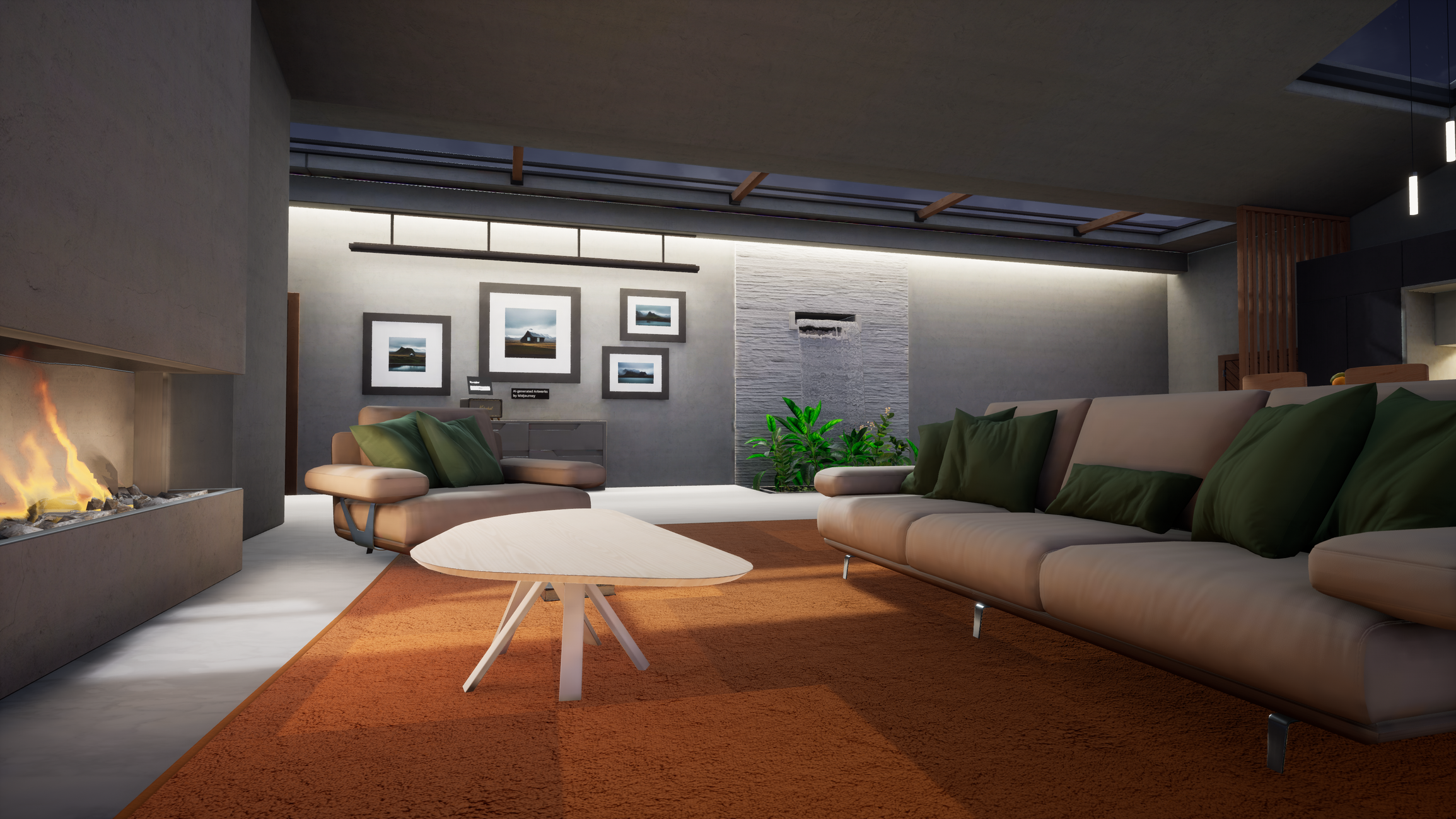
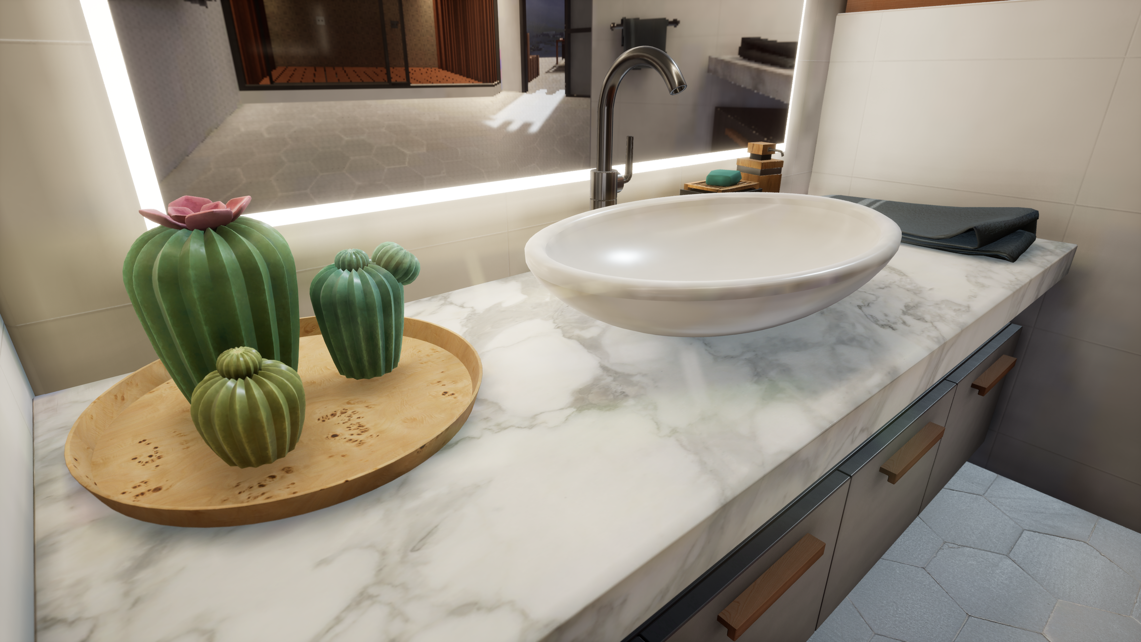
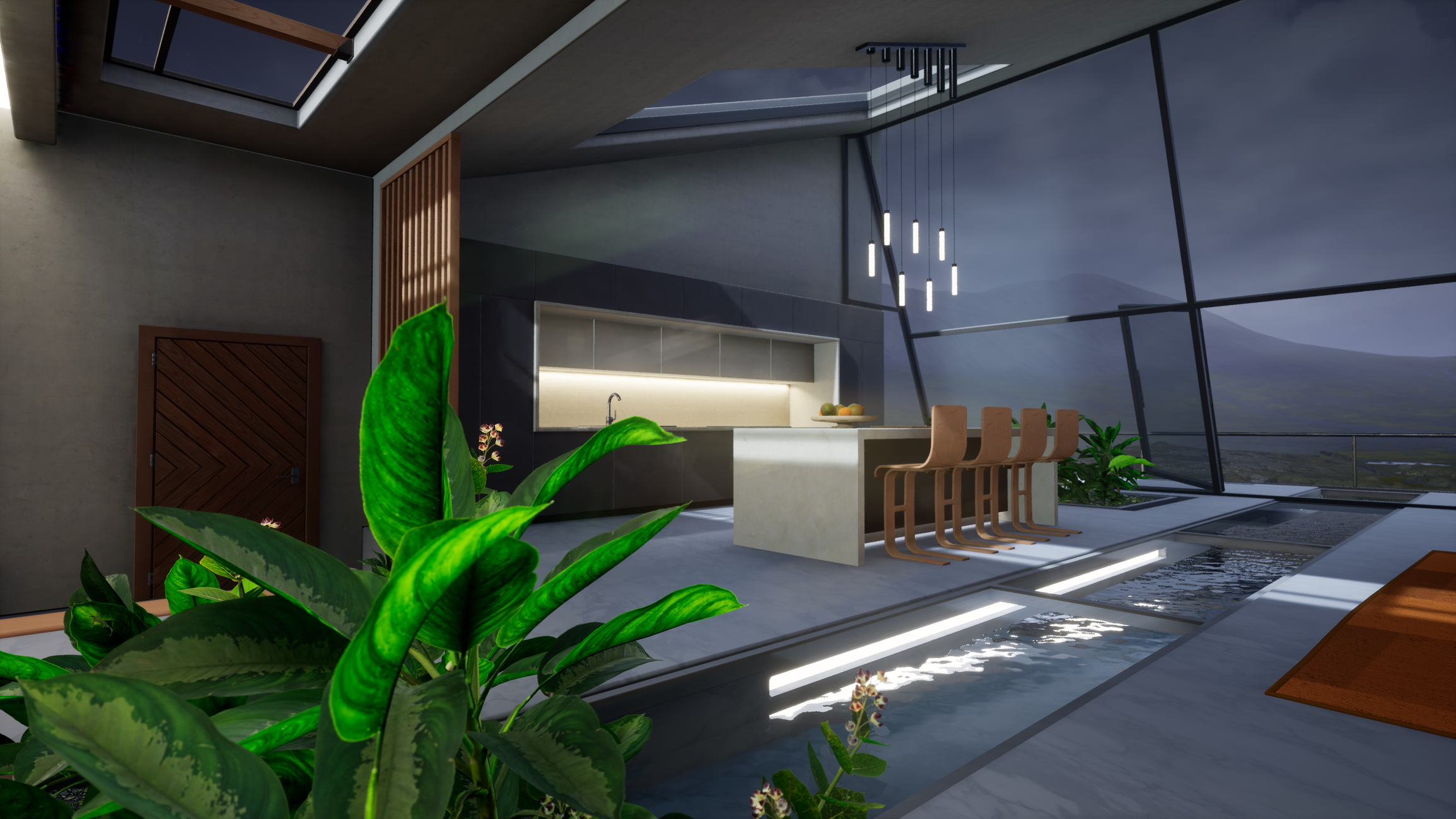
This just a quick cinematic and it is not meant to be final. You can clearly see the VR headset from the VR pawn and also that book falling. Furthermore, the light bake is not final. Here are some stills :
And here is a gameplay video. It is slightly older than the cinematic and the stills so you might see models missing and also the outdoors is less detailed:
There is a bit more info about this project from this other post:
I want to add some more models to add detail in some areas but besides that I would say I don't have more ideas on how to improve the scene. I would love to have more accurate reflections like planar reflections but I don't think that would sit well with the performance. Please let me know your thoughts 😊


Replies
Looks amazing! The vibe of the interior is great. Considering this is for VR, this looks fairly detailed. I know this is a little nit-picky, but I feel like the house doesn't feel connected to the ground. Maybe add some rocks or make the terrain slope up to the building so that it has a nice gradient? Maybe bushes can be placed to hide the seam of the building clipping through the ground? I'm not sure if that will hinder the performance but it's just an idea :) Keep it up!
Really cool so far! I agree with the other comment about incorporating more of the outside features in the interior. One easy solution could be changing the green of the plants to match the more muted color of the grass outside. I also think it could be cool to emphasize the river outside and the way the interior water feature flows into it.
Thank you all for your feedback! I have been working on blending the house with the terrain and also emphasizing the river.
I also added a very simple splash as an animated material, at the bottom of the outside waterfall. Far from realistic but I do not want to go with particles. This is a flipbook texture I got from an animation made in blender:
I finally finished this project, you can check it out here:
https://www.artstation.com/artwork/xYgKyO
Thanks everybody for your feedback!