Book of Tyrael
Hey gang! Long time no see.
I've been noodling with photorealism for some time now and decided to take on this old thing.
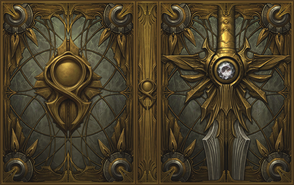
Naturally, as a modern day CG enjoyer, I went to town on that sweet sweet subdiv modeling. In Blender, no less.
With pretty shaders included!
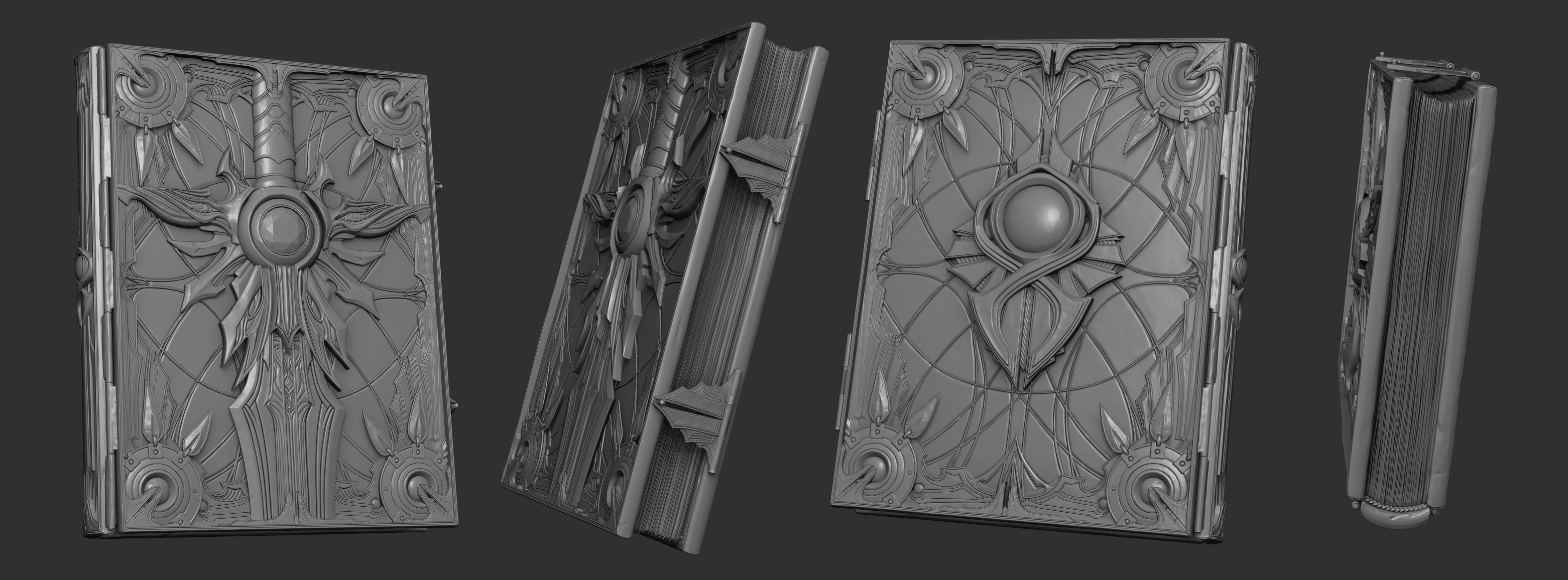
I then tossed it over to Zbrush and effed it up a little, so that it looks properly old and beat up ^^ Just a little bit though.
And then over to retopology. This time in Maya, I haven't tried it in Blender yet, so in the interest on expediency I went back to my roots.
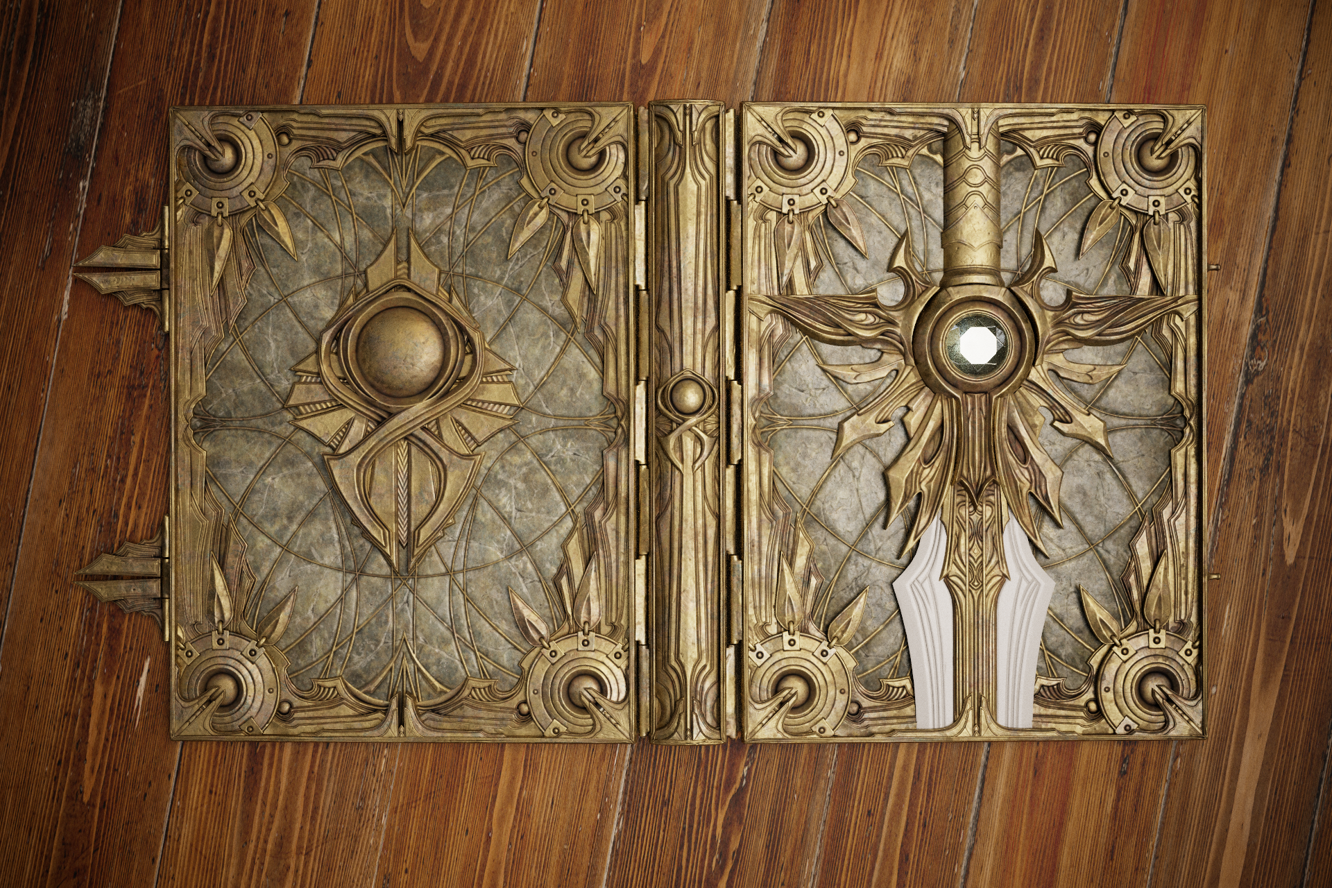
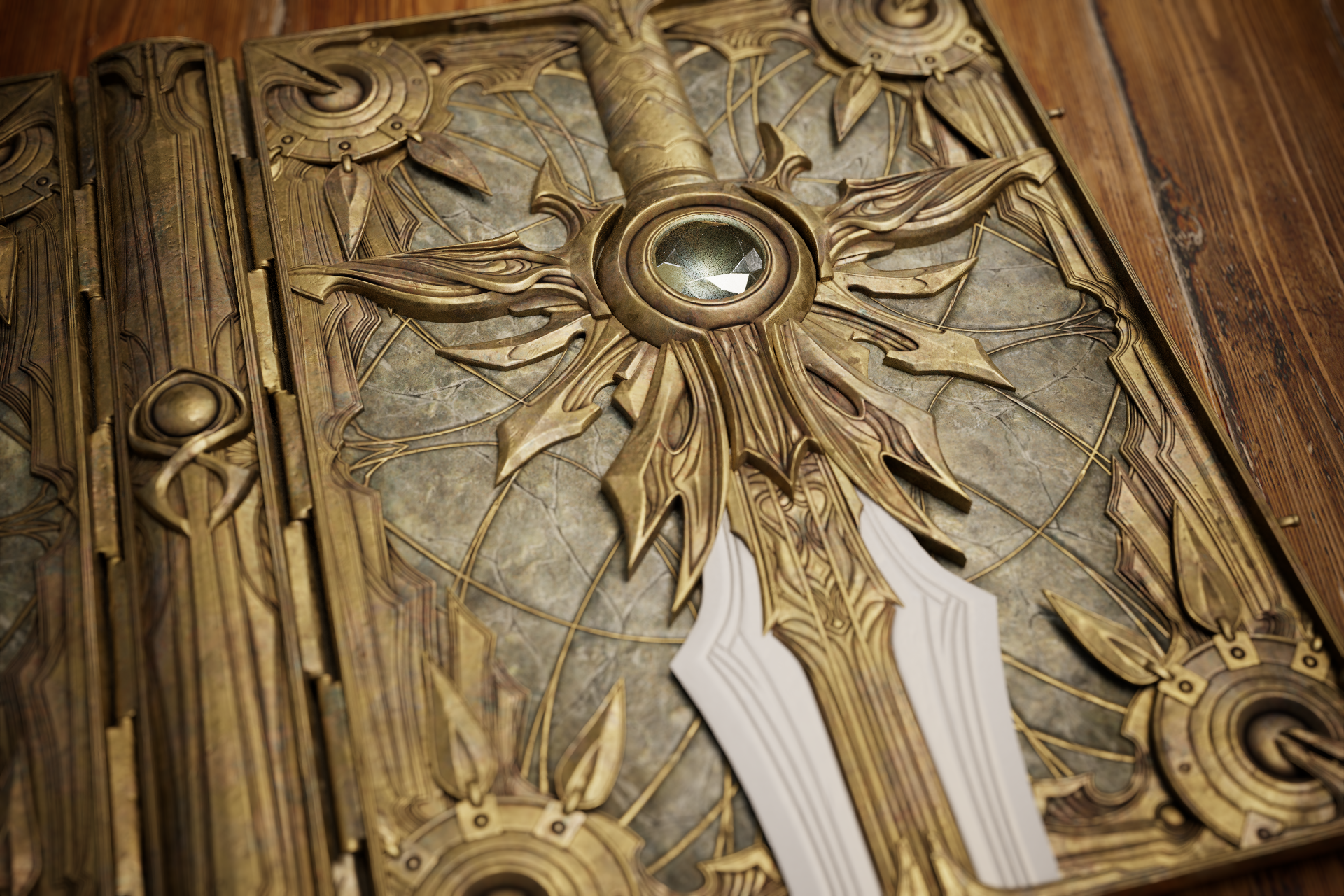
When all was said and done, I've sent it over to Substance and using a metric ton of macro references and another metric ton of coffee started texturing this bad boy!
So here's the thing, folks. I wanted to gauge your guys' opinion on how it's going so far. It's nowhere near done, there's still a lot of work to do, but i would really appreciate some feedack, if you got any.
Cheers!


Replies
Looks great!
One thing i would play with is the metal roughness. A bit more variation and a tad shinyer. I see the metal in the concept is pretty dull but i think it would look even better to be a bit less rough
Great details!
My main gripe would be those fine feather-like elements in the corners sticking out making the book seem more fragile and less functional. It would work better for me, were those elements solid as the rest of the frame. But I can also see how fragile elements like that underline the concept of a book that has to be handled with great care.
The other thing is the white blade part on the front having an undefined material.
Keep it up!
Just to throw in a herring. I really love the layered fractured look and that the detail has physical depth. Supa dupa work man!
Thank you so much guys. You're totally right about the metal and the feather-like elements. I also did some work on the white metal.
Still need to do some experimenting with a diamond and then move on to paper.
Also, raytracing was eating up some AO so I painted some to add the accents on the layered parts. Maybe it got a little out of hand, let me know what you guys think.
This is dope, love it!
Plenty of things changed since I last posted!
I've polished the cover and noodled around with the render of a Diamond. I gotta say I'm really liking the way it looks now! :D
And I've also gotten a great piece of feedback regarding the scene. I've added some props to compliment the book and to be able to render it standing up instead of flat on the floor of the scene! Not 100% happy with the text now, will be tweaking it some more.
Cheers and stay tuned for more!
Aaand, It's done!
You can also find a flythrough video on artstation. Go check it out!
https://www.artstation.com/artwork/eJLxJb
Well done, it turned out great!
Would love it if my copy of the book looked like this 😅
Thanks Matthew! It'd be so cool if the real book had a metal binding. It would also be pretty expensive I imagine 😅
really cool. very nice texture work!