[WIP] Cliffside City Environment
Original Concept by: JC Jongwon Park (https://jcpark.artstation.com/)
Most Recent WIP shots.
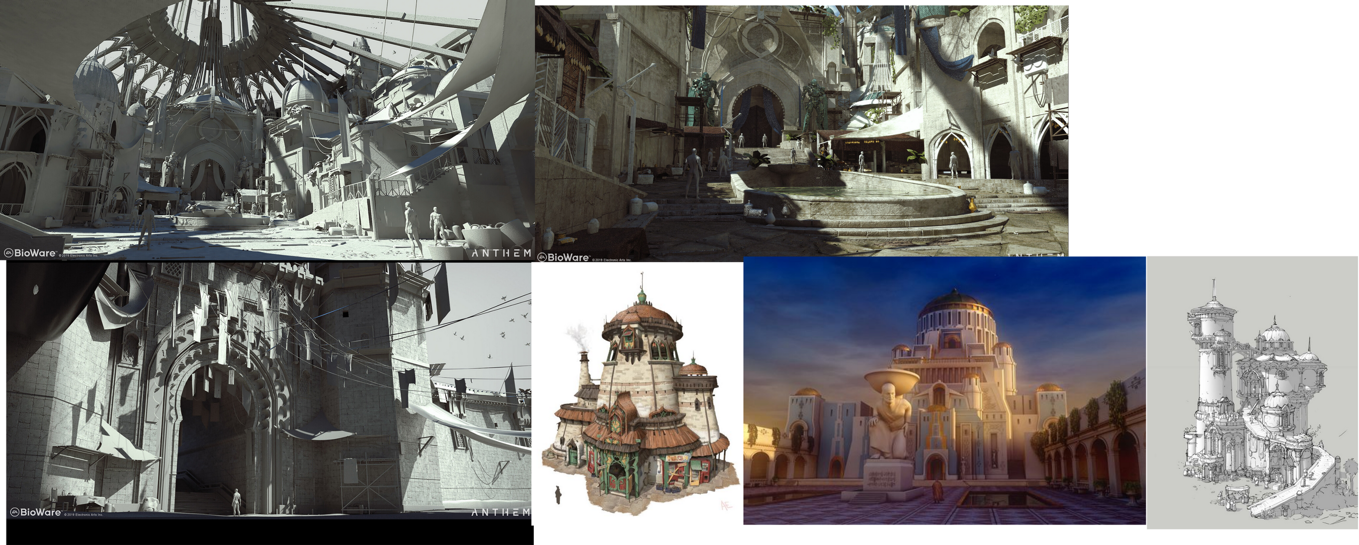
Up until now i have been mostly working on the far-away views of the scene, but i plan to make shop/market assets in order to make it seem more alive. The original concept has a lot of tarps hanging from the buildings and i really like that layered canopy-like look. The first anthem trailer has a similar aesthetic.
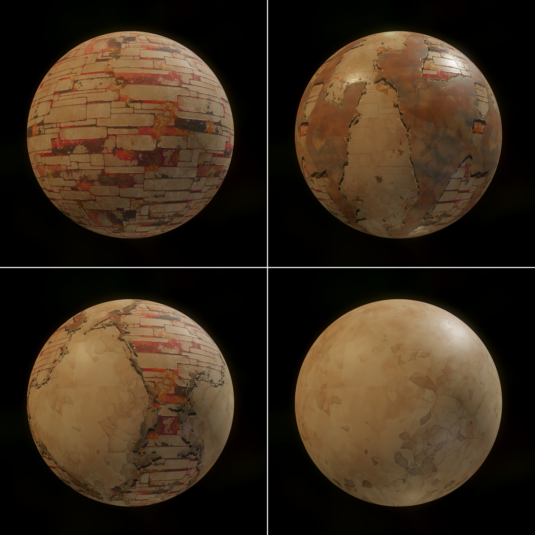
For the texture style the original concept reminded me of a toned down Ghibli-like aesthetic and i tried making some materials that evoked a similar feeling with some inspiration of the Arcane style.


Replies
i like the painterly colorization and stylization you're exploring. looking forward to seeing how you develop it.
Set up a basic Vertex Paint material and started blending the textures together.
I made 2 versions of the material, one where I was blending the AO with the Color, it gave the models more depth but it also made the scene a lot darker and noisier, Here is a comparison of the 2 materials.
With the Ambient Occlusion color blend:
Without the AO Blend:
More lighting and texture refinement
Going to start working on the Market/bazaar assets now.
Made some more detailed arches and modular parts to integrate them into some of the existing buildings and will use them to make some trims for the environment.
Made a very simple Spline Mesh Blueprint to place the cables (will be added soon) and tapestry in the scene
Also made some changes to the lighting, textures and vertex painting
Some of the shadows in certain places are very harsh and i`m trying to find a way to reduce their intensity.
I will also need to fix the cliffs in order to fix some of the weird normal issues as well as add in some greenery and foliage to the scene.
There's alot of things I could say, but its a WIP so not sure what parts are finished and whats not.. Are you going to work on the cliff texture?
I think this image looks the best.
The lighting seems the most natural. There's some image where there appears to be too much ambient light.
Maybe add some birds and a spaceship in the foreground.
Check out this video. Alot of things they talk about can be applied to this sort of scene.
https://www.youtube.com/watch?v=cFXO-82Eodo
Cliffs are the roughest/most unfinished part right now, something is going wrong when i'm baking the highpoly and im in the process of fixing it.
Birds and a spaceship(going trough the hole of the main structure) are things i will add in the future.
The scene having too much light is a comment i keep getting so i'm going to tone it down,
I'll check the video out and see what i can apply.