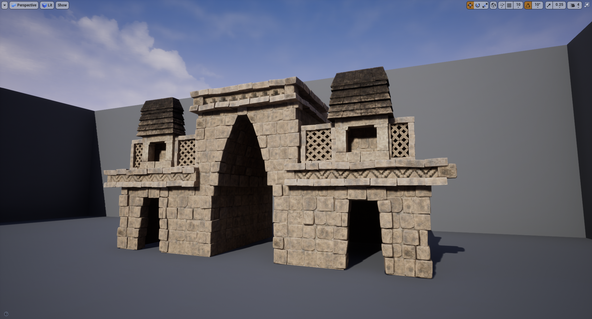
Environment: Pre-Colombian Ruins
Hello guys, I've been modeling props for quite some time, but I am kinda new to the environment world. I am really loving and pursuing to improve and develop myself as an Environment artist. Some stuff I already knew is helping me a lot, like knowledge of Maya, hard surface modeling, sculpting in zbrush, some of Unreal (but still a lot to learn).
Well, as everything in life, there are still some parts that I am struggling with, but I hope to overcome those obstacles as soon as possible. I would love some feedback to improve my work as this one is a personal project, there is no deadline (although I want to finish ASAP to have it in my portfolio) so I can work on it, pay attention to the details and keep improving as the time goes by.
So here are the references I used:

This is the blockout I made for the final scene to look like:

Here is the current state of the scene in Unreal:


Well that's it for now. I would love the opinion of the highly talented artist we have in this forum! Thanks in advance for taking your time in critiquing my work.
Well, as everything in life, there are still some parts that I am struggling with, but I hope to overcome those obstacles as soon as possible. I would love some feedback to improve my work as this one is a personal project, there is no deadline (although I want to finish ASAP to have it in my portfolio) so I can work on it, pay attention to the details and keep improving as the time goes by.
So here are the references I used:

This is the blockout I made for the final scene to look like:

Here is the current state of the scene in Unreal:


Well that's it for now. I would love the opinion of the highly talented artist we have in this forum! Thanks in advance for taking your time in critiquing my work.

Replies
This is what I have for now. I know there is still a lot of things to fix and to improve and I would love any suggestion, feedbacks or thoughts about my scene.
My plans for the rest of the environment, is to put this is a jungle. For that I would probably use some ready unreal jungle pack, because I never made vegetation before, and to master it would take some time. I think if I try and make the jungle simple and just as a background, putting the focus on the building, properly crediting the pack creator, it wouldn't be a problem. What do you guys think?
For the horizontal details on the building, I am using a trimsheet with a parallax effect. But i didn't like the result so much. I think I will try using the geometry with the textures baked.
That's it for now. Hopw you guys like it
1. Buildings of this style tend to be built onto platforms to keep them from sinking into the ground. You may see walls appearing to pop out straight from the ground but they usually either have hidden foundations or are the contention barriers and foundations.
2. The texture is passable but isn't doing justice to the beautiful sculpting work. It only needs a tiny bit more work to reach the next level. The dirt is a bit too cavity-ish and procedural, looking artificial when it should be all about water. Wear patterns, living things growth pattern, dirty spots pattern, everything here is linked to how the water moves on the surface of the object—and in this case, a rainforest, that's a lot of water influencing things!
Water seeks the path of least resistance. Where it flows? Where it pools? How swift is it? That'll tell you the pattern of the color variations and dirt you're including. It's also good to take the natural variations in the material itself into account. No two stones are the same, they'll have areas of slightly different composition, they'll be more porous or harder, they'll have different hues, saturations and values both in the macro scale (stone vs stone) and micro (high frequency details). Only man-made materials can afford to be homogenous and even if those stones were cut by people they were not created by them.
Two other things, one minor and one big, are the stone bits flaking off and the dirt from the ground on the foot of the building. I don't know if you ever paid attention to old stones or concrete but it has a tendency to flake off where water repeatedly hits it and where things grow and weakens the surface, revealing bright spots where the darker flying bits once stood. This small detail is the key difference between it looking just dirty and looking aged.
The dirt from the ground is important. It's not only realistic, anchoring the building into the environment but makes for a pleasant transition from ground to the structure.
That's it. I hope it's helpful and I loved that structure. Do you know its name?
About the name of the original structure, I think it's called Labná and it's in Mexico.