Home 3D Art Showcase & Critiques

Portfolio Critique Wanted

polycounter lvl 2
Offline / Send Message
wHromek polycounter lvl 2
Hello! Since it's the beginning of the new year, I wanted to get some feedback on my current portfolio. The last two years were a huge learning experience for me, but I don't think my work is at a 'professional' standard. I've tried to keep my projects character-oriented with a focus on clothing and armor, as that is the field I'm most interested in joining. I have made some attempts at branching into environment/prop creation (which I enjoy) after hearing that it was an easier field to get a job in, but I'm worried I'm spreading myself too thin in trying to attempt both.

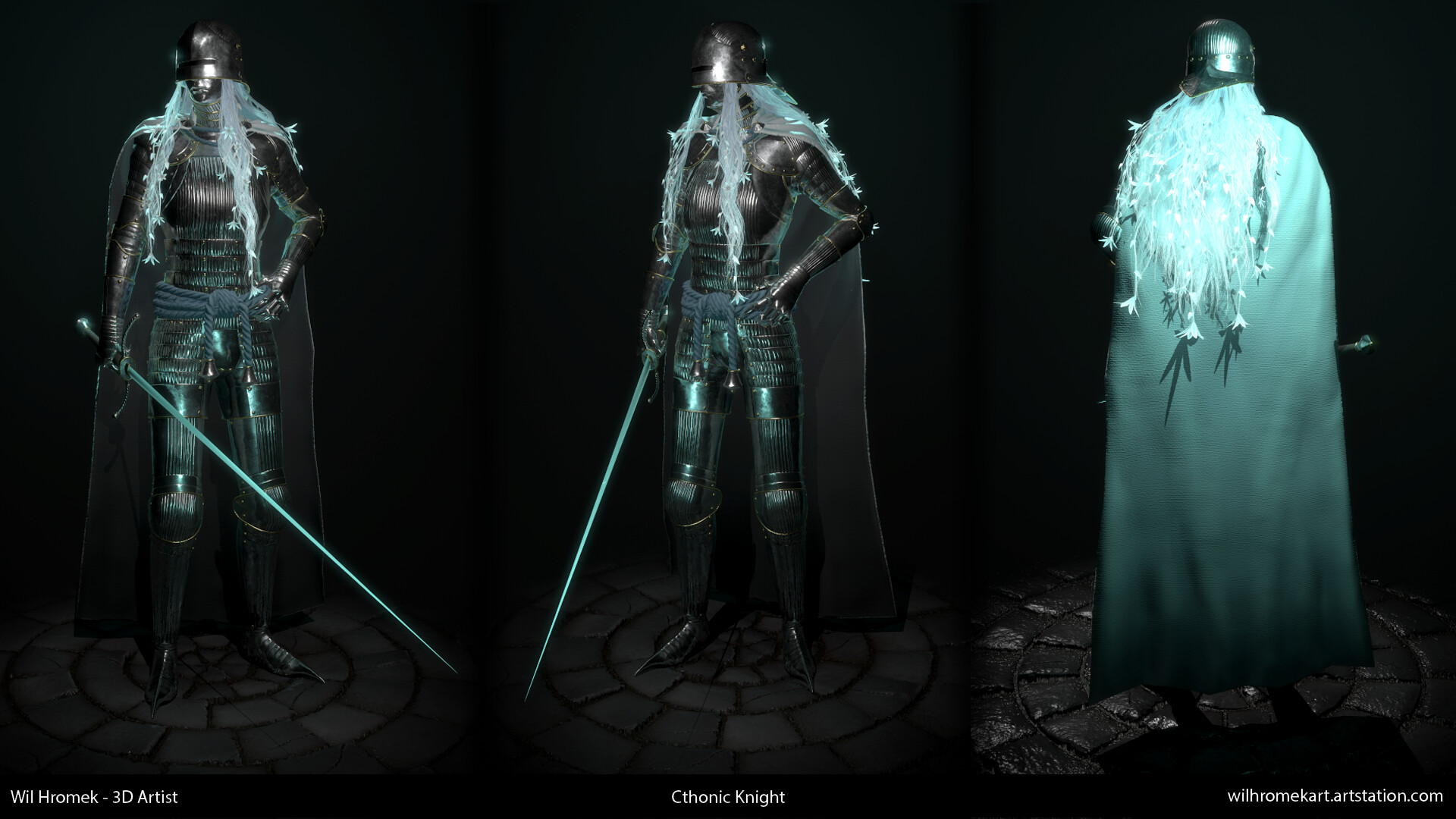
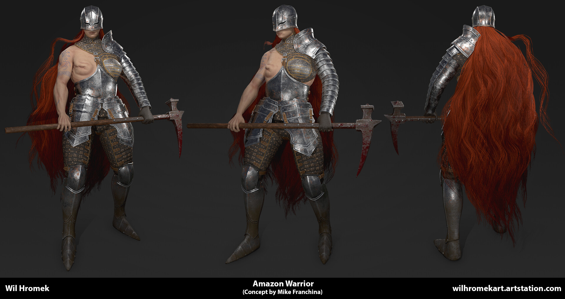
 My portfolio can be found at: https://www.artstation.com/wilhromekart. Here are two examples from my portfolio, which I consider my strongest pieces:


I look forward to your feedback and guidance!

Replies

  • Ashervisalis
    Offline / Send Message
    Ashervisalis grand marshal polycounter
    I think its a bit odd that you have so many characters but I can't see a clear face in your portfolio. That would worry me if I was looking at hiring character artists.
  • BagelHero
    Offline / Send Message
    BagelHero interpolator
    Seconded. Adore both the works you showed in your post, though, they're stunners. Hands in Amazon Warrior are notably wonky though, and in combination with the face thing it's another concerning thing.
  • JohannesAg
    Offline / Send Message
    JohannesAg greentooth
    Your two newest pieces for sure your strongest, I actually feel like there is too much of  a quality difference between these two and the earlier soldiers you did ( the ones in your banner) so personally I would remove the older work from your folio because I feel like it´s dragging the overall quality down. 
    Like Bagel pointed out, the hand on the amazon warrior is wonky looking but the whole arm is a little off tbh, so I think working on your anatomy would be a good thing

  • wHromek
    Offline / Send Message
    wHromek polycounter lvl 2
    Thank you @Ashervisalis, @BagelHero, and @JohannesAg! I agree, my anatomy could use some work. My facial anatomy is pretty weak too, which is why I haven't really put up a clear shot of a face. This is probably the most I've shown:

    I agree that this is a pretty big weakness, and I'll work on correcting it in the future.

    What do you think of me including materials/environment art in my portfolio? I'm worried it may make the portfolio seem unfocused.
  • Ashervisalis
    Offline / Send Message
    Ashervisalis grand marshal polycounter
    While I don't think it could hurt (if your environments/materials are solid), I think you should focus on characters or environments. You've obviously been focusing on characters for a while, I would think you should keep going on those. Your fabrics are cool material balls, but I don't think any of your other materials really make the cut. If anything, those are doing your portfolio harm. The Northern Campsite is pretty cool, but maybe let that be your only enviro? I think for your next project you should maybe focus on a bust to show you got facial anatomy down.
Sign In or Register to comment.