Medieval Armor and Weapon Assets
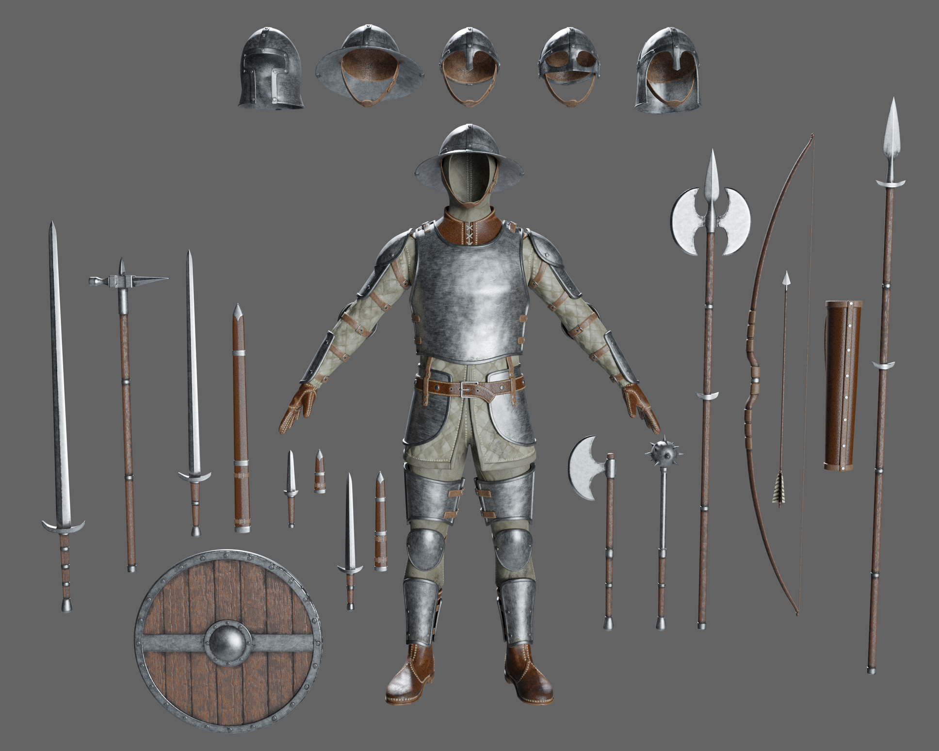
Howdy Polycount folks! Over the last few years I've been trying to create some medieval assets and sell them online. I went way overboard and made 11 weapons in 5 different unique styles, so 55 models in total. When I first started making them, I was more concerned with the model rather than the textures. However, I realized that being a decent 3D artist means you actually have to make decent assets, not just models. So I learned procedural texturing and began revamping these assets, as well as making armor for the different styles. Long story short, I've spent too much time on these assets and haven't really gotten any useful feedback, so I'm posting them here. So this is the "Common" style. These weapons were suppose to be simplistic in design and kind of "standard issue". These are all PBR textures created in Blender, rendered with Cycles.
 This was the next set I did. "Crude" style. I was a lot happier with these as compared to the models above. I've had trouble getting the wood correct on both sets however. Getting the lighting right has also been a challenge. In this photo, everything feels too blown out, but in other images, with the exact same lighting, they look better.
 This armor consisted mostly of leather, so I added a lot of wear to the edges. Unfortunately a lot of it gets lost in the default brown color. In the black and colored versions those details stand out a lot more.
Any feedback would be awesome! I've been doing 3D for quite a while now but haven't completed a lot of work. Or shown anyone the things I have finished. I've pretty much been working in a vacuum and at this point I can't accurately gauge the quality of my stuff anymore. The thing I'm most concerned with is wether or not this is portfolio worthy.
 So this is the "Common" style. These weapons were suppose to be simplistic in design and kind of "standard issue". These are all PBR textures created in Blender, rendered with Cycles.
 This was the next set I did. "Crude" style. I was a lot happier with these as compared to the models above. I've had trouble getting the wood correct on both sets however. Getting the lighting right has also been a challenge. In this photo, everything feels too blown out, but in other images, with the exact same lighting, they look better.
 This armor consisted mostly of leather, so I added a lot of wear to the edges. Unfortunately a lot of it gets lost in the default brown color. In the black and colored versions those details stand out a lot more.
Any feedback would be awesome! I've been doing 3D for quite a while now but haven't completed a lot of work. Or shown anyone the things I have finished. I've pretty much been working in a vacuum and at this point I can't accurately gauge the quality of my stuff anymore. The thing I'm most concerned with is wether or not this is portfolio worthy.
Replies
Going to say those textures are not great. (tbh it looks like i had other priorities i rather spend my time in, this is good enough.)
Seem's if simplicity is your goal with these for possibly turn around time you are there.
A quick search of artstation brang up some very nicely made designs that would be of similar interest to your goals, though seem to be of a high quality/resolution/geomerty. You didn't mention platform goals, texture sizes, geometry limits, aim.
Design/Metal:
The Design and execution here is probably my goal if i were to take on these tasks.
By looking at your designs and this design it should be apparent what needs to be done, off the bat the metal just to mention something reads much better, atm with yours it looks like i splattered textures on their cause money now. (Harsh?) It is what the art is speaking to me, is that my fault? not really.
Weapons:
If I were to make weapons the look of these and shields .
Hope it helps, images speak volumes, maybe you've been reworking these so much you forgot about inspiration pieces and quality to strive for?
Hope the tough love read well.
Otherwise congrats and good luck with it.