The Bi-Monthly ENVIRONMENT ART Challenge | November - December (69)
Welcome, all! Time to get started on the sixth and FINAL Monthly Environment & Prop Challenge for 2020!
Remember if you don't finish in the time allotted, just keep plugging away and post when your work is finished. There's always some good progress that falls off the radar - we want to see your work! So keep going and finish those pieces!
Without further ado, here are our official options for Challenge 69:
- ENVIRONMENTS -

Artist: https://www.artstation.com/artwork/rAlzGG
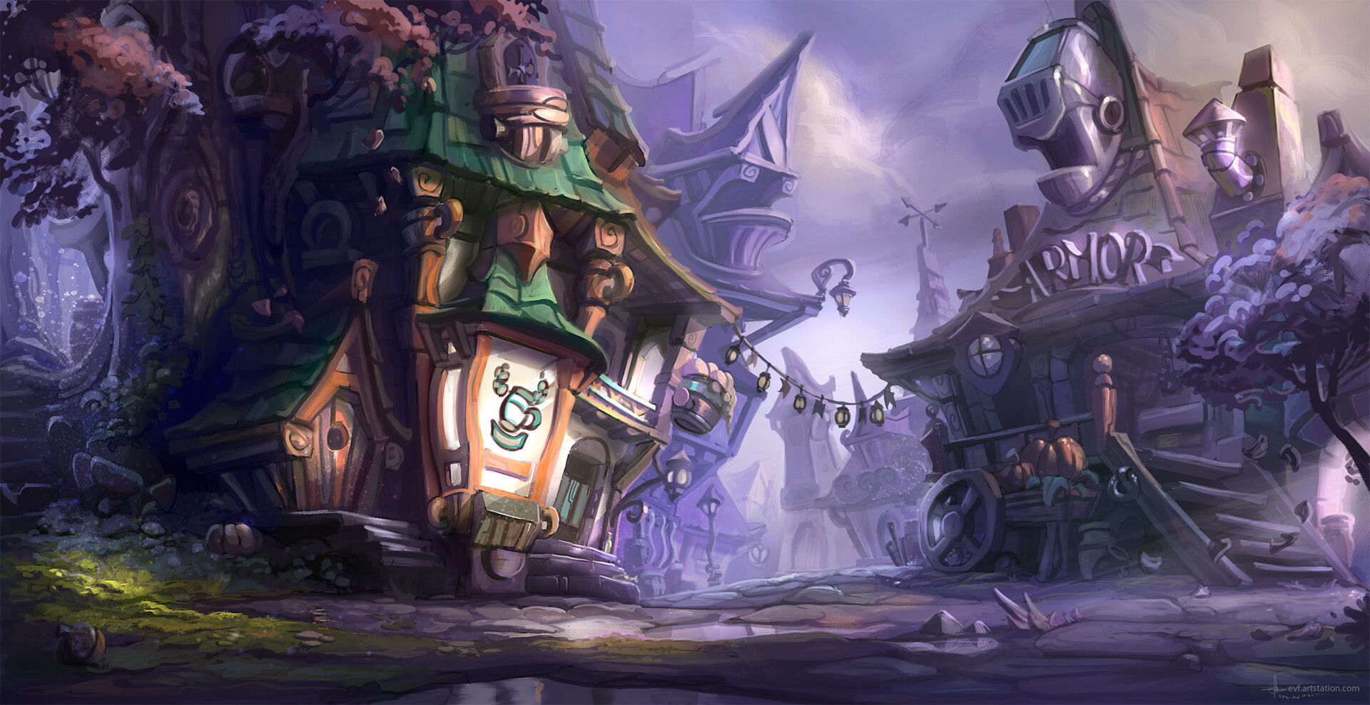
STYLIZED ENVIRONMENT:

Artist: https://www.artstation.com/artwork/ykoO4O
- PROPS -
HARD SURFACE PROP:
Artist: https://www.artstation.com/artwork/Po2o58
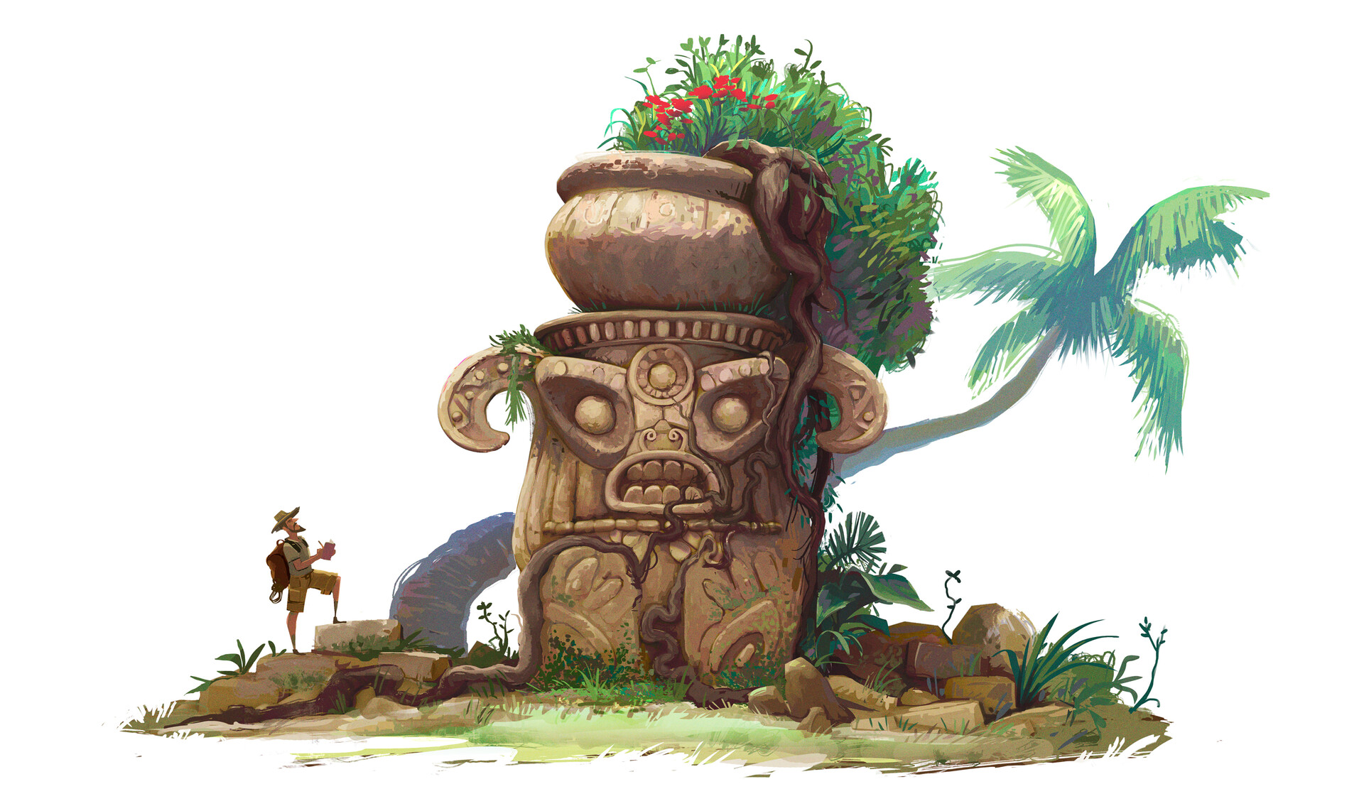
STYLIZED PROP:

Artist: https://www.artstation.com/artwork/48ayDY
- WILDCARD -
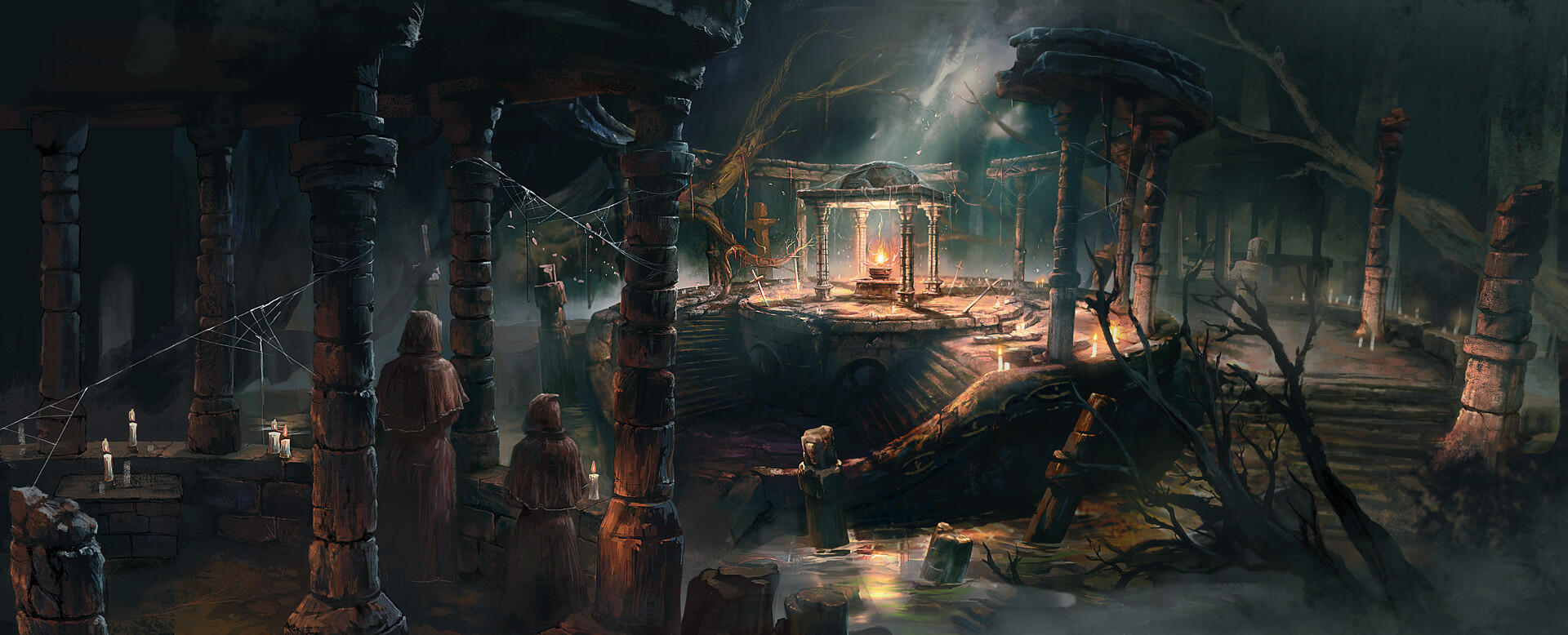
FANTASY INTERIOR ENVIRONMENT:
Artist: https://www.artstation.com/artwork/Nx2d01
It's been a while since we've had a concept that's more explicitly Fantasy-themed, so I figured this environment concept suggested by @gastrop0d would work great!
Please read all the rules before starting:
-Try to post one critique for every post that you make. This will make for a better learning environment and help us all grow as artists.
-Try your best and finish as much as you can in the time frame provided.
-Post what you are working on in this thread so that way it's a more centralized place for advice and critique. We don't need to have 1000 disjointed threads littering the forums.
-It is recommended to use a game engine to present your work. Unreal Engine and CryEngine are very common engines that can be used but feel free to use any alternatives that you want. (Marmoset Toolbag is allowed as well)
-If you want to change up your chosen concept a bit, then feel free! Interpret these concepts to your liking, especially if your aim is to add storytelling elements.
And here are some recommendations:
-When you are just starting out making a scene, it can seem complicated or imposing, so take the time to break it down.
-Think about how you can re-use assets, re-use textures, break it down as simple as possible and plan it out. A lot of people will break it down in their own way when they start out their challenge. Gather some reference images as well for different parts of the scene, maybe gather some refs and make it your own.
-Take your time planning and blocking out, it will set you up for success later on.
-We strongly encourage you to go and look at other games and see how they make their assets as well as get concept art to give it your own feel.
All that matters is that you learn while being able to effectively critique others, as well as accept critiques on your own work. Remember to have fun!
Good luck! ![]()


Replies
Artist: https://www.artstation.com/artwork/Nx2d01
Artist: https://www.artstation.com/artwork/ZGJ61R
All that said, I like the top concept of the museum the best actually. It looks complex and cluttered which is intimidating but for me personally I like that it breaks down into lots of smaller props that offer different challenges. Also the variation in the height and shapes of the rooms are very interesting. It gets my vote for sure though I will say both concepts @gastrop0d presented have some amazing atmospheric qualities
Good luck everyone, and let's finish out this year strong!
If it were my piece I would modify the concept to add more connections or bracing to that back thrust frame, perhaps connecting to the back of the vehicle body. Would make sense I guess for it to be somewhat compressible, like suspension:
If it is suspension, then the joins at the original points should be a mobile axle. I guess that round thing they already connect to could be an axle. Anyway, just my 2 cents.
Ok! I'm excited to see the temple concept included! It's going to be my quarry for this challenge. It's a big step up from the last challenge's concept for me, but I'm willing to give it a go. This time I'm set on realising the scene in Unreal.
I think the scene could be quite modular, with extensive use of a stone trimsheet to cover the majority of the work. Here's my attempt at a breakdown:
I might have gone a little overboard, but my take on the assets is this:
Core Structures
- Stone pillar body - use stone block trimsheet with tesselation to achieve chunky silhouettes. Apply a random UV offset to each model instance based on instance world position
- Pillar base stones - 2 variations needed (small for foreground, large for background)
- Pillar caps - could get away with just 1 variation, but 3 would give best variety
- Broken pillar caps - same as above
- Inner ring core
- Inner ring staircase
- Inner ring body
- Outer ring staircase - potentially clone and scale inner ring staircase
- Outer ring body - potentially clone and scale inner ring body
- Top stone ring body - 22.5 degree or 45 degree repeatable segment. Maybe unique unwrap/sculpt
- Top stone ring caps - created off of body sculpt to ensure seamless connection
Details- Altar
- Dead tree - unique unwrap & material
- Candles - unique unwrap & material, maybe with faked SSS
- Swamp water material
- Swamp water algae/grime/surface goop
I think getting a well-featured stone trimesheet and combining it with tessellation for the stairs and pillars will be key in tackling this scene with a minimum amount of work. It's going to be a real test of my stone sculpting skills, that's for sure!Good luck!
I've experimented a little with UVs, tessellation and Unreal in general over the weekend. I set up a simple UV random offset material for some test pillars and a test tiling texture. Results are good, decent breakup of repetition and no seam issues to speak of:
Regarding the project at large, I realised that I could use splines to warp meshes into the curved shapes of the concept. In this way I can work with simple, straight sections of a modular kit and then warp them into shape to compose the scene. I set up a construction blueprint based on this tutorial:
I extended it a little to allow for sharing splines across multiple actors and to assign various offsets and limits to easily compose things. It's been really fun really digging into Unreal proper to set this up. Here's how my blockout modular kit and spline test is looking:
Going to be much easier to sculpt and tile the modular kit like this, I think.
There's some scale issues when comparing it to the original concept, I plan to fix that up once I move into blocking out the scene in earnest. For now it appears this technique will work! Here's a better look at the spline arrangement:
looking forward to your project using tesselation. haven't tried it yet my self but I think you will see seams problem if your texture not tiled perfectly. or when you scale the texture up. just my guess.
@Zorina : that's a nice Blockout! hope you already analyze the concept and break into modular assets? because I see a lot of repetition there.
@samA : this is nice! just need some skulls and you're almost finished XD
---
so I realized I won't have much time till December for creating a big environment (because of work and uni), I decided to do stylized prop this time
since I've never tried stylized props in my life before, this will be a great opportunity to learn something new.
oh and I will try CryEngine too for rendering. hope I can finish it on time.
my sclupts so far:
I think I will make 4 different faces for the 4 side, I got the idea from the three wise monkeys
if you guys have a great tutorial for creating stylized props, I would love to hear it
Cheers!
Also, by sketching a body into it I changed the general shape of the ship(?) so the body and arms are in a better position.I hope this turns out OK as I'm really changing things around.
I feel that for the next part I need first to decide how I'll do the materials as it'll affect the modelling, if I'll bake nromals for each part or if I'll weigth the normals.
At first I'm thinking that baking from higher less will be better as I may want to be specific about where to put rust and wear. I don't think tileable textures or trim sheets will be as effective as on the model from the last challenge.
good idea though with changing the design because I think its kinda uncomfortable to sit
a bit update from me: I'm finished with 4 sided faces
I think I'll start retopo tomorrow so I can get to the exciting part on weekend: hand-painting
At the current moment I really only have a block out in Blender going but I wanted to post it anyway to hear any feedback and also give @Zorina another take to look at as I have had the benefit of since you posted yours. Also I was curious of how you plan to approach the skeletons?
Moving from this through UV's and texturing to showcasing it in a game engine is sure to be quite the journey for me but Imma keep chipping away at it. Really excited to see everyone else's progress along the way
bad news ist that I have to reload the psd texture everytime I made change and reapply the texture (SP doesnt do this automatically) . if I find mistakes in 3D view (like color doesnt match between uv islands), I just repair it on SP
btw seeing your blockout, I think you intrepet it a bit wrong in some part. let me post a picture what I mean
the black part is kind of cut out on wall like an xray. its should be mirroring the other side. also the other room too.
btw you will need a lot of tiling texture I think for this piece.
---
so Update from me :
spend weekend on retopo and hand painting. man it was brutal I'm not sure I did this right (never hand painting before). but hey at least I got base color almost right I think. it still lacks a details and color gradient to make it look cooler.
this one render from cryengine, I also added rocks and some blockout foliage made in photoshop
btw here's the 4 side face I manage to sclupts
I'm short on time as always, so I did not finish the modeling yet. But soon I'll post it, before getting to the materials.
it is looking nice so far.
I guess that if you make the vase bigger so its borders almost hit the border of the head it'll look great.
On my side, I've just finished the modelling. It was a challenge mostly because from the moment I decided to change one little thing on the concept, I decided to change a lot of things. So I did not have a direct reference and I had to kind of make my own design on top of it. I hope I get through the texturing process fast enough so I finish by the end of the month. I really enjoyed the tileable materials with decals workflow I learned on the last challenge, so I'll try to use only that, even for worn edges I'll try to use edge decals. It may not be ideal for a model like this, but let's see how it turns out.
I just posted the concept voting thread for Challenge #70, please check it out, send in some concept suggestions, and vote for what you'd like to see in our first challenge of 2021! https://polycount.com/discussion/224166/the-bi-monthly-environment-art-challenge-concept-thread-january-february-70
This has been tough. It is still not finished as I want to add some decals to place some bolts and some hard surface details, but I could not do this on time. It is rendered on eevee, later I'll render it on UE4.
I'm pretty happy with the result so far and I could only do it with what I've learned from the previous challenge: weighted normals, trim sheets and decals ( althought the last one will come in a future post).
It has been great to be part of polycount somehow, I feel I'm learning and improving a lot from reading other's posts, as well as from the conversations here.
I won't take the next bimonthly challenge as I'll try to go througt CG boost's Sculpt January. But I'll surely follow it and I'll see you all on march-april's challenge.
Happy new year! Cheers!
https://www.artstation.com/artwork/nYLOX9
I can finally say goodbye to this, been a rough ride for me, but I finished it
thankyou guys for all the inputs! I saw some of you also finished on time. cheers!
now off to sleep for me..
glad you like it
Could you give some technical and professional feedback on it?
I want to have something relevant for industry standarts, but I find it hard to know what they are.
I work part time and I get around two to three hours a day to study and practice 3D. I am really working hard on making a portfolio but yet this piece, which I'm happy with the result, seems to lag behind the avarage when trying to get into a professional position. This took me around 40 work hours, through two months, although I took some time to get back to it and make this post. It would take me 2 weeks to do it, but I took some time into studying material creation.
1 RGB 256x256 texture: masks (roughness, metalness, height)
height is used with bump offset node
1 BW 256x256 texture: height
this is a decal material with parallax occlusion mapping
for turntables:
https://www.artstation.com/?sort_by=latest&dimension=3d
This might be a better aproach to environment, which is my next step. I was too afraid to takle it.
And last but not least.
I really need to start getting a bit of income from 3D, so I may focus more and more into it. By looking at "the rookies" site, I feel I need a year in the rythim I am right now to get a chance. By searching for work opportunnities I rarely find what does not require 2 years of experience. Freelance websites makes me feel I will stop making 3D art to start bidding on projects. At my level, how can I make a change to so I may get experience and develop further?
As far as feedback, I think your piece works really well as a style/quality comparison to World of Warcraft assets. Your stylized texturing is quite similar, and I'm getting a last-gen feel from your geometry. That's not necessarily a bad thing! However it does demonstrate a certain bar that you are currently able to hit, when you may be aiming for something higher.
You mention that you didn't use a highpoly workflow to bake your normals, which is perfectly acceptable for certain situations, but that is the industry-standard workflow right now, and if you want to improve your art, I would recommend learning and practicing it.
As far as your last question about developing further, I would highly recommend looking into any of the 3D mentorships that are currently offered. Look up The Mentor Coalition, DiNusty Empire Mentorships, or Ryan Benno's Environment Art Mentorships. These will provide you with one-on-one instruction and guidance to develop your skills and better achieve your goals.
One last note is that you shouldn't be afraid to apply to jobs that say "minimum 2 years experience required". That note is only there to scare people off, and if you have the skills or the style that the company is looking for, your experience should not matter. Time spent learning and practicing 3D can be seen as experience as well, not just time holding a job in 3D.
Good luck.
It is really hard to keep track of things based on my own opinion.
Also, thanks for organizing these contests.