[Finished] Snake queen character
Hi guys!
My name is Kate and I have been working in 3D for some time. Now I want to make a good character for the portfolio.
Will be glad to see you in my
Artstation profile - https://www.artstation.com/kozemerchakk/blog
Instagram profile - https://www.instagram.com/kozemerchak/
_____________________________________________
Will be glad to see you in my
Artstation profile - https://www.artstation.com/kozemerchakk/blog
Instagram profile - https://www.instagram.com/kozemerchak/
_____________________________________________
I remembered my old charater and decided to remake it. I’ve been working on this for some time, but I want to share these with the forum.
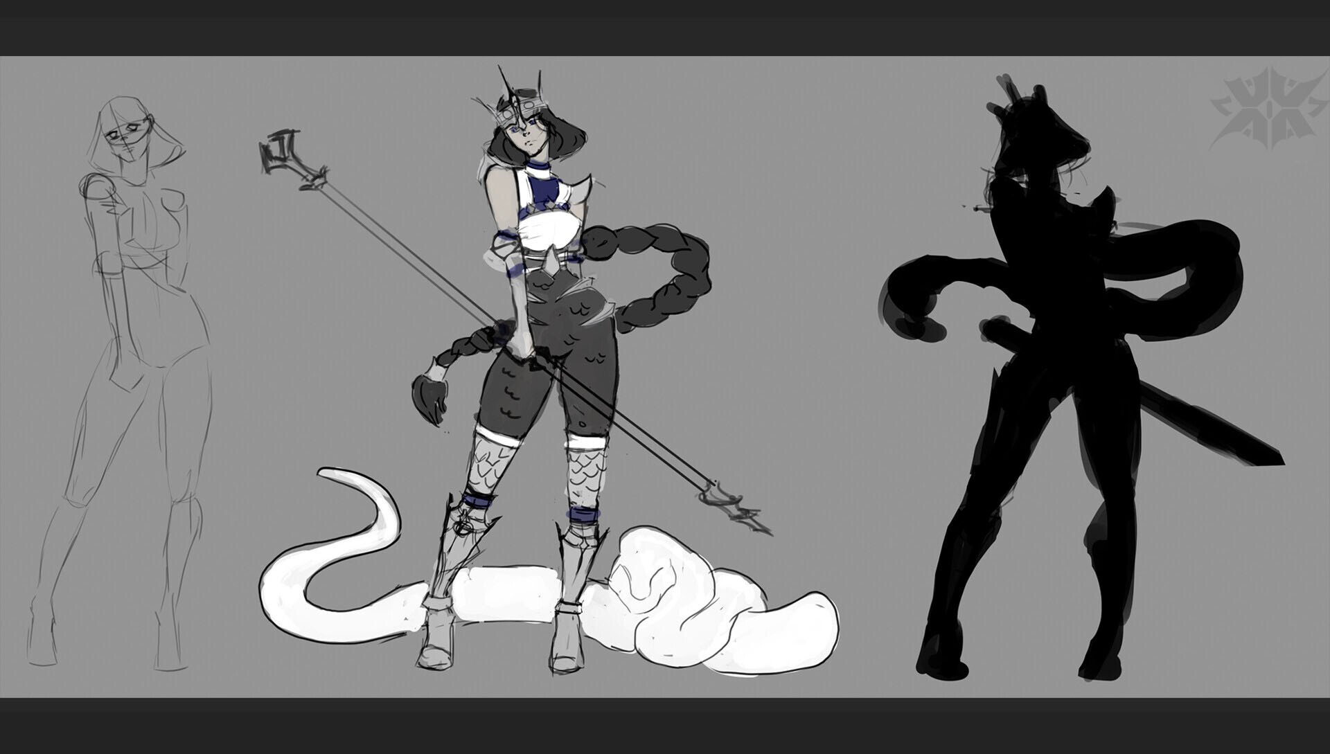
So my character is the snake queen. I made a simple sketch, which, however, changed a bit during the sculpting process.
Sculpting is almost finished, I will soon turn to the topology and the creation of accessories.
Here is some skulpts steps.
I making this character for vertexschool and it's quarantine course of making stylised character.
I will be glad to your comments
WIP: Sketch

Refboard:

Here is some skulpts steps.
I making this character for vertexschool and it's quarantine course of making stylised character.
I will be glad to your comments
WIP:
 Sketch
Refboard:


Replies
Only critique I can give so far is that her arms are really short compared to her super long legs. I might even bump the size of her head up a tiny bit. Something like:
Thanks for your feedback. Yes you right, I will correct the proportions.
Yes, she is like evil Jasmin a bit
I like that I can keep a small blog of my work. This raises mativation to work. So thanks to everyone who follows.
There is some WIPs of making model greed.
It needs some little correction and finish details.
Now I start to see the end of the work.
It is time for UV.
I decided to take the chance and stady a new program using this character. I wanted to learn RizomUV for a long time and it was a great opportunity.I decided not to put the model in one UVtile, so that the quality of the model was higher and I could make close renders
So i have 4 part:
I decided to take a break from 3D.I finished drawing the sketch a bit to put it in the final post in the future. 2D is still not my strong point (I hope to fix it in the future), but overall I liked the result
And here is a small result:
Nice facial rig will make for some better ortho render poses than the one above with the very neutral face and scary smile.
This critique might be a little too late, but here goes! I feel like the body suit is missing a framing element that would help with visually differentiating the various elements of the character. For example, if this character was walking around in a game engine, it might be hard to tell which is the left leg or which is the right leg from a side view since it's all dark. The shininess is also too uniform and would be nice to break it up with a matte element. The third thing is that the metal ridges / protrusions on her hips are getting lost in the scale pattern on her suit . They would benefit from having some sort of frame or base to make them stand out. I did a quick paint over of how I would solve these issue: basically I added a fabric panel that runs down the side of her body. It's just an idea. you can take it or leave it
These pants were the inspiration for the entire costume. But now I am get more roughtness. Soon I will make some renders
And sure this scary face is only for T-pose. It would be more emotional.
Thank you for your critique, you version looks better than mine. I see, that silhouette looks clearer. And you right in games it can be important. I will consider this in the future works. This work now in render phase and soon will be finished.
Tooday I present to you a pack of my character's emotions. The work on this character is almost complete. This week I am already doing the final renders. You will see the final post soon
Foosche a face rig provides many opportunities for presenting work. However, along with this, it also throws up a considerable number of technical problems. I still haven't figured out how to properly export the animations of face rig to Marmoset, but thanks to my ingenuity, I was able to solve this problem differently.
I am sure you will like the result.
O, thanks, it sound like an idea. I will try!
It was interesting and very helpful for me. This is the most global work in my portfolio at the moment.