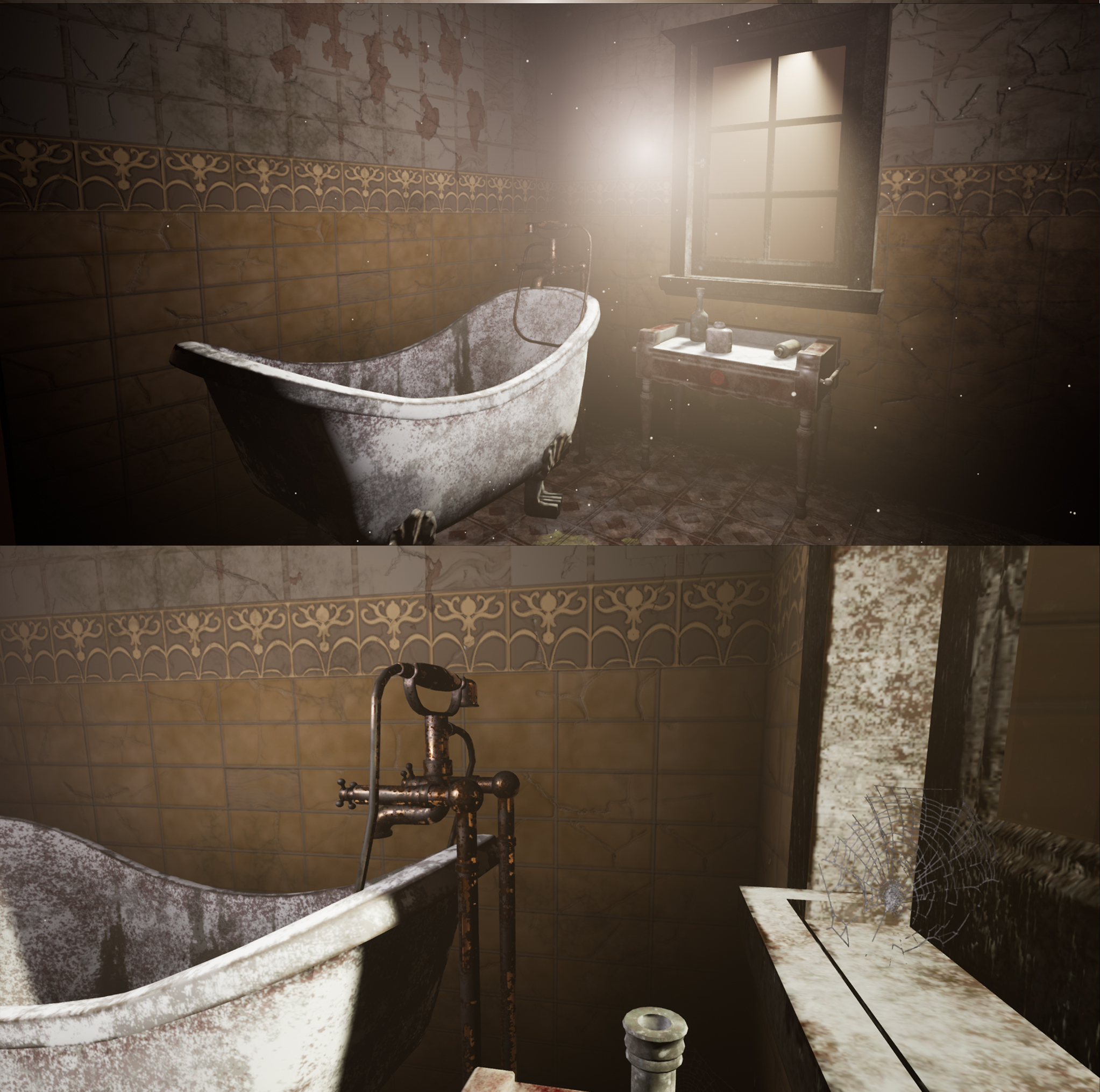
Old abandoned bathroom [Unreal4] feedback and tips appreciated
Hello everyone! 
I'm a recent graduate (2020) and worked on this small bathroom scene for about one week after submitting my final project at Uni. I tried to keep everything small and focused on creating my own materials in Substance Designer, as well as, the lighting. I modelled everything in 3ds max and textured in Substance Painter. The grass textures and decals are from textures.com. To create the spiderwebs I found a nice tutorial on Youtube: https://www.youtube.com/watch?v=6DxzNHsu6MM
I would love to get some critiques and tips on this piece.
Here is the link to my Artstation profile to see more details and turntables: https://www.artstation.com/artwork/Ooq5N6


Final render in Unreal

Unlit and Detailed Lighting modes in Unreal

Marble material for the tabletop created in Substance Designer

Broken tiles material for the wall created in Substance Designer (I added dirt in Substance Painter)

Dirty tiles material for the floor created in Substance Designer
I'm a recent graduate (2020) and worked on this small bathroom scene for about one week after submitting my final project at Uni. I tried to keep everything small and focused on creating my own materials in Substance Designer, as well as, the lighting. I modelled everything in 3ds max and textured in Substance Painter. The grass textures and decals are from textures.com. To create the spiderwebs I found a nice tutorial on Youtube:
 https://www.youtube.com/watch?v=6DxzNHsu6MM
I would love to get some critiques and tips on this piece.
Here is the link to my Artstation profile to see more details and turntables: https://www.artstation.com/artwork/Ooq5N6


Final render in Unreal

Unlit and Detailed Lighting modes in Unreal

Marble material for the tabletop created in Substance Designer

Broken tiles material for the wall created in Substance Designer (I added dirt in Substance Painter)

Dirty tiles material for the floor created in Substance Designer

Replies
Thanks for your detailed feedback. I agree with everything you critiqued there is still a lot of work for me to do and to learn.
I will look into Flood Fill node and Vector Warp node to be honest I have never used them before so thanks for the tip.
I used a decal for the moss I thought I would be enough but I agree that I should have done a mesh.
Thanks again and have a nice day!