Home 3D Art Showcase & Critiques

[WIP] Dark Rider

insane polycounter
Offline / Send Message
Pav3d insane polycounter
Hello,

Been playing a lot of Fire Emblem so I wanted to make a baddie that could fit in that universe, based loosely on Napoleonic cuirassiers.


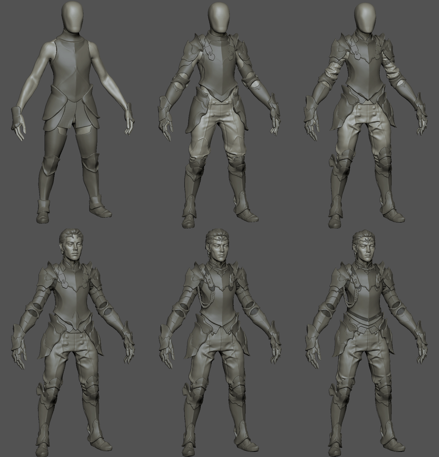
Had some downtime a few months ago so was able to get rather far with the concept sculpt. Heres a gif of the very early versions:
I wanted to give him a mount so Ive been doing some horse practice. Heres the concept sculpt and a rough blockout of the final pose too. Not too sure on the horse armour yet, will need to come back to it.

Replies

  • Nuclear Angel
    Offline / Send Message
    Nuclear Angel polycounter
    Damn Pav you are starting out strong on this one! I am not a fan of the final pose though, feels very stiff and does not give any sort of bad guy vibe to me. 
  • Phoenix995
    Offline / Send Message
    Phoenix995 polycounter
    i like the pose on it :)
    will turn out great for sure!
  • TaulNotShort
    Offline / Send Message
    TaulNotShort polycounter lvl 6
    Very cool! Can't wait to see more!
  • LokiDokie
    Offline / Send Message
    LokiDokie polycounter lvl 7
    This is awesome i love the face shape :) 
  • Pav3d
    Offline / Send Message
    Pav3d insane polycounter
    Thanks everyone! Ive been busy with the high poly for the rider
    Also been redoing the horse armour, will be focusing on that next :)
  • stevston89
    Offline / Send Message
    stevston89 interpolator
    Really digging this! Don't know if this is just my personal preference, but the sharpness of the orbital and the fact that is fully visible all the way around the eye feels a bit awkward. Having it smooth out as it goes to the cheek/malar fat pad area feels more natural to me:
     
  • DavidCruz
    Offline / Send Message
    DavidCruz interpolator
    Love it, started out Asian and became this guy, pretty cool, those are some original and intense looking eye brows. :) Looking forward to more.
  • carvuliero
    Offline / Send Message
    carvuliero hero character
    I see you work on another masterpiece ,maybe I can give my little contribution :
    Arms look kind of broken as if they are not his someone gave them to him to wear for a while
    I think the problem is combination of armor design [shoulder and forearm piece]  and exaggerated carrying angle , reducing carrying and  and making his shoulder wider will do the job .I know you going to rig and pose him but still some of current gesture/flow will remain baked in the pose
    Also his feet are quite small , widest part of feet [metatarsal heads] and knee are pretty much the same width
  • Pav3d
    Offline / Send Message
    Pav3d insane polycounter
    Really digging this! Don't know if this is just my personal preference, but the sharpness of the orbital and the fact that is fully visible all the way around the eye feels a bit awkward. Having it smooth out as it goes to the cheek/malar fat pad area feels more natural to me:
     
    Thanks stevston89  thats a good spot :) Im going to reduce it but ill still keep there a bit there since I do like the exaggerated orbital
    I see you work on another masterpiece ,maybe I can give my little contribution :
    Arms look kind of broken as if they are not his someone gave them to him to wear for a while
    I think the problem is combination of armor design [shoulder and forearm piece]  and exaggerated carrying angle , reducing carrying and  and making his shoulder wider will do the job .I know you going to rig and pose him but still some of current gesture/flow will remain baked in the pose
    Also his feet are quite small , widest part of feet [metatarsal heads] and knee are pretty much the same width

    Cheers carvuliero, something was feeling a bit off and thats really helpful :)
  • CheeseOnToast
    Offline / Send Message
    CheeseOnToast greentooth
    No useful crits here, just mentioning that I really like the compression folds and planar bits on the trousers. You just don't get results like that from MD.
  • Svartberg
    Offline / Send Message
    Svartberg quad damage
    Ooh, the stylized look is sooo crisp, man!
    It's going to be really good!
  • Pav3d
    Offline / Send Message
    Pav3d insane polycounter
    Thanks guys :)

    Been working on the horse armour, reworked it from the last concept to be a bit lighter.


    Still need to finalise the horse anatomy, other than that im off to low poly hibernation...
  • Lou_
    Offline / Send Message
    Lou_ polycounter lvl 6
    Hey Paul, 

    Lovely work so far ! 

    I was looking at your concept final pose and I was thinking you could push it a bit further. I know this is all wip but here is my input :) 

    I feel the horse is lacking the awesome characterization you have given your dark rider. Don't give it a expression but try and push in the noble and snooty direction the rider has in spades. 

    I tried to cut down as much negative space as possible and I have highlighted what I think the 3 focal points are and you should highlight and focus the composition on. :) 


    I think tilting the horses head gives it that sense of motion that it has just been halted as he has riden up to the camera as well as making nice leading lines towards the face. I think that could add to the storytelling you are doing in the shot. 


  • Pav3d
    Offline / Send Message
    Pav3d insane polycounter
    Hello!

    Been a while but hand painting takes ages... Been working on the rider, just a whole horse to go :P


  • DavidCruz
    Offline / Send Message
    DavidCruz interpolator
    Love the forehead eyebrows, i just want them to be the same color as his head hair though.

    I didn't expect this (Ha.Pa.) texturing. 
    Zooming out with this guy, makes it a bit tough to read (for me, for all i know i could be going blind.) 
    Might be all the highlighting (on armor), maybe somehow control the "brightness" in area's guessing a shadow gradient of some kind might help here. 
    (sure something will be done but no C&C/post if i don't mention it.)
    Which is probably why they came up with it in the 1st place, way back when.   

    On that single close up shot idk why but to me he looks like he wants to cry.
    Nice updates.
  • Pav3d
    Offline / Send Message
    Pav3d insane polycounter
    DavidCruz said:
    Love the forehead eyebrows, i just want them to be the same color as his head hair though.

    I didn't expect this (Ha.Pa.) texturing. 
    Zooming out with this guy, makes it a bit tough to read (for me, for all i know i could be going blind.) 
    Might be all the highlighting (on armor), maybe somehow control the "brightness" in area's guessing a shadow gradient of some kind might help here. 
    (sure something will be done but no C&C/post if i don't mention it.)
    Which is probably why they came up with it in the 1st place, way back when.   

    On that single close up shot idk why but to me he looks like he wants to cry.
    Nice updates.

    Hey thanks David, no youre not going blind, he is quite noisey at the moment, i need to do some balancing, for now ive chucked in all the highlights and need to push some back.
    Im glad you brought it up coz Ive been staring at it for so long :P

    Ill give white eyebrows a go, they may stick out too much, but lets see.

    His eyes may be a bit too watery if thats the case, ill have to do some fixes.

    Thanks for the C&C! :)

  • Pav3d
    Offline / Send Message
    Pav3d insane polycounter
    Hello, Did a pass on all the spec to try and even it out as well as the suggestions for the face

  • DavidCruz
    Offline / Send Message
    DavidCruz interpolator
    LMFAO holysh!t wow, wait a minute... i can't believe this, you know that metal headpiece all this time i thought those where his eye brows!  idk wtf to think anymore wow, i had a great laugh though so it all works out.
    (You are pulling a  fast one on us aren't you.)
    Updates are great fixes it on my end.
  • Pav3d
    Offline / Send Message
    Pav3d insane polycounter
    Hello! Been texturing the horse


  • DavidCruz
    Offline / Send Message
    DavidCruz interpolator
    Awesome stuff, guys head and expression look a lot better now - has a more determined look to him.
    I know you have to put lights and darks in these sorts of textures, idk what could be done but i both like and put off slightly at how dark the horse is over all.  It is tricky not seeing the environment if there is one, would be the reason for this "thrown off", feeling i am getting from the 'dark horse' textures mostly the darks.
    Looks like a lot of work, i am reliving my hand painted learning experience through your work keep on, keeping on.
  • Pav3d
    Offline / Send Message
    Pav3d insane polycounter
    Cheers David, hopefully it makes more sense in context here :)
    Wrapping this up (finally) here are the poses, wanted to post here first in case anyone catches anything! Did two poses, mounted and standing (lots of images incoming!)


  • demigodssw
    Offline / Send Message
    demigodssw greentooth
    This is looking solid and polished, reminds me of blood knights from Warhammer. The contrast seems a bit high though, I did some edits in photoshop that might look better. I don't have much experience with characters though, so take it with a pinch of salt.
  • lluc21
    Offline / Send Message
    lluc21 polycounter lvl 6
    That pose makes it very hard to see the hand in the first and second image, it doesn't work well with the silhouette.
    Also because the colors and shapes are so similar between the horse and the rider armor on some angles it's hard to tell what belongs to the horse and what to the rider. The legs of the horse often "merge" between them or with the rider legs
  • carvuliero
    Offline / Send Message
    carvuliero hero character
    Love the pants !

    I am not sure if this is intentional but he end up as very tall guy or its prospective any way Try to scale up his head 20% 
    For such chiseled gaunt look I think his face have way too much fat + some of the structures could be better
  • kanga
    Offline / Send Message
    kanga quad damage
    Great work! The weird specular effect is a bit much tho. The blanketing shader effect makes the figure hard to read. A bit like a monotone Christmas tree.
  • Pav3d
    Offline / Send Message
    Pav3d insane polycounter
    Thanks everyone for your feedback, really useful pointers :smile:
Sign In or Register to comment.