How to improve this bake?
Hey guys,
I am still trying to figure out how to get a good bake so I test with simple objects like this. I uploaded it here so everyone can check it out:
https://we.tl/t-4GG1l2wALm
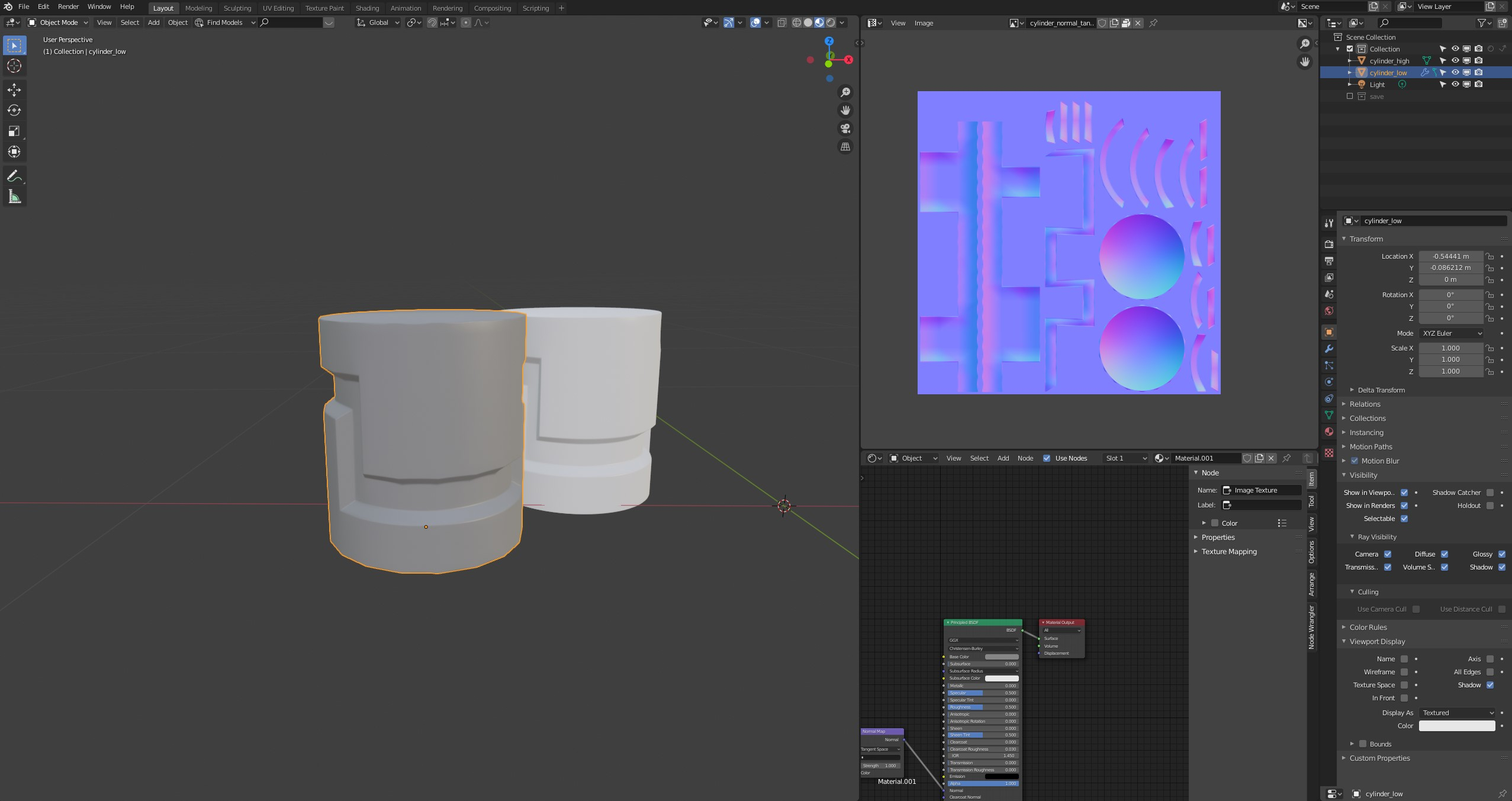
So I think the bake turned out ok but how would I go about improving the UV layout and the bake itself. I was doing a test with one smoothing group only and one with multiple smoothing groups and sharp edges.
If I use multiple smoothing groups with extra splits wherever there is hard edge the result is horrible if I don't use an averaged cage.
Also the normal maps obviously look very different.
So what is the better way to go and where can I improve this?
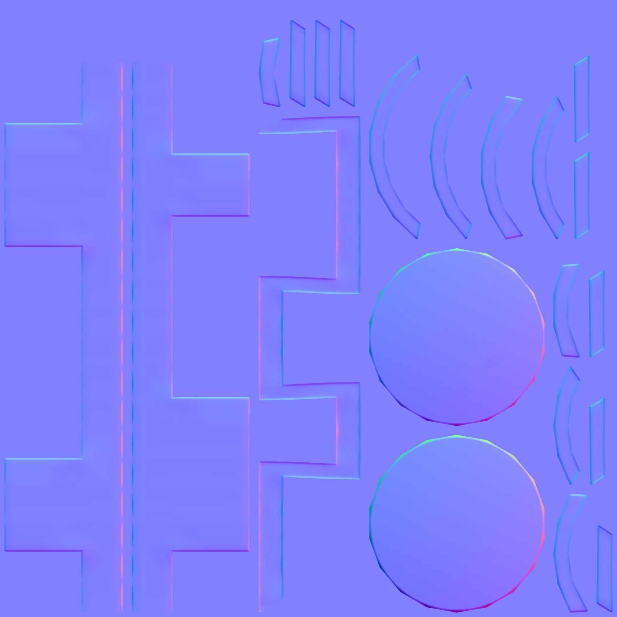
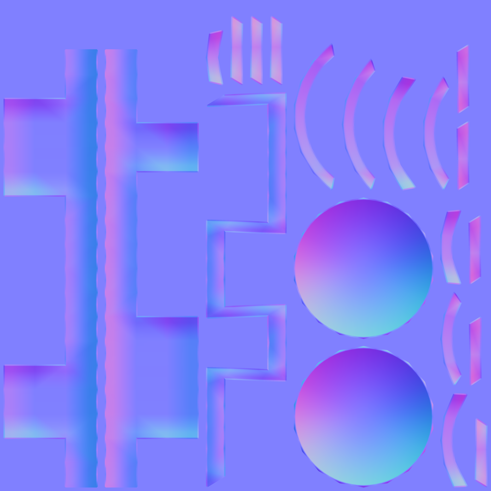
I am still trying to figure out how to get a good bake so I test with simple objects like this. I uploaded it here so everyone can check it out:
https://we.tl/t-4GG1l2wALm

So I think the bake turned out ok but how would I go about improving the UV layout and the bake itself. I was doing a test with one smoothing group only and one with multiple smoothing groups and sharp edges.
If I use multiple smoothing groups with extra splits wherever there is hard edge the result is horrible if I don't use an averaged cage.
Also the normal maps obviously look very different.
So what is the better way to go and where can I improve this?


Replies
Dilation is always needed on baked maps because when they get mipped, you get seams from the empty neighbour pixels. You don't have dilation on these bakes.
The second thing is to straighten those curvy uvs. You get better anti aliasing and less of the previously mentioned issue if they are straight. Dilation would also be higher quality. Its a tradeoff. You get minimal stratching for better anti aliasing in the texture. If they are like that, uv islands can be much more tightly packed so you get increased resolution too.
The texture is 2k and has a 4 pixel dilation actually. I used the TexTools Addon which usually gives 8 pixel as a preset but I lowered it.
For 2k, 16 px is recommended. But i think its the best to max it out because it doesn't do anything bad and you don't need to think about how wide it should be at minimum.
I understand the issue with the stamps when they are straight. One more thing could be done to improve the tightness of uv packing. You could cut the zig zag pieces so they pack better. Its recommended to have a smoothing split there anyways.
And here with an averaged cage
Your bevels look better now.
A few more things, you can reduce the waviness of edges in the normal map by making a "proxy". Is the same as your low poly but with a support loop. This proxy will only be used for baking. And finally, follow Obscura recommendations: straighten the islands (avoid curved islands where possible) and optimize the UVs space (try to not have unused space in the UVs)
I tried as suggested. The layout has a lot more cuts now and is tighter packed and straightend. I might have overdone it on the cuts. I also used a proxy with support loops but it doesn't really make a difference. The waviness is still there.
Understanding averaged normals and ray projection/Who put waviness in my normal map?
1. Use more vertical edges
2. Use a "medium poly" mesh as highpoly. It should have the same amount of divisions as your lowpoly. You can take your existing lowpoly, and simply bevel the hard edges. This way, the "highpoly" will be exactly aligned to the lowpoly on every pixel, so you don't get the waviness, but you get the soft edges. This is the method that can't always be applied.
Instead of this:
Have this:
its happening because the shape of the highpoly and the lowpoly is very mismatched because of the difference in the number of divisions on the lowpoly and the highpoly. Making the lowpoly matching the highpoly more closely makes this better and reduces the waviness. The issue is only apparent on very sharp edges though.
Its cool that method 2 worked but this has some serious workflow issues on a very complex highpoly model and you simply can't do it in some cases. Though, as you can see , this method fully eliminates the error.
I have another question regarding baking. I noticed some strange artifacting in Blender on my model when the normal map is applied. Is there a way to avoid this? You can see some squares all over the model. I also tried the same thing with a 16bit map with no change in the results. Is this a result of missing dithering and the limitation of bitmaps?
in this picture the normal map value is at 1:
Here is the bake result without other maps. Looks ok in my opinion.
I then cranked up the Normal Map Node value from 1 to 10 to exaggerate the normal map look. It looks a little strange in some places:
Did you try to use the Blender's native baker to compare the results? I also highly advise to bake the same maps on xNormal as a form of sanity check whenever you get issues you can't easily attribute to geometry or other common issues.
Regarding Blender in general, there are two catches you need to be aware of:
1. To make a map truly linear make sure you change the target image color space to Non-Color data. It can't be Linear. For some reason Blender 2.8x saves images baked as anything other than Non-Color data as either 8 bit or 16 bit, specified format and float notwithstanding. So even if you're saving it as 16 bit it's good to ensure you're saving it from a non-color bake, because something is off with the Linear bake.
2. Blender uses +Y swizzle, but it can bake -Y. Depending on your target engine either bake it as +Y or flip the Y directly in the shader node tree.
I was using TexTools internal baker that comes with the Addon. There is no difference between both bakers in terms of the banding we see. +Y is also not flipped. I am only working in Blender atm. I always change the Color Space to Linear/Non-Color for any texture that isn't Albedo.
Here are some results with no distracting textures. If you want I can upload the file too.
16bit image, Normal Strength = 1, looks fine
16bit image, Normal Strength = 10, still some artifacts
8bit image, Normal Strength = 1, you can see some stepping
8bit image, Normal Strength = 10, really bad banding
In your place I'd do what I mentioned before: bake it in a different program I trust to double check if it's something with Blender's bake settings or the geometry itself.