Warlock Environment [WiP]
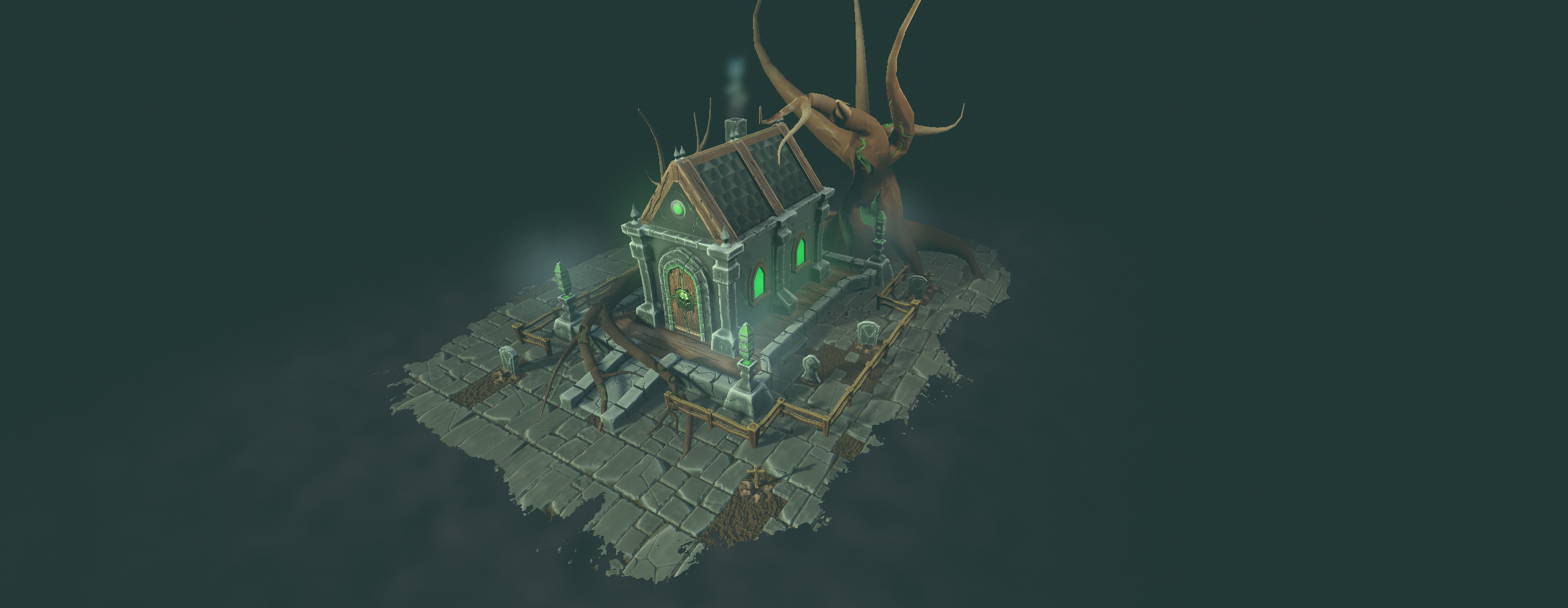
Hey! So im working on the FlippedNormal Warlock Environment challenge. And would really love some feedback on the environment as it is right now! Below are some screenshots from Unity. I will also add in a screenshot of my UV's and base mesh from Maya.
The current process I go through with the assets is making a base mesh in Maya, ZBrush for high poly, baked in SP.
As for texturing I use SP's procedural noise and generators to create a gradient and some base material (for example the wood grain base is made within SP, I then paint over it to highlight specific cracks etc.,)
OR
For the roof tiles / diorama floor I used SD, instead of importing that in as a sbsar file (seems to mess up my opacity in SP for some reason), I bring it in as separate maps and use a fill layer and paint additional textures on top.
Hope to hear from you all! I've always heard really good things about this community
Some feedback that I still need to work through:
The destruction on the edge of the diorama, instead of making it random as it is now, delete specific tiles off the side
Add more definition to the tree
Add some more vegetation (small ferns / bushes)
UV / Mesh --------------------------------


RENDERS -----------------------


The current process I go through with the assets is making a base mesh in Maya, ZBrush for high poly, baked in SP.
As for texturing I use SP's procedural noise and generators to create a gradient and some base material (for example the wood grain base is made within SP, I then paint over it to highlight specific cracks etc.,)
OR
For the roof tiles / diorama floor I used SD, instead of importing that in as a sbsar file (seems to mess up my opacity in SP for some reason), I bring it in as separate maps and use a fill layer and paint additional textures on top.
Hope to hear from you all! I've always heard really good things about this community
Some feedback that I still need to work through:
The destruction on the edge of the diorama, instead of making it random as it is now, delete specific tiles off the side
Add more definition to the tree
Add some more vegetation (small ferns / bushes)
UV / Mesh --------------------------------


RENDERS -----------------------


Replies
As for the renders, these are just screenshots of unity. They aren't necessarily renders yet
Also I noticed a weird looking texture on the tree
The weird look i've figured out. Its the height map property within Unity. Its not working well with my current maps. I need to take a look into that later. Might take height maps away completely tbh as they aren't very prevalent within my scene.
Here is what happened to the environment