Parking Bay - UE4 Environment
Started working on an underground parking space inspired by a movie scene, since i like the setup and lighting thought of trying to make a similar scene in Unreal. And this time would like to work my way through to final result with advice and feedback.
Reference:

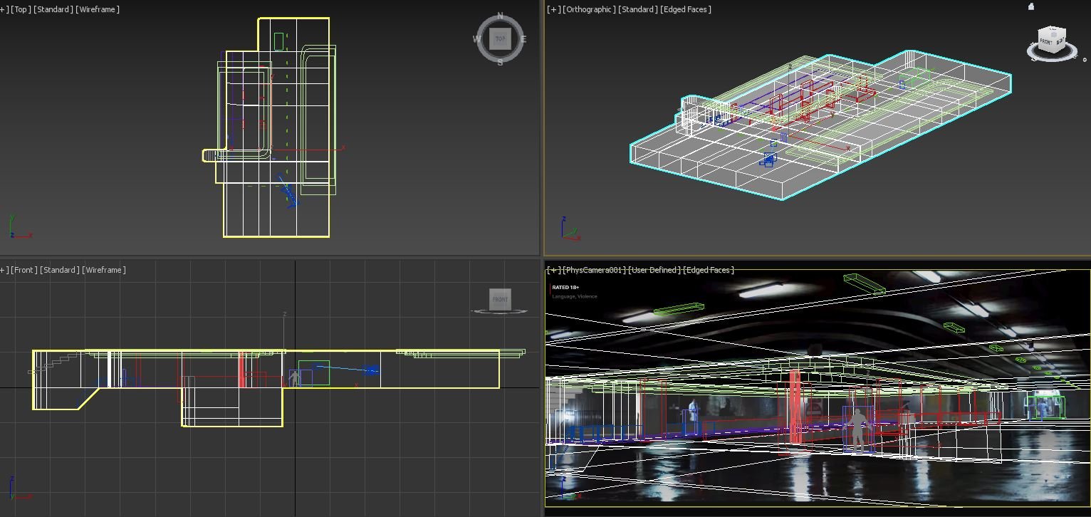
started with Perspective match , Blockout in 3ds max


And then brought it to Unreal Engine to check for scale match or any modifications before i start working on modular assets. went back and forth between 3ds max and unreal until i got a better scale match for the blockout.

Reference:

started with Perspective match , Blockout in 3ds max


And then brought it to Unreal Engine to check for scale match or any modifications before i start working on modular assets. went back and forth between 3ds max and unreal until i got a better scale match for the blockout.


Replies
Imported the pieces to Unreal, and started filling up the initial blockout with the modular pieces and used materials from Megascans library. I thought Ill put in the few filler props that I need after this stage. Created a simple material for vertex painting the puddles of water on the floor, but not completely satisfied with the reflections. will be adding a few decals too for non-uniform structure.
I am finding difficulty lighting this scene and need help or advice for
1. better ground reflections
2. Better method to light the scene, more realistic lighting.
Another thing that isn't helping in your scene is the scale of it. Unless you're doing the whole car park, I'd probably try to stick to the same scale as your reference, that way it'd be easier to achieve the source length and radius of your lights. I'd make rectangle lights and span them across the row of lights to get that overall ambient light from there. You can then blueprint up your ceiling lights and add a point light to mimic the light radius it emits on the ceiling. Essentially you are faking it by adding a general rectangle light source for one row of lights while each ceiling light has it's own point light emitter , if that makes sense.
Your scene has a few really black areas that look purely black, which doesnt feel physically correct considering the amount of lights in there. I'd probably plop a sky light in there and play around to balance out the black areas. Just have your reference open side by side with your scene and judge the colours and intensity of the lights from your reference.
Also the puddles on the ground look weird while in the reference it loos like there is a uniform amount of wet ground, whch is why the light reflection pops out more. I'd say focus on working on the ground material since the outlook of the whole scene seems to be dependant on how good your materials are as well as the lighting. I suggest looking at some wet asphalt references, once you get these details into your ground material, the reflection and lighting will definitely pop out more. You can add some decals over it later once you got the right balance for your ground material.
1.I will most importantly work on the wet look of the ground which would help with the reflections. gave me an idea instead of vertex painting puddles, i will try to use wet and dry asphalt to achieve that look. and then use vertex painting to blend them.
2. Lights, yes will work on blueprints and create the variable tints as in reference, get the black areas covered too, haven't yet done the skylight so yes I think that might help.
3. About the scale,I was able to camera match the perspective of the reference and build my entire scene in 3ds max for the blockout because I was able to modify the properties of the camera in 3ds max. I haven't yet gotten around yet to fiddle with the camera settings in UE, still working on it. I tried adding a human reference and a vehicle reference in the scene and it looks good but looks weird when the scene is empty .Even I am bothered a bit by the scale appearance .any advice or links regarding this could be helpful.
And yes I will be adding a few vehicles and a few filler props in the scene for the scale of the scene to look a little more appropriate.
Worked on some wet asphalt material, modified some materials from megascans to achieve the look i was going for and vertex painted the unequal wetness of the floor .
And then added variable tinted lights and a little more progress added props and materials.
Still a long way to go with decals,lighting and materials.
Also there was something I also spotted later on and figured out what else could be stopping you from achieving a look closer to your reference.
The way the ceiling lights are bouncing off onto the environment is going on a 180 degree direction. That means you're going to get the soft gradient of white to black until it hit's a surface. In your reference, you can see the gradient from light to the next surface fades slightly until it finds a surface facing the light, causing it to have a highlight effect where it'll be lighter than the point where the gradient ends.
Anything that seems to be facing directly to the ground are much darkeras they're not catching the light as much because they're lower than the ceiling lights on the Z-axis. In your scene, the stepped areas on the ceiling, the areas facing downward are still catching light from the ceiling light which feels physically incorrect and tells mere there is another hidden light source there. I'd say don't worry about adding extra light sources to fake some stuff until your main lights have been tweaked.
While you do have some gradient going on in the left side, the right side has a harsh white to black gradience which results in these black areas and considering the amount of lights in this scene, it wouldn't make sense to have 100% black (the reflection on the floor may also reflect back upward to give a soft bounce light). At the moment they seem focal to one direction only.
Did the fixes to the ceiling lights ,changed attenuation radius of lights so it does not hit the ground too harsh. and more realistic push sideways .
still have some work to do with the lights though.
Removed all support lights and increase GI Diffuse boost and indirect bounces to 5, that seemed to help light up the entire scene, so now most of the lights are from only visible light sources in the scene, just 2 support filler lights. still have some decals to add. Getting the look closer to what I wanted to achieve. later will do a small cinematic camera just with raining sounds background.
will make some changes in exposure ,post process volume next.
The contrast is a bit too much but thats just personal preference.
Reminds me of that scene from fightclub where tyler fights the... other guy, i guess.
Removed all support lights now, added skylight , modified ground contrast and playing around with lights and reflections.
Pretty satisfied until now....will start with some cinematic camera.
Any advice or suggestions are welcome as i'm always looking to improve in any way i can.
Will put crop panels for a more cinematic look
Checkout my artstation for the final cinematic
https://www.artstation.com/artwork/Z5NL5X