Home 3D Art Showcase & Critiques

The Bi-Monthly ENVIRONMENT ART Challenge | May - June (66)

1
interpolator
Offline / Send Message
alytlebird interpolator

Welcome, all! Time to kick off the third Monthly Environment & Prop Challenge for 2020! Since we didn't receive many votes during the voting portion of this thread, I've gone ahead and retooled it to be the challenge thread.

Remember if you don't finish in the time allotted, just keep plugging away and post when your work is finished. There's always some good progress that falls off the radar - we want to see your work! So keep going and finish those pieces!

Without further ado, here are our official options for Challenge 66:


- ENVIRONMENTS -

HARD SURFACE:
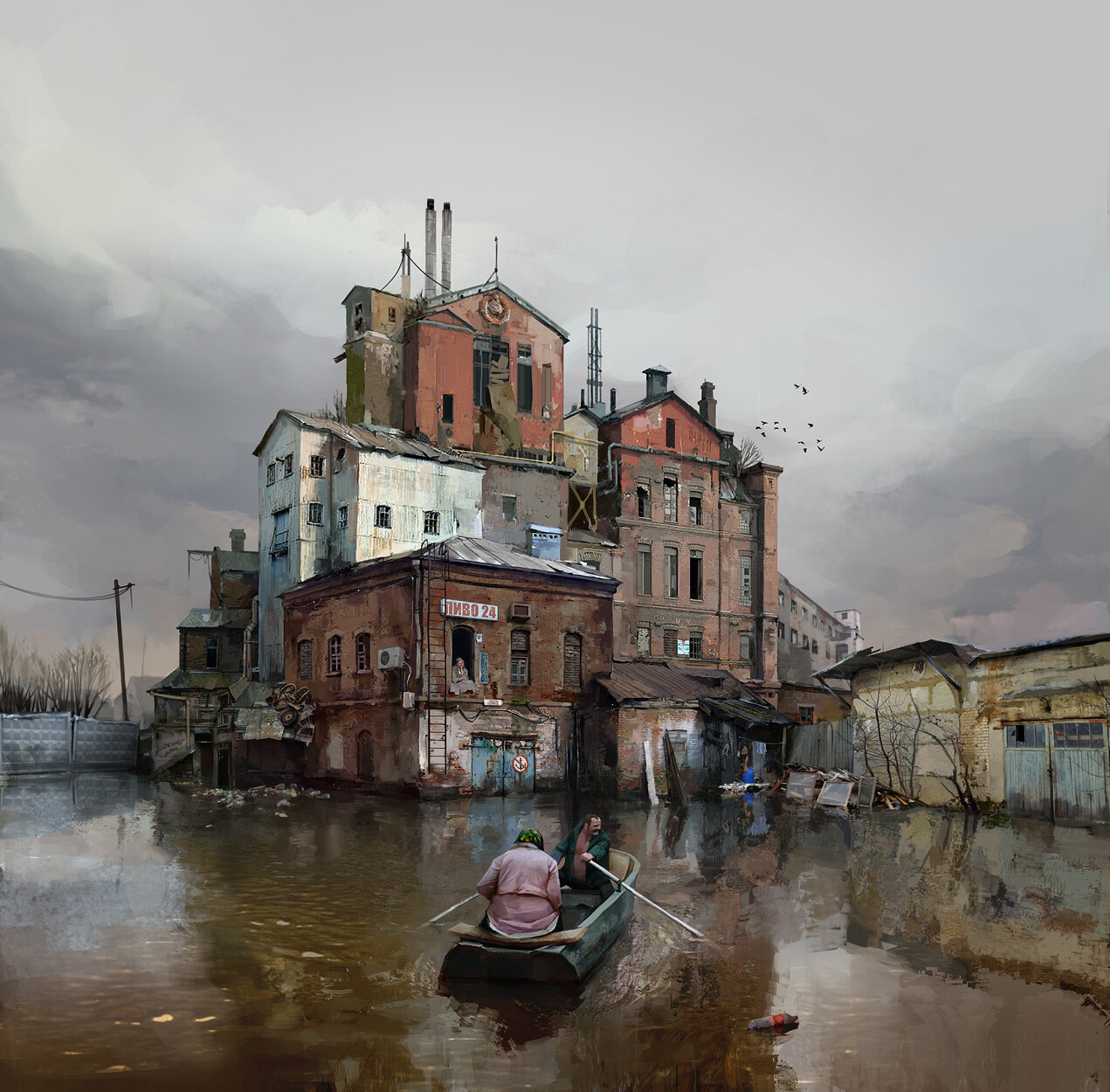
Artwork link: https://www.artstation.com/artwork/1nwGZq

STYLIZED:
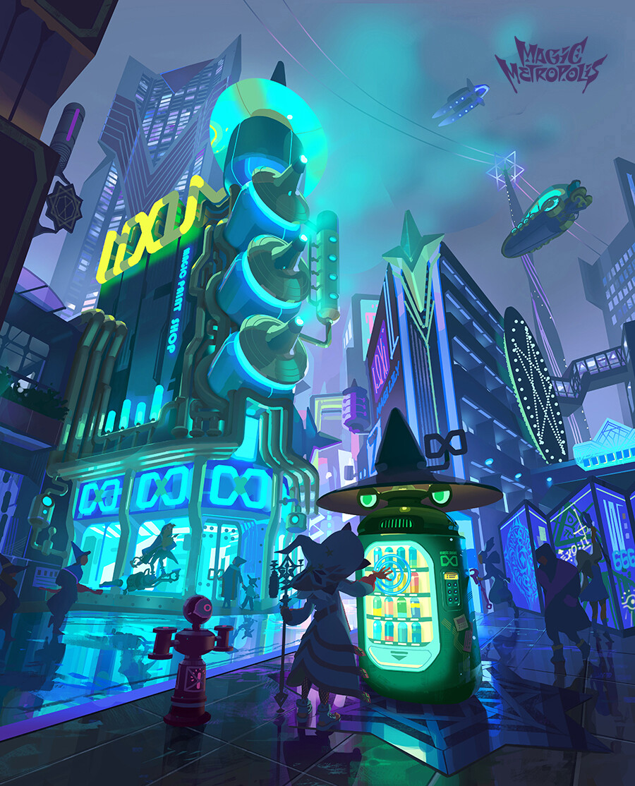
Artwork link: https://www.artstation.com/artwork/N523ed

- PROPS -

HARD SURFACE PROP:
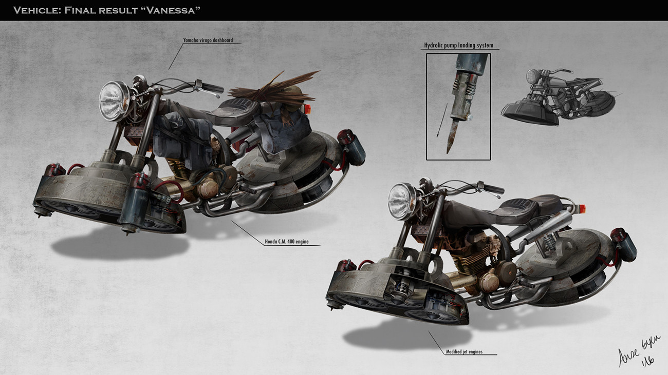
Artwork link: https://www.artstation.com/artwork/W0klG

STYLIZED PROP:
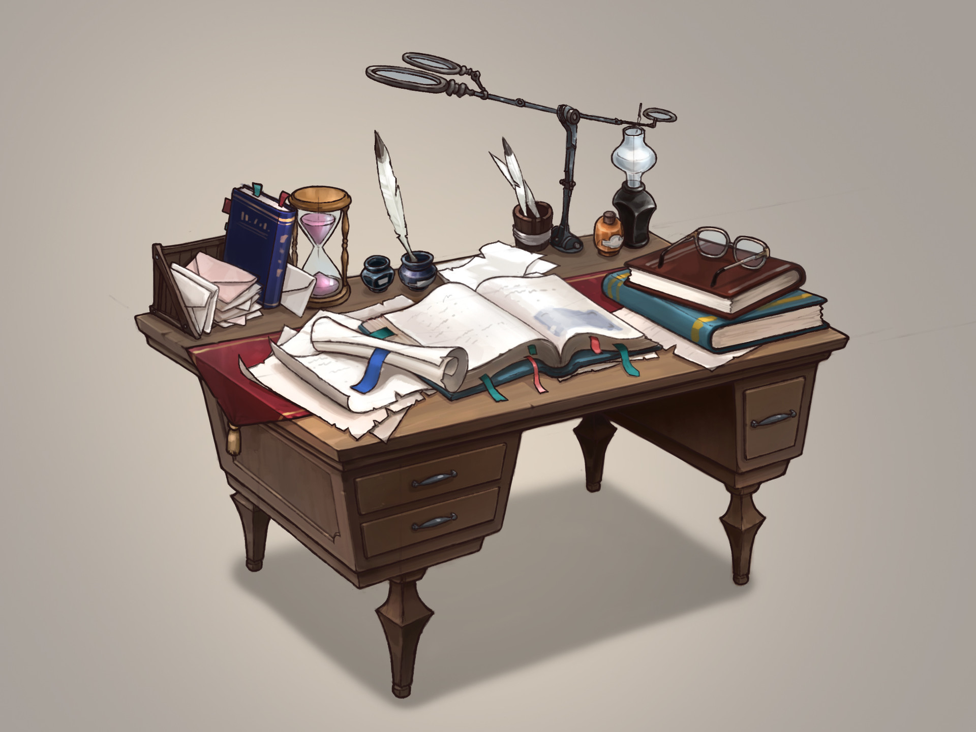
Artwork link: https://www.artstation.com/artwork/BKaaz

- WILDCARD -

HARD SURFACE INTERIOR:
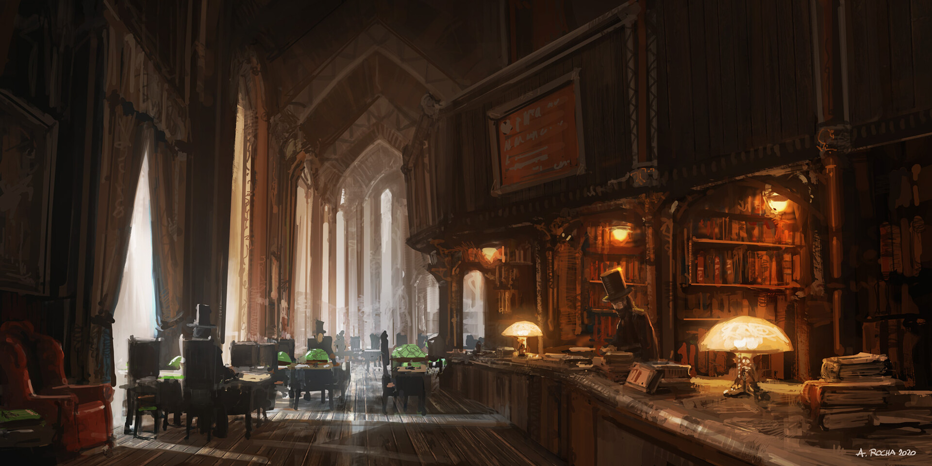
Artwork link: https://www.artstation.com/artwork/9eYxAO

Yet another challenge with two exterior concepts, so we have yet another interior concept for our Wildcard entry! I'm really curious to see what people come up with for this, as it's got a lot of room for interpretation, being more of a loose illustration. Enjoy!


Please read all the rules before starting:

-Try to post one critique for every post that you make. This will make for a better learning environment and help us all grow as artists.

-Try your best and finish as much as you can in the time frame provided.

-Post what you are working on in this thread so that way it's a more centralized place for advice and critique. We don't need to have 1000 disjointed threads littering the forums. 

-It is recommended to use a game engine to present your work. Unreal Engine and CryEngine are very common engines that can be used but feel free to use any alternatives that you want. (Marmoset Toolbag is allowed as well)

-If you want to change up your chosen concept a bit, then feel free! Interpret these concepts to your liking, especially if your aim is to add storytelling elements.


And here are some recommendations:

-When you are just starting out making a scene, it can seem complicated or imposing, so take the time to break it down. 

-Think about how you can re-use assets, re-use textures, break it down as simple as possible and plan it out. A lot of people will break it down in their own way when they start out their challenge. Gather some reference images as well for different parts of the scene, maybe gather some refs and make it your own.

-Take your time planning and blocking out, it will set you up for success later on.

-We strongly encourage you to go and look at other games and see how they make their assets as well as get concept art to give it your own feel.


All that matters is that you learn while being able to effectively critique others, as well as accept critiques on your own work. Remember to have fun!

Have at it!

Replies

  • pixelpatron
    Offline / Send Message
    pixelpatron polycounter
    Getting some strong Half Life 2 vibes from that first image. Would love to create that. Too bad I don't got time for it atm. *saves image for later date.
  • kadeschui
    Offline / Send Message
    kadeschui greentooth
    Great selection this month! Hopefully be able to join in the fun this round ;)

  • Dinka
  • alytlebird
    Offline / Send Message
    alytlebird interpolator
    @Dinka Thanks for the suggestions! I've filed a few of those away for future use. :)

    Alright everyone! Since we didn't receive many votes during the voting portion, I've gone ahead and reworked this thread to be our challenge thread. I have also added the Wildcard concept, so make sure to check that out!

    Spread the word and get working! :smiley:
  • Bostvic
    Offline / Send Message
    Bostvic polycounter lvl 5
    Love the Wildcard. I'm going to get started this weekend. Need a good win after being trapped on endless projects for too long
  • tystnad
    Offline / Send Message
    tystnad polycounter lvl 5
    I like the derelict atmosphere of the first concept, it suits perfectly to my current mood.
  • Bostvic
    Offline / Send Message
    Bostvic polycounter lvl 5

    Blockout and basic lighting. I's too bright at the moment, but I am focusing on getting the forms right first. There's some weird perspective going on with the counter and its alignment to the fascia board above it.
  • mole420
    Offline / Send Message
    mole420 polycounter lvl 10
    Been wanting to take part in one of these challenges for a while and finally have some time to do so. Made a start on blocking out the scene in unreal.
  • FazioH
    Just did the blockout of the scene. This is actually the first scene im going to do so i might take longer. Hopefully i get a great result.
  • ThisisVictoriaZ
    Offline / Send Message
    ThisisVictoriaZ polycounter
    I've never done one of these before, I've also never done a city environment before so i'm excited to participate! Blockout in UE4 and first building for the stylized environment  :3


    @mole420 really nailed the perspective, very nice greybox!
  • alytlebird
    Offline / Send Message
    alytlebird interpolator
    @FazioH nice start! I'd recommend adjusting your camera perspective and checking proportions a bit; right now your boat in the foreground looks to be a couple meters away from the building, whereas in the concept they are much further away. Your building might come out looking too small because of this. Use your mannequin as a size guide to make sure the building is to scale, i.e. roughly 3-4 meters for one floor. I'd also recommend pulling the boat and camera back a bit, and messing with the camera settings to try to get a solid match. Getting everything set in place with your blockout before really starting the project will only help you moving forward. :) Keep plugging away!

    @ThisisVictoriaZ Great job on that front building, you captured the silhouette really nicely! I do feel like your blockout is a little too "blockish" right now; you might try making primitive models more specifically for the primary buildings and props in the scene, and capturing the forms that make them stand out. For that terminal in the center of the scene, even using a cylinder and a sloped cone to get the shape right would be a big improvement. I would also recommend doing at least a bit of work on your lighting, just so you're not stuck with the Unreal defaults. Right now, you have two very different times of day between your concept and blockout, so try capturing some of that purple night sky and bluish-green neon lighting, that'll be great for capturing the mood. Good luck!
  • Dinka
    Offline / Send Message
    Dinka keyframe
    A few days late but here's what I got done now. Blocking out in blender, and going to start setting up a ue scene soon :) 


    /Edit I know the buildings look kinda big compared to the human references. Fixing that next
  • simonBreumier
    Offline / Send Message
    simonBreumier greentooth
    First time doing the challenge and really felt in love with that desk
    Started to block out few objects on blender to get the proportions right  :)


  • mole420
    Offline / Send Message
    mole420 polycounter lvl 10
    Managed to set aside some time tonight to work into the blockout a little more, Couldn't resist playing with a little bit of lighting to start getting a feel for the scene. 

    Some great progress so far from everyone, really cool to see a lot of people using Blender :smiley:
    @simonBreumier That's a really solid blockout it feels maybe a little too deep compared to the concept, and I think you could exaggerate some of the shapes and forms a little to help it feel a little more stylised.
  • FazioH

    @@alytlebird  Thanks for the feedback! i fixed the perspective in blender but cant match it 100% on UE4. Any ideas on how to match it? Anyway i think im going to start doing the basemeshes since it looks good even though it doesnt match perfectly
  • alytlebird
    Offline / Send Message
    alytlebird interpolator
    FazioH said:
    @@alytlebird  Thanks for the feedback! i fixed the perspective in blender but cant match it 100% on UE4. Any ideas on how to match it? Anyway i think im going to start doing the basemeshes since it looks good even though it doesnt match perfectly
    So something you could try is directly copying all the properties of your camera in Blender into the camera properties in Unreal. This would only work if your blockout meshes are exported in place from Blender and set at zero in Unreal. I'm not overly familiar with Blender so I don't know if there's some magic solution, but more than likely it'll take a bit of fiddling to get right however you do it.
  • Orbit
    Offline / Send Message
    Orbit polygon
    I started modeling again after an 8 year break from it, and what I thought would be simple didn't turn out to be :). Any tips on modeling some of these objects would be really helpful. 
    @simonBreumier Looks great! Way better than my attempt! The other objects could use some of the style you put onto the book to match.


  • Dinka
    Offline / Send Message
    Dinka keyframe
    @mole420 love how you made the environment more player friendly! :)

    Still blocking out, testing a bit in ue as well... havent built a scene in the engine before and the process is suuper slow since I have to google how to do everything. It's about time I learn how to use it though :D

    Flipped the boat since I wont add the humans in the scene, and I think im going for some vegetation hanging from the buildings as well.


  • ThisisVictoriaZ
    Offline / Send Message
    ThisisVictoriaZ polycounter
    UV and textured this building, tried to simulate the blocky and painterly style by painting on most of the highlights and shadows in substance painter. 


    @Orbit I think you've got a great start, especially after taking such a long break. Are there any elements in particular you're having an issue with? Sometimes I find it helpful to remember with stylized pieces that over exaggerating certain shapes can help the piece feel more full of life and fun!
  • Orbit
    Offline / Send Message
    Orbit polygon
    @ThisisVictoriaZ Thank you! Before I post my own issue, some feedback! That bottle(?) landmark on top of the building seems like it would be a little wider/larger, as well as the pipes being more bulky around the building. Here's a quick paintover:


    My problem is messy modeling really - I'm not sure how to model some objects so I'm brute forcing them now with mostly extrusions. Specifically the magnifying glass body and the eyeglasses.


  • Dinka
    Offline / Send Message
    Dinka keyframe
    Having some fun with composition and lights and trying to do some storytelling. I dont know if it will work out in the end but thought something like this was cool. The shadow might be a bit "extra" but eh, gotta see if it would even stand out with textures in. Let me know what you think :D
  • Dinka
    Offline / Send Message
    Dinka keyframe
    @Orbit If the item has a sharp edge/ seam where you're having problems putting them together, an easy thing would be just to have them as separate slightly intersecting geometry :)
  • ThisisVictoriaZ
    Offline / Send Message
    ThisisVictoriaZ polycounter
    @Orbit Thanks for the feedback, right now on the building I have the pipe moved over because right where you drew the line is the corner of the building and I had a very hard time trying to figure out how to get the pipe so go over the curve there without it sticking out. Ill look into it more though! 

    Also for the magnifying glass I wouldn't do everything with extrusions because that could make it really hard to UV that later. I would use separate primitives for each little part and combine them when you're done, this makes the modelling and UV process faster and when I've done it I think it looks better in the end. Good luck!
  • Dinka
    Offline / Send Message
    Dinka keyframe
    Wanted to do some material stuff for change so made a brick material I can use in the project 
    https://www.artstation.com/artwork/v1lk56

  • fdfxd2
    Offline / Send Message
    fdfxd2 interpolator
    I know I'm supposed to critique the people before me but I'm at a loss as to what to critique, they're all so good and seem to be going in the right direction. (or maybe I'm just not experienced enough with environment art to notice any flaws.)

    I'm going with the hoverbike on this one, partly because I don't have enough space in my ssd to reinstall unreal enginer 4 and partly because I think it's a concept with a lot of potential.


    Starting out with a rudimentary block out to get a feel for all the proportions of all the objects
  • McGreed
    Offline / Send Message
    McGreed polycounter lvl 15
    @Dinka Good start however there is something wrong with it, it looks kinda fuzzy, blurred for some reason, doesn't look as defined/sharp it should be.
  • Dinka
    Offline / Send Message
    Dinka keyframe
    @McGreed you are right, I think its the microdetail I added causing that, and the roughness. It's not visible tho from a distance and should be fine ^^

    Here's what I have at the moment. Did some material blending for the front building, and added some detail with individual bricks. Made a decal for the ac vent fan thingy in substance designer, from an image I got from textures.com


  • ThisisVictoriaZ
    Offline / Send Message
    ThisisVictoriaZ polycounter
    Added the second building and a construction fence, also changed the lighting in UE4. I think the two buildings defiantly look nice together but the lighting is a bit too dark and I think the buildings need to be bigger as well. 


    @Dinka the brink texture and reflection on the water look really nice! I'm not a big fan of that tree there, it would look much nicer in the background, or maybe if there was more than one it wouldn't stick out so much
  • fdfxd2
    Offline / Send Message
    fdfxd2 interpolator
    ^ I'm with you on the lighting being too dark


    I think i've blocked everything from the main concept out. time to deviate and add my own spin(not too much of a fan of super grungy post apoc art tbh)
  • alytlebird
    Offline / Send Message
    alytlebird interpolator
    Added the second building and a construction fence, also changed the lighting in UE4. I think the two buildings defiantly look nice together but the lighting is a bit too dark and I think the buildings need to be bigger as well. 
    You're doing a great job capturing the feel of the buildings from the concept. :) I think the issue you mentioned about the buildings needing to be larger points to something about the way the concept is presented, as opposed to the actual scale of the buildings. Your composition is horizontal, but the concept is vertical, leading to some really accentuated forced perspective with the buildings. At the very least, you'll probably need to change the focal length of your main camera, probably close to 20 or 25. If you're feeling adventurous, you could flip your comp to be vertical as well. All depends on how you wanna take the scene! I'm imagining you'll have to fill in the sides with new buildings if you stick with the horizontal comp.

    @fdfxd2 Really nice work on the blockout, you're setting yourself up to do well in the next steps. :)
  • ThisisVictoriaZ
    Offline / Send Message
    ThisisVictoriaZ polycounter
    Thanks you @alytlebird ! That's a really good point that I didn't think about, ill defiantly be messing around with the camera to see if I can get some cool effects!
  • simonBreumier
    Offline / Send Message
    simonBreumier greentooth
    @Orbit The magnifying glass was really a pain for me too. In the end, I had to do several small cylinders to make it right (which is a bit of a mess In my UV but it does the job..). For the shape which is not well defined in the reference, references such as this one are a great help (especially for the rotative junctions).

    @Dinka really cool, I really like the destroyed part of the wall on the corner. I don't know if this is the final texturing for the building but did you plan adding some more color variations ? I fell like it still look a bit monochromatic.

    @mole420 Thanks for the advice! I've tried to exagerate a bit some of those shapes, I think I could have exagerate then even more in fact
    I also started a bit of texturing and decided to hand-paint the whole desk.

  • fdfxd2
    Offline / Send Message
    fdfxd2 interpolator
    ^ I was a fan of the stronger directional lighting of the original concept of that stylised table. But then again it doesn't make much sense to add those hard shadows and light so early.

    It's looking good so far in every other department


    Yes I'm very aware that it barely looks like the original concept but I'm a huge fan of how the rear hoverpad turned out with all it's intentionally bad cable management and joints and bumps, really can't wait to retopo it with sub d later on.

    Mixed feelings on the front hoverpad though.
  • Orbit
    Offline / Send Message
    Orbit polygon
    @ThisisVictoriaZ Looking great! I think the building in the back (center) should actually be closer and of the same size as the main building - the concept is a plaza that splits into alleys/streets from the looks of it, and that  building in the back I *think* might be way out there in terms of space, a skyscraper seen from the ground up. 

    @fdfxd2 I love the chunkiness of this as opposed to the concept :), it really does improve on the original by a lot. As for the front hoverpad, maybe it might look better if it had some more supporting struts? Match the 'weightiness' of the back?

    I started on the texture as well, though after so many years, very rusty.
  • Dinka
    Offline / Send Message
    Dinka keyframe
    @simonBreumier yeah I added some variation and strengthened the normals etc to make it look less flat! :) still going to add detail and damages with decals later. :) Thanks for the critique!^
    @ThisisVictoriaZ heh yeah it was just a block out dressing tree, not final placement ^^

    Some progress, still gotta work on everything but got a solid base on all the buildings soon


  • fdfxd2
    Offline / Send Message
    fdfxd2 interpolator
    ^ Looking good so far, transition between the water and the walls is the only thing that stands out as "off", I guess some algae or more debris would fix that, but you were probably already in the process if doing that so that's not very helpful criticism from me lol.

    I feel like I've blocked it out enough, so I started doing the highpoly of the rear hoverpad, since it's the most complicated detail dense bit, and probably the most satisfying to "highpolify"
  • PhantomString
    Offline / Send Message
    PhantomString polycounter lvl 3
    Heya! It took me a bit of time to get started on this one, but, here's my blockout. Let me know what you guys think! 
  • alytlebird
    Offline / Send Message
    alytlebird interpolator
    Heya! It took me a bit of time to get started on this one, but, here's my blockout. Let me know what you guys think! 
    It's a solid start! Make sure to take this time at the start of the project to really nail down your composition with the blockout. Right now, your camera settings and position make the building feel very small, and you have a lot of negative space on all edges of your composition. Pull it in a bit and make use of your frame! :)
  • ThisisVictoriaZ
    Offline / Send Message
    ThisisVictoriaZ polycounter
    @Orbit sorry it took me a few days to reply, I took a bit of a break but I think you're right! My camera angle needs some improvement so ill make some size and camera changes next time I go into the scene 
  • Dinka
    Offline / Send Message
    Dinka keyframe
    Progress and some close up details. Still gotta cover the water edge with some depris and trash ^^

  • simonBreumier
    Offline / Send Message
    simonBreumier greentooth
    @Dinka Nice ! ahah, love the "caution wet floor" sign
    fdfxd2 , thanks for the critique, I'm still not sure which shadows to paint when hand-painting objects as they should remain usable in different lighting contexts.

    I've finished a first texturing pass for most objects. 
    At first I wanted to take the chance to practice procedural materials and finally ended out painting everything by hand as I was not sure where to start ^^'. Next I will try exporting everything into UE.

  • PhantomString
    Offline / Send Message
    PhantomString polycounter lvl 3
    @alytlebird Thanks for the reply. I made some changes to the camera and added more details to the buildings. Let me know what you guys think!


  • ThisisVictoriaZ
    Offline / Send Message
    ThisisVictoriaZ polycounter
    Progress on the vending machine prop for my scene 


    @Dinka I think the door that you made looks super good! And I think the yellow sign adds a nice touch of color! I know its not in the original concept but with your fog it would be cool to have a light of some sort in the scene to add to the moodiness of the environment


  • fdfxd2
    Offline / Send Message
    fdfxd2 interpolator
    ^ Vending machine looks like exactly like the concept. That's a good thing on my book because the concept was pretty good.

  • ThisisVictoriaZ
    Offline / Send Message
    ThisisVictoriaZ polycounter
    I made the ground textures and fixed up the camera angles, not sure how im going to be able to get the reflections on the ground to look more painterly without actually painting them on. I want to avoid that because that would mean I would have to make multiple different textures as I have each of the squares on the ground as a separate mesh. 


    @fdfxd2 Thank you! I think your prop looks great, the shape of the seat seems a bit off, in the ref theres a big space between the bottom of the seat and the body of the hover cycle, but that could also just be that im not seeing it from the correct angles
  • fdfxd2
    Offline / Send Message
    fdfxd2 interpolator
    Oh with the top parts, the seat and the fuel tank, I decided to go with using the real life honda cm 400 bikes as a reference, because I'm not too much of a fan of the overly post-apocalyptic/rugged mad max aesthetic the original concept was going for. "Probably not going to be allowed to do that in a production environment (i think?) but it's personal project so why not?", I thought to myself


    Alright, everything that was blocked out is now a nice smooth continuous surface with mostly clean topology, the highpoly is done, for now. I'll take a few days off to make sure that high of modelling something "so complex" is gone and see the model in a more cold analytical light.
  • Orbit
    Offline / Send Message
    Orbit polygon
    @ThisisVictoriaZ Really coming together! I'm not 100% sure, but maybe you could add a grunge/roughness on the tiles to break up the mirror surface a bit? Something like a smudge grunge or a wet surface since the concept almost gives off the vibe of the scene being post-rainstorm. I think adding a similar skydome - even a temp one - will help a lot with seeing how that would come off.

    @Dinka That looks seriously good! Since you won't have the boat people still (I assume?), it might be great to make a little trash island and have floaters coming off of that, like the people living there are just throwing the stuff into this heap in the water.

    Speaking of trash....I started texturing the smaller assets and I learned UV's are really hard to re-learn.
  • Dinka
    Offline / Send Message
    Dinka keyframe
    Finished my piece! :) Please go check it out on artstation for more shots and videos! ^^

    https://www.artstation.com/artwork/ba6VNo


  • Finnn
    Offline / Send Message
    Finnn greentooth
    @Dinka love the camer settings of the third shot! Also your material work is very nice. good job on interpreting the materials in the concepts. the scene is very professional!
  • fdfxd2
    Offline / Send Message
    fdfxd2 interpolator


    Nothing's changed, I just decided to do a quick vanity render of the highpoly.
1
Sign In or Register to comment.