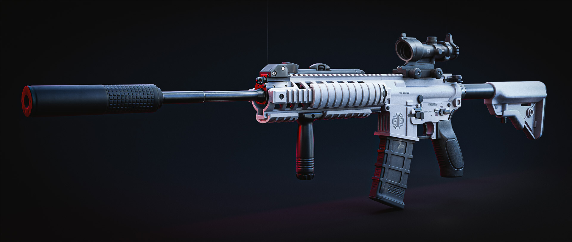
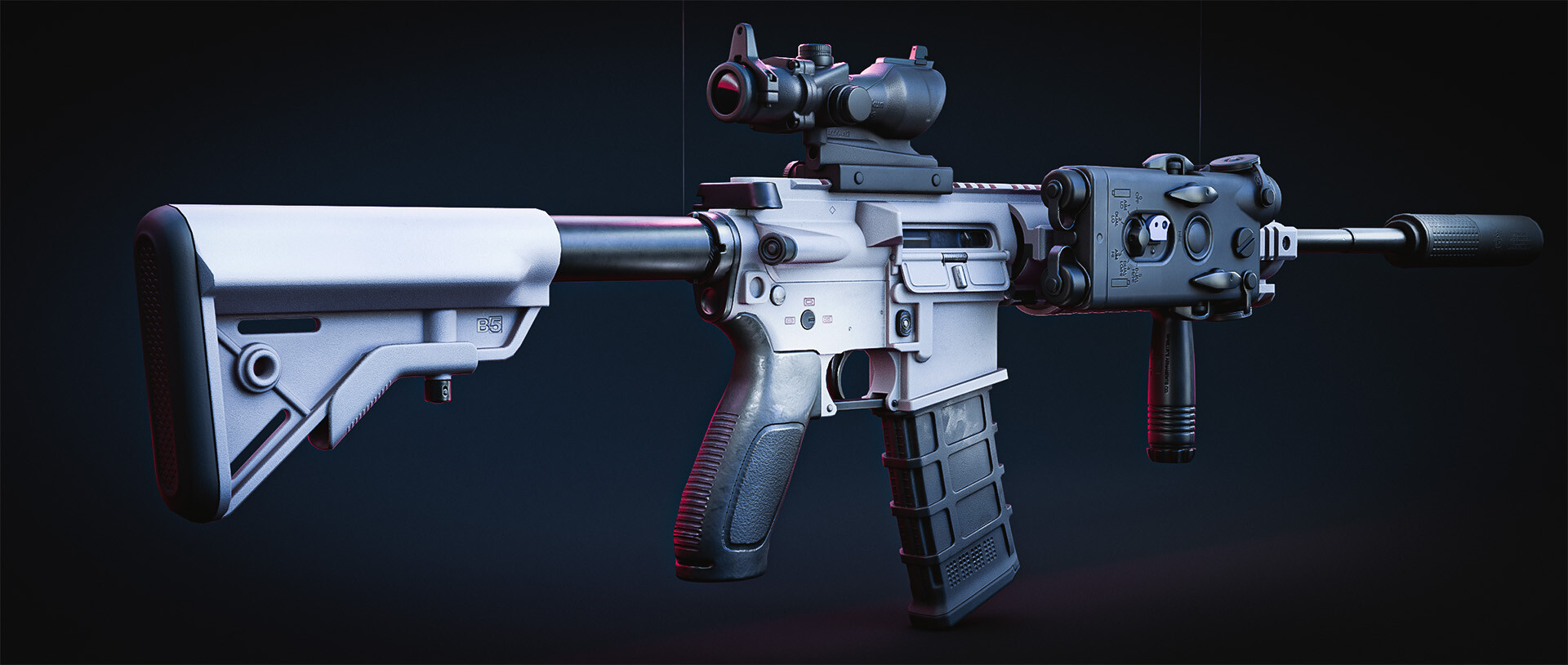
Yeah yeah, "another AR 15" but in my defence I started this project 3 years ago, 2017 (not continuously! A lot of breaks in between, didn't really work on it in 2018/19) and, it's white. basically a totally unique gun you guys.
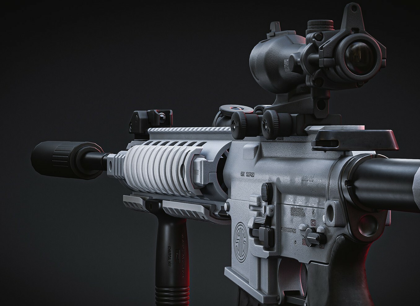
I didn't think it would take so long to make a highpoly of the quadrail but, the blockout was missing a couple of details, and making the mesh, an actually nice & smooth, "chocolatey" mesh wasn't as easy as just using the bevel modifier. But that's okay because I think the extra effort shows in the end.
I'm considering making the general bevels a bit smoother but for now I'll move on to the backup sight. Anything to delay the inevitable stress fest that will be figuring out the topology of the upper receiver.
It's looking great! One thing that stood out to me is the rounded shape at the tip of the handguard. I think this is the same gun: https://youtu.be/nP7yt1mQgPE?t=572
The quad rail seems to be different in a lot of my reference images. In some images it's shorter and doesn't cover the gas block, others it covers the gas block but it's not rounded, in another it is,etc. so I just decided to go with what I thought was the most... "interesting"
- Laser Sight was moved to the side (It was kinda ruining the silhouette a bit)
This one was weird, the one that I had thought would be the easiest to model, the stock, was the hardest(or at least, most tedious, joining vertices isn't particularly difficult) and the one that I had thought to be the hardest, the magazine ended up being the most fun. I used a lot of very unconventional modelling methods and I feel like a tech priest now.
Of course there's still a lot missing(the pistol grip is missing too much for comfort) but I'll call it a day for now.
Here's hoping that trend of hard things ending up being really easy to model continues, and the upper receiver and acog sight aren't going to be as much of a nightmare as thing they'll be.
Added Pistol Grip floaters that would be too much of a pain to do in substance.
Well this was a lot more time consuming than expected, here I was thinking the upper receiver was going to the pain with the odd shape of the sig 516's forward assist or brass deflector. But it only two bits remaining before I get to the mundane task of uv mapping and texturing this beast.
Would you look at that, another case of thing that i'd thought to be hard to model, being actually pretty easy to model. For the most part. The brass deflector was a pain to modeland it took me way longer than i'd like to admit to realise that the 516's bolt carrier is a special one
It's not complete yet, the dust cover, and charging handle are obvious WIPs, but all the hard parts are done.
Alright, just the ACOG's left. Noticing a trend for all the "hard" parts being the easiest to model so um...
"oh the acog's gonna be so hard to model I can't just ctrl + b q.q"
I was sceptical at first, i did indeed use dimensions from the manufacturer of each bit. But it turns out there were some proportional errors, the charging handle was... all kinds of wrong, the pistol grip was too thin and the magazine was too tall.
Thanks
Changelog
Corrected some proportional errors
Charging Handle (I didn't think it'd take as long as it did but the block out was waaay off)
Basic steps for the ACOG
Man times like this I wish i bought a license of zbrush or something. I imagine zremesher would come in really handy, particularly in combining all the weird shapes here (...that is something zremesher would help with, right?)
So no other path open other than just raw sub d modelling, which hey it's not that complicated of a shape anyway, I'm not complaining.
Almost. Modelling this was a lot more straight forward than i thought it would be. I guess that 12 month detour modelling cars paid off in the end.
After I finish modelling the ACOG, I'll take an 12 daybreak to work on something else ( I don't know what yet, but that bike in the monthly challenge looks sweet. ) before I finalise the modelling and start doing the lowpoly & texturing.
Well that ended up being way longer than "12 days" but at least it's not a whole year this time lol.
Decimated and uv mapped the gun and the accessories over the span of 3 days, used very... "unconventional" techniques to do so, at least to me. Which frankly I'm surprised didn't end up making an unrecognisable mess of a lowpoly.
Limited dissolve with seams and "normal" as limiters, isn't so bad after all. Just make sure you lay the seams down first.
So I've decided to make the gun white ( Maybe not this white though, might be a bit too bright ), though the accessories colour's are up in the air but I guess I'll cross that bridge once I deal with the symmetry errors on the pistol grip.
You've got what looks like a bake/shading error there on the last image where the fire select is. Maybe a weird shadow? Either way it stands out on that last image.
You've got what looks like a bake/shading error there on the last image where the fire select is. Maybe a weird
shadow? Either way it stands out on that last image.
It turned out to be a weird shadow thing. The lighting setup was taken from an old car rendering project so that's probably why it happened. Thanks for pointing it out.
For the studio scene, I want there to be a strong pink-bluish motif but I don't think it's being executed as nicely as I
think it could be. Notes to self haven't found a decent note taking app that works on both linux and windows so I'll settle with leaching off
polycount's server space, love you
Pistol grip is still pretty bad
Add the panelling to the bottom of the pmag
Make the texturing of the accessories feel less lazy
Nice work man! Straight out of Tarkov! I like the presentation as well (especially the one with the red blue BG looks kind of like cop car lights but the purple is nice as well) minimalist yet stylish,
Some unsolicited crits for you to do with what you wish
I desaturated the stock and darkened it up a bit I thought it was drawing too much attention Darkened the mag since I think it balanced the gun out a little more (Maybe the grip as well Im not too sure)
Also maybe some mist or some form of volumetrics would be nice in the BG, could just be done in gimp or photoshop
As for cross platform note taking, I find a little app called pen and paper works best! battery life is pretty good too
Massive thanks mook , yeah a lot of people suggested I make the magazine black but seeing it in a photoshop definitely convinced me. Also went ahead and made the pistol grip black too.
And with that I'm calling this gun done, finally. after like 3 years
Blend file from "November 12 2017" I uhm... didn't know what I was doing lol.
3 years in the making, ending in 2020, an still you decided to go with a PEQ-7 over a PEQ-15? ooh its done? forget I said anything lmao looks great though.
Replies
The back lens glass looks too spherical. In reality its almost flat with a slight curve.
It turned out to be a weird shadow thing. The lighting setup was taken from an old car rendering project so that's probably why it happened. Thanks for pointing it out.
For the studio scene, I want there to be a strong pink-bluish motif but I don't think it's being executed as nicely as I think it could be.
Notes to self
haven't found a decent note taking app that works on both linux and windows so I'll settle with leaching off polycount's server space, love you
Some unsolicited crits for you to do with what you wish
I desaturated the stock and darkened it up a bit I thought it was drawing too much attention
Darkened the mag since I think it balanced the gun out a little more (Maybe the grip as well Im not too sure)
Also maybe some mist or some form of volumetrics would be nice in the BG, could just be done in gimp or photoshop
As for cross platform note taking, I find a little app called pen and paper works best! battery life is pretty good too