WANDERING EARTH CONCEPT ART by Utopies Selectives
Hello everybody,
so I just joined polycount and thought I would join in the amazing shares we can see on the forum!
I'm a concept designer for movies and game, worked in China and in North America.
I've recently decided to update my artstation so I have a lot of designs from the movie The Wandering Earth to post.
l left my artstation to rot for like 2 years, so yeaaaaahhhh....
you can check out here my whole page
https://www.artstation.com/utopieselective
and I'll post some pics here too!
I'll cut the share in several posts to make it easier to navigate.
EARTH ENGINES


Replies
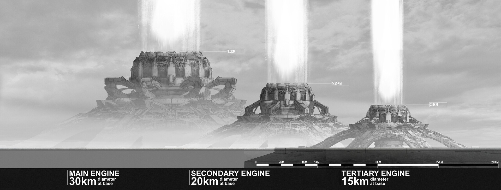
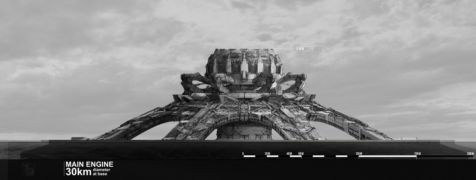
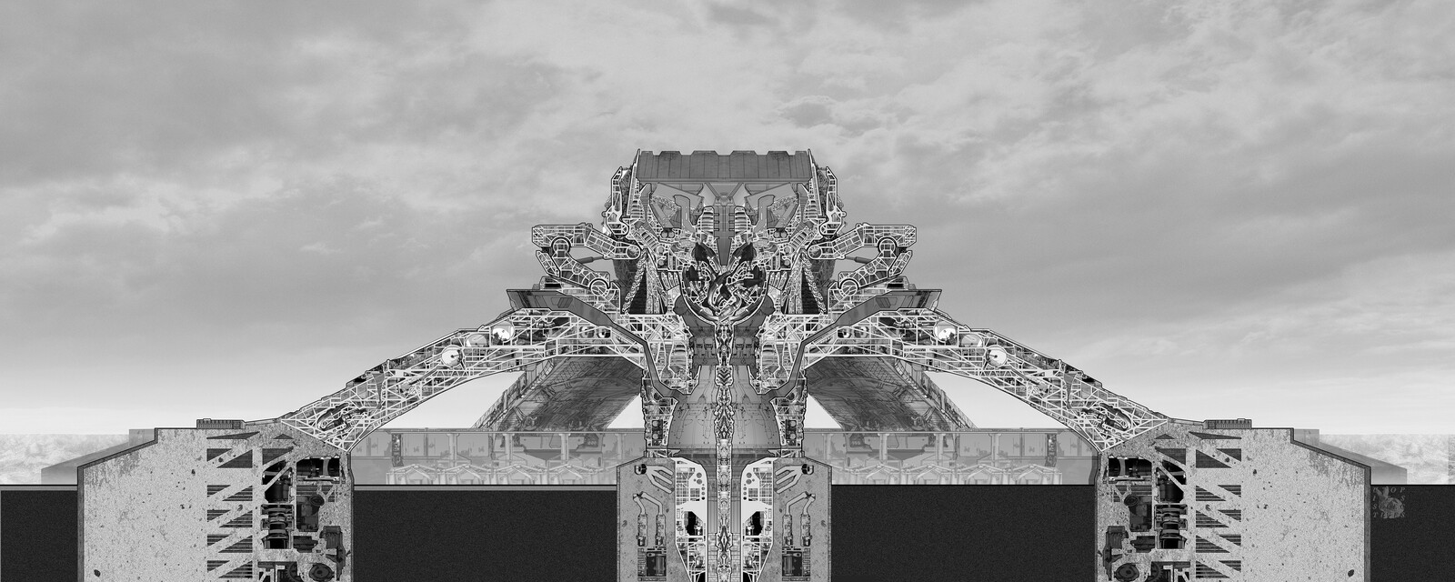
This is the detailed section of the Earth Engines's thrusters. Rather than opting for a giant jet engine, the design was made as an array of smaller engines, allowing more flexibility. There too, a lot of the elements where loosely based on a jet engine. The array consist of linear aerospike engines (the 7 green bars) and 7 panels containing smaller classical engines. Because the size of the blast would probably cause major disruption in earth's atmosphere, we used aerospikes as a base, since this kind of engine is designed to keep a constant efficiency even with the loss of atmospheric pressure. Similar to a jet engine, the corolla is able to contract and expend to regulate the thrust. The central part of the engine is used to shoot massive amount of air from the base to make sure you have a proper burn at the top (8km altitude)
first version:
This is the first version of the space station for The Wandering Earth. Rather than going with the full rotating ring, we made a stick with counterweight at the opposite of the control module. The crew was rather small at that point (really early in the project). It was then completely redesigned by another concept artist in another team, and I must say, it was better than my version. But a lot of the details survived, as for the command center and the general organisation of the space station.
For the interior drawing, I did a model of the space and then made a lineart detailing the space (with the help of ZHOU WENTING). The fully rendered version was made by WANG DI, who is the queen of detailing complex scenes.
A lot of the drawings on The Wandering Earth are collaborations and has the team lead I overviewed the whole design package and process.
Wandering Earth - Space station command center - Rejected!
Here is the rejected options for the space station.
They started with movie magic gravity which made me cringe a little,
first version was an assembly similar to the ISS, with small tubular modules making the interior.
second version had a central hub which gave me space to the actors to interact, with an access hatch in the ceiling. Just because!
I made a sketchup model of both those options and a line drawing to get the idea across, but the final render was made by ZHOU WENTING ( https://www.artstation.com/zhou2014 ) and WANG DI ( https://www.artstation.com/adiwang0326 ). They made a fantastic job breathing life into my technical sketches.
Thankfully it evolved in a more realistic version, I'll post it next
WANDERING EARTH - Command Pod
This was the approved version of the Jupiter Space Station shown in the movie. The new design took account of the gravity changes during the movie and had 2 main orientations. That way we gave the director several points where the action could take place.
In the earlier script, the command center was able to detach and fly away from the space station so the piloting seats had more importance. This was cut in the final version.
The final render was made by the talented WANG DI ( https://www.artstation.com/adiwang0326 ) based on my model and sketches
WANDERING EARTH - Machine Gun
https://www.artstation.com/artwork/BmdQq8
the second pass was made by hand on a 50% print of the first pass,The soldiers needed some machine gun so I was tasked with coming with different options for the machine guns.
The first pass was made with the smudge tool in PS,
and then back to computer for the 3rd pass. By then the production decided to change design completely so the fully shaded and colored version was made for my pleasure. The redesign's goal was to make the gun more discreet and very close to the actual QBZ-95 used by the chinese army.
WANDERING EARTH - Cargo Truck Interior
https://www.artstation.com/artwork/6ar5rn
Interior of the cargo truck featured in the movie. A big part of the movie happens in that area so I spend a lot of time doing different angles and details for the environment.
Even in the first drawing, the idea of separating the interior in 2 areas: the pilots area and the passenger area was there, but a lot of effort was made to keep those as close and open as possible to create interesting foreground/background interactions.
The process is my favorite part so might as well share it with you all
WANDERING EARTH - Cargo hatches details
In the early script, a lot of the action happened around the hatch so I spent some extra time to make detailed drawings of those areas.
Eventually it didn't matter so much!
Made using Sketchup and some texture bashing.
WANDERING EARTH - Surface Elevator
(Those drawings were made on paper and then shaded in Photoshop)
This was the first drawing we made for the movie Wandering Earth. At the time the project was still in pitch so this picture was made to convince investors that we knew what a Chinese sci-fi movie could look like. This elevator is designed to take people from the underground cities up to the surface, a travel of more than 2km. So the elevator was made to offer some comfort, hot water and vending machine for snacks. But due to the scarcity of ressources, finish panels are reduced to the minimum and the mechanical parts are taking over the space.
final
pass 02
pass 01
WANDERING EARTH - Reactor Lighter
---
In order to restart the faulty reactor, the heroes need to bring the lighter to the reactor core. Shown first in a cubic casing, the core is actual a sphere of incredible power (No idea what it is really). As an inspiration, we referenced old Chinese puzzles, little pieces of wood assembled to make a sphere.
WANDERING EARTH - AI Robot
---
The Space Station needed a camera following everybody around and eventually be the main antagonist of the astronauts of the space station. A little bit like HAL2000, but mobile, so I did some passes at the design. The director wanted something that felt like a Chinese lantern, so this was the original guideline.
Eventually ending up with 2 versions, a more sleek sphere and a rough boxy version.
And then it changed again because of lack of time and budget, the prop was made with things salvaged from other sets
WANDERING EARTH - Exoskeleton and Suits
Tasked with designing the suits that the crew would wear on the surface, a lack of heat and oxygen makes the surface of the planet akin to an alien planet, we thought of them like space suits. One of the first element we worked on was the soldiers because they have an exoskeleton attached to them. The driver suits would then be simplified to an "exoskeleton-less" suit.
We did several passes at helmets too, the goal was to create an helmet that would make it easy to see the face (because we are not paying those actors to hide!) and a variant with a "mechanically opening helmet" that would allow easy transition from open to close,
Another element of consideration was changes in gravity, so I designed some shoe-weights to keep them on the ground
Final design was made by YUAN SHUO from our team
THIS LAST ONE WAS MADE BY A MEMBER OF MY TEAM, YUAN SHUO. IT WAS THE FINAL APPROVED DESIGN.
WANDERING EARTH - Space Station Escape Pods
Bit of a background explanation:
After the redesign of the space station made by the director's team during the shoot, they were able to add Wu Jing to the actors. Which meant that the space station sequence had to be boosted in length and importance. So the space station model that they had was not adequate anymore, and they came back to our team to make sure the details would be believable.
The plot needed escape pods able to fly out of the space station and get back to earth if needed.
The director really wanted to give them the feel of portable hard drive, so I mixed a space shuttle feel to a very boxy shape, trying my best to make sense of the design.