Home 3D Art Showcase & Critiques

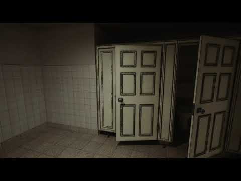
[WIP] [UE4] Public Restroom, inspired by Quixel

A_J_K
polycounter lvl 2
Offline / Send Message
A_J_K polycounter lvl 2
hey,
This is actually the first time for me posting my work here on polycount. Looking forward for some constructive crtitcs reagrding basically everything in my little scene, color selction, material, assets, lighting  etc...

Some background about the Public Restroom scene, obviously it was heavily inspired by the amazing work of Wiktor Öhman and his Silent Hill Restroom scene. In case you haven't seen Wiktors amazing work, please have a look at the link i have posted at the bottom of this topic.

The goal for my scene was to create a used, grubby public restroom, not destroyed but definitely no taken good care of. The scene is completely modular and was created mostly by the use of Quixel Megascans. Beside some megascans base materials like floor and walls, i took also heavily advantage of the beautiful decals you can find in the megascans library, however i also tried to use all the decals in a more subtle way, since i wasn't going for destroyed look in my scene.

One little goal for me was also to create the whole scene in blender, from low poly to high poly models etc... everything was modeled in Blender 2.8.


Since im doing still some changes here and there, i made a quick "dirty" video until im satified at least by 90%. Than i will try to add a more profesional looking sequencer clip.


Wiktor Öhman, Silent Hill scene


Replies

  • Anura_Interceptor
    Offline / Send Message
    Anura_Interceptor polycounter lvl 6
    Those doors look way more run down than everything else in the environment, you could add some paint chipping to the non-tile parts of the walls, add some scuffs and scratches to the tiles, maybe scatter small details into the floor texture like old gum, cigarette butts, etc.
  • JohannesAg
    Offline / Send Message
    JohannesAg greentooth
    I would try to break up the wear on those doors, right now they scream cavity mask, the rest looks cool
  • A_J_K
    Offline / Send Message
    A_J_K polycounter lvl 2
    Those doors look way more run down than everything else in the environment, you could add some paint chipping to the non-tile parts of the walls, add some scuffs and scratches to the tiles, maybe scatter small details into the floor texture like old gum, cigarette butts, etc.
    Yeah good point, the doors look way more run down like everything else in the scene. I just started to play around with different ceramic tile textures, that have a more damaged look. I was also thinking about to reduce wear effect on the doors.

    I would try to break up the wear on those doors, right now they scream cavity mask, the rest looks cool
    Good point too, i will try to find a decent looking decal to break up the repeating wear effect.
  • DeathstrokeFTW
    Offline / Send Message
    DeathstrokeFTW polycounter lvl 4
    Toilet doors arent like those, atleast from what I've experienced. They are just flat simple ones, you can do all sorts of decals and wear over it.
  • A_J_K
    Offline / Send Message
    A_J_K polycounter lvl 2
    Toilet doors arent like those, atleast from what I've experienced. They are just flat simple ones, you can do all sorts of decals and wear over it.

    Thanks for the feedback!
    Yeah, most of the public toilets have simple flat doors, however i wanted to go for something more old and different looking. After a quick google search i found quit a few of this different looking toilet doors. You can also find them on my reference screenshot.

    The doors can defentely use some more decals work, im also thinking about to rework the damage on the doors and the wood behind the painting.
Sign In or Register to comment.