Home 3D Art Showcase & Critiques

[WIP] [Environment] Monster hunter's bedroom

Anura_Interceptor
polycounter lvl 6
Offline / Send Message
Anura_Interceptor polycounter lvl 6
I've been working on this wardrobe for a larger environment for about a month so far, finished the high poly and low poly, now having issues with textures. I'm using a 2048x2048 texture and still don't have nearly enough texel density, the details come out pixelated. Should I give the wardrobe multiple 1k-2k textures? I already decided to give the sun emblem its own 1024x1024 texture and justified that by planning to reuse it elsewhere. Having several textures adding up to 4k or 8k worth of pixels just seems like a lot for an environment object. How much texture space might a professional use for this if they were working on a graphics heavy AAA game? I'm probably way lowballing how big the textures of modern games are.

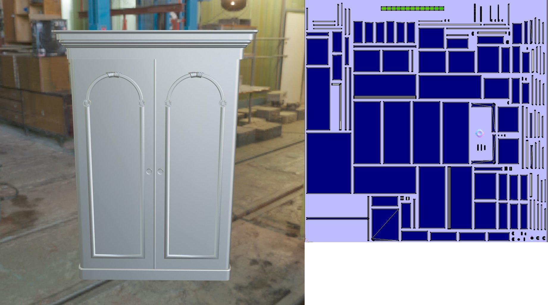
Here's the low poly and UV map. Low poly is currently 5379 triangles.
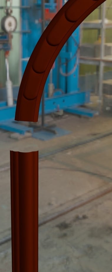
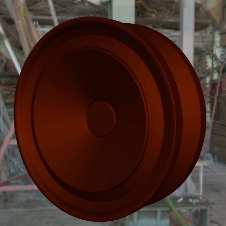
Here's some of the high poly details I'm trying to bake into the normal map.
Replies

  • fullpinkdog
    Offline / Send Message
    fullpinkdog greentooth
    Hey, i will try to help you with texel density, i not pro artist, so it's just my thoughts
    Wardrobe is a pretty big object, so no wonder it gets low texel density, but here is my thoughts
    1-st: your UV has a lot free space, try to use all free space as possible


    2-nd: in my humble opinion in this case it's better to make a few more cuts, so it will be more handy to manage all this UV-pieces and gives you more space(but only if it's not so critical for final result), something like this:


    3-rd: i think in this case reduce percentage space between UV-pieces will be a good move, i would say something like 0.5 is good enough, i use Maya but i guess you understand what i mean. And again, do this if it's not critical for final result, and when i say it i mean that your bake can be fucked up with not enough space between UV-pieces or with wrong UV cuts:


    Hope this will help
    My english not perfect btw, so let me know if there is something you can't understand
  • icegodofhungary
    Offline / Send Message
    icegodofhungary interpolator
    It might be a good idea to just UV half of it and mirror the mesh since it's symmetrical. That will buy you a lot of UV space.
  • fullpinkdog
    Offline / Send Message
    fullpinkdog greentooth
    Also, you can make UV-pieces really small if no one will even see it, for example back part of wardrobe or/and top and bottom part of wardrobe, something like that
  • Anura_Interceptor
    Offline / Send Message
    Anura_Interceptor polycounter lvl 6
    @fullpinkdog Thanks for those pointers, missed how much space some of those were wasting in the rush to get normal maps working. I have to leave one of them seamless to avoid artifacting, but most of them are fine being chopped up. I think the UVs are autopacked as tight as I can manage, it's set to give them textureResolution/128 pixels worth of spacing.

    @icegodofhungary I wanted to avoid that because I thought it might be noticeable, but after a few mirror modifiers and an array modifier I'm reaching almost the same texel density with a 2K texture as the original had with a 4K, once I manually pack this I'll get the 5 pixels/cm^2 I'm going for. Definitely worth repeating the texture to get this much of an efficiency boost.

    Here's my result with the improvements, going to do the manual packing tomorrow after I wake up.

  • Anura_Interceptor
    Offline / Send Message
    Anura_Interceptor polycounter lvl 6
    Currently at this stage, redone the UV maps about 3-4 times and still have to adjust them a bit, switched everything from split edges to 1 segment beveled edges with face weighted normals, plan to figure out how to do simple objects like this using mostly low poly and only baking normals from high poly for details that need it, would be much faster than using a high poly to bake into every piece. I'm getting artifacts in Substance Painter when trying to bake mesh maps using low poly as high poly though, is there any way around it or do I have to manually paint in stuff like edge wear/highlights? I've tried several different baking options and adjusted UVs to fix seams when I find them, but none of that has helped with position/curvature/world space normal map artifacts.


  • JamesBrisnehan
    Offline / Send Message
    JamesBrisnehan sublime tool
    I cannot tell what is happening from these images, it could be any number of things. But I have some thoughts that might help. 


    -When baking a curved high-poly edge down to a hard edge you usually get better results when the UVs for the low poly are split in the same places that the edges are hardened (or edge normals are split. Whatever you like to call it) Have a few pixels of space between UV shells for the baking software to put the edge information. More on best practices for normal baking here: https://80.lv/articles/best-practices-for-hard-surface-normal-map-baking/

    -Trouble shoot your low poly mesh and make sure there is nothing weird going on. Double check it one last time to remove any variables. Fix any N-gons (polygons with more than 4 edges) make sure your normals are all pointing in correct directions. No overlapping UVs or flipped UVs. No duplicated faces floating on to of each other. Optimize scene size, delete history, ungroup and unparent. make sure that your low poly and high poly are as perfectly lined up as possible with frozen transforms and pivots in the exact same place. These may seem silly, but I have had each one of these screw up a bake despite knowing better.

    -In your UV image all of your UV shells are different colors. I don't know what software you are using to create your UVs, but if it's anything like Maya LT, it either means UV shells are stacked, flipped backwards, or stacked and flipped backwards. All of which are bad for baking. Having stacked and flipped UVs are fine for displaying textures, saving space, reducing or increasing tiling effects etc.. But baking on anything other than a single layer of nicely laid out UV shells is going to cause problems. Easy fix though, make a copy of your low poly just for baking, and move all of those extra UV's out of the 0-1 space, or delete redundant pieces of your copied mesh.  

    -Substance Painter only needs 3 things to create all of the "mesh maps" to drive the smart materials and mask generators (like edge wear). The low-poly mesh, the normal map, and the ambient occlusion map. You can plug the normal and AO into their slots in SP and use them to generate any map that doesn't need a high-poly like the World Space Normal, Curvature, and Position. No need to load the high poly, or check on the "use low-poly as high-poly", or play with the search distances, or any of that gunk. If your Normal and AO are good, the other maps will bake perfectly. With this workflow, you can do whatever it take to make a clean normal and AO, and then go from there. You can bake, hand paint, photo-bash, node-up in Substance Designer, or any combination of things to get your clean normal and AO maps.

    -Sometimes creating a copy of your model just for baking and then blowing it up helps. I've run into issues sometimes where I get artifacts from having separate meshes too close together during a bake and it can look pretty weird. Similar to your images. Separating all of the different pieces, or using Substance Painter's match mesh bu suffix option can help.

    -You could try texturing your model with a trim sheet. It's kind of hard to explain in words, but it's like, instead of creating a texture to fit your UVs, you create your UVs to fit a texture. And the texture usually tiles horizontally. https://polycount.com/discussion/214726/creating-trim-sheets-4-part-tutorial-polygon-academy I have seen this technique used really well for wood furniture. Plus, once you have a nice Trim Sheet, you can build the entire bedroom set all running off of one texture.


    I hope some of that helps you out. Good luck.
  • Anura_Interceptor
    Offline / Send Message
    Anura_Interceptor polycounter lvl 6
    -In your UV image all of your UV shells are different colors. I don't know what software you are using to create your UVs, but if it's anything like Maya LT, it either means UV shells are stacked, flipped backwards, or stacked and flipped backwards. All of which are bad for baking. Having stacked and flipped UVs are fine for displaying textures, saving space, reducing or increasing tiling effects etc.. But baking on anything other than a single layer of nicely laid out UV shells is going to cause problems. Easy fix though, make a copy of your low poly just for baking, and move all of those extra UV's out of the 0-1 space, or delete redundant pieces of your copied mesh. 
    This was the problem, I made a second version with all overlapping UVs removed and have gotten very promising results out of it using low poly as high poly. Still need to spend tomorrow fixing minor issues, but I think I'm close to figuring out this high-poly-not-required workflow. I know of trim sheets, watched Polygon Academy's tutorial on them. I plan on using them as much as possible, but I didn't think they'd be very useful here since most of the detail is specific to this wardrobe. Will definitely put those to use on the walls, floor, ceiling, and any props that they fit well with though. Thanks for the help, would've stumbled blindly and burned out trying to fix this on my own.

  • JamesBrisnehan
    Offline / Send Message
    JamesBrisnehan sublime tool
    You certainly don't have to change your entire workflow if everything is working now. I just mentioned the other workflows (trim sheets or normal map based baking) as work-arounds in case you just really couldn't get baking to work. But it looks a lot better now. Well, except for the pink wall and the arches with that Adobe-style transparency checker pattern. But you said you just had some minor issues to work out, so I'm sure you've got it form here.
  • Anura_Interceptor
    Offline / Send Message
    Anura_Interceptor polycounter lvl 6
    Removed a lot of overlapping faces entirely, now only the shelves and drawers overlap before mirror/array modifiers, so I just export only one shelf and drawer to SP. The mesh maps baked well enough for environmental clutter, a bit rough here and there, but the grunge maps smooth it out, will definitely be baking normal maps from high poly for more important objects though.

    Is there anything I should do to push this texture further before I go through the process of merging all the exported texture sets? I've been looking at Red Dead 2 screenshots for pointers on rustic furniture, I think the overall wear and tear is good, the underlying wood itself seems bland somehow though. Next up will be some modular wall pieces and blockout, I didn't know this was going to be a full environment when I first started. Then I'll go back and get fittings on this, the crests, drawer handles, and hinges.


  • Anura_Interceptor
    Offline / Send Message
    Anura_Interceptor polycounter lvl 6
    Got more work done on the environment. Got everything into Godot, blocked out all the large objects, built two modular wall pieces and made a blockout of the window+door to balcony piece. The green wallpaper is a 1024x1024 tileable texture I made in Substance Designer, the arches and trims are a 256x256 trimsheet that tiles around 5-10 times across the surface, didn't feel the need for more resolution than that since there's not much detail besides a bit of mottling to the color and very light dust.

    Going to make those bars about 1cm narrower, they clip through the wall currently. I want them to be thick because they're not meant for common thieves, they're made to stop big monsters that could shred ordinary bars like paper. Will start blocking out a door and some more ornamentation to those bars as well. Dresser also needs more tweaking, the Substance viewport doesn't accurately reflect how it looks in Godot for some reason.


  • Anura_Interceptor
    Offline / Send Message
    Anura_Interceptor polycounter lvl 6
    More work done, going to be posting updates every Friday from now on. Slowed down the work a bit this week to avoid burnout, still managed to get new bars and all the wall trimsheets in place. The window and wall trimsheets are now on one 512x1024 texture, going to adjust the baking so that the details are baked at an angle matching where they'll be used instead of just baking flat. Next up is making those crests that are still the warning yellow, adding a door and the stained glass above it, finishing up the windows, and figuring out a brick texture for the outside wall. Haven't worked on the wardrobe much, still WIP, removed the uniform scratches and toned down the edge wear, adding some larger gouges to the bottom front from it being accidentally kicked. The reference picture I'm basing this wall off of is below as well.


  • Anura_Interceptor
    Offline / Send Message
    Anura_Interceptor polycounter lvl 6
    This project isn't abandoned, got enough money to get all of Daniel Thiger's SD Fundamentals series and been on hiatus going through it, now putting that knowledge to use here. I think the bricks are 90% done, need to add some face wear to complement the edge wear, then fix the roughness so it has a brick-like feel instead of this uncanny CG plastic look. The wrought iron needs a lot more work, it seems like a hard material to get right. Might get some Daniel Thiger and/or Josh Lynch stuff on full materials, Fundamentals covered how to use nodes to get the effects you want and solve problems rather than full materials.


Sign In or Register to comment.