WIP Forest Alter
Hello all, I am currently working on a project for a course I am in. I would love any feedback on this as I progress through the end of the month.
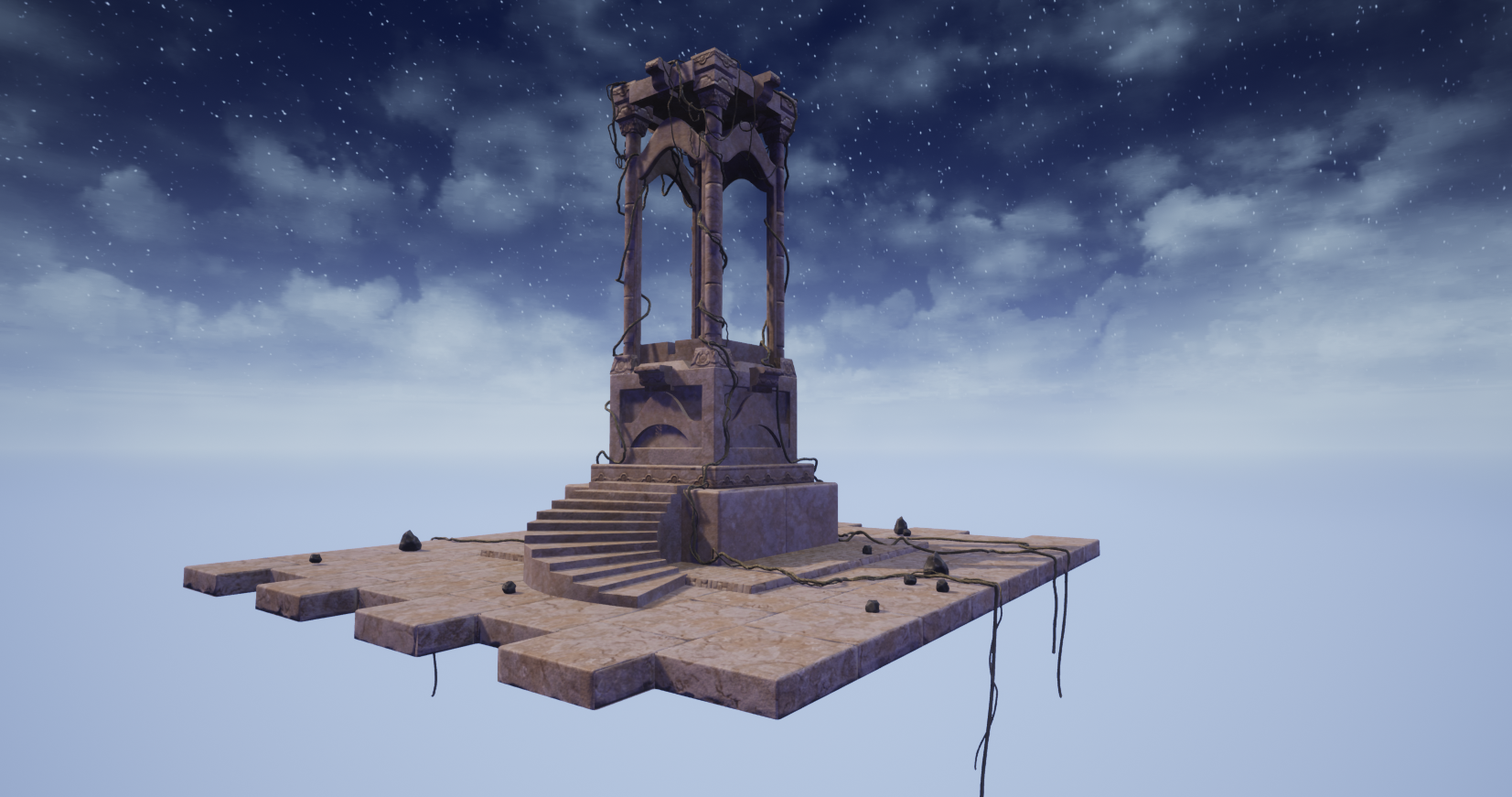
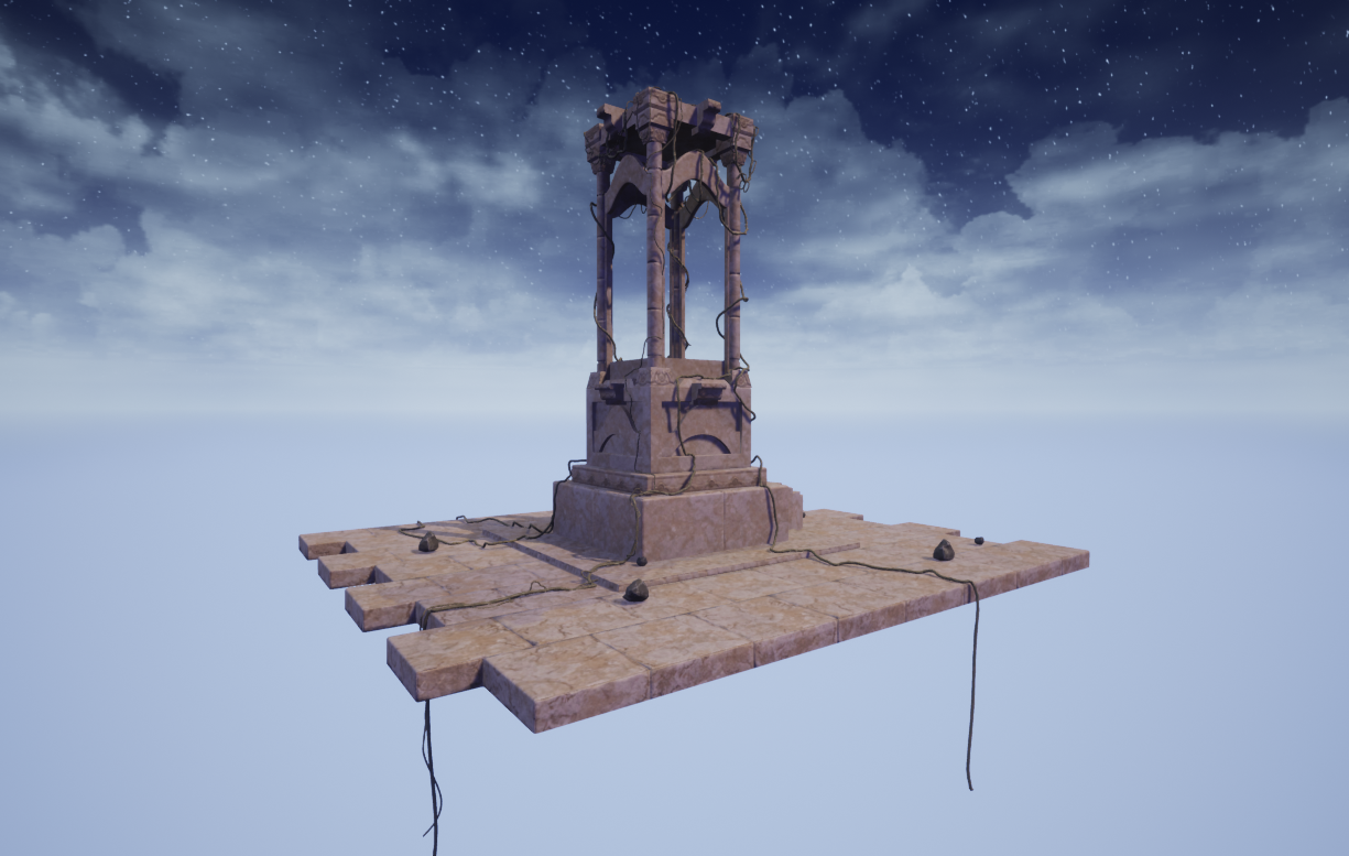
This is my first piece using Trim Sheets, I have never used the workflow before. Everything except the rocks uses the trim. I plan to add more variation to the trim sheets and fix the seams in a few places as well as add many more layers of depth. This is my initial base texture placement and first pass at lighting ideas. I also plan to add a few more vines. Suggestions are greatly appreciated and thank you so much in advance!
Update: I have worked more on making the trim-sheet more broken up in color and used vertex painting to continue that process. I have added some leaf decals too. I also started my lighting and I have added various lights throughout the scene to highlight areas, but I need to lighten the scene overall, but not sure how to do that and keep the feel. Doing some research and looking for suggestions. Thank you so much for taking the time to offer any suggestions, comments or other critiques.


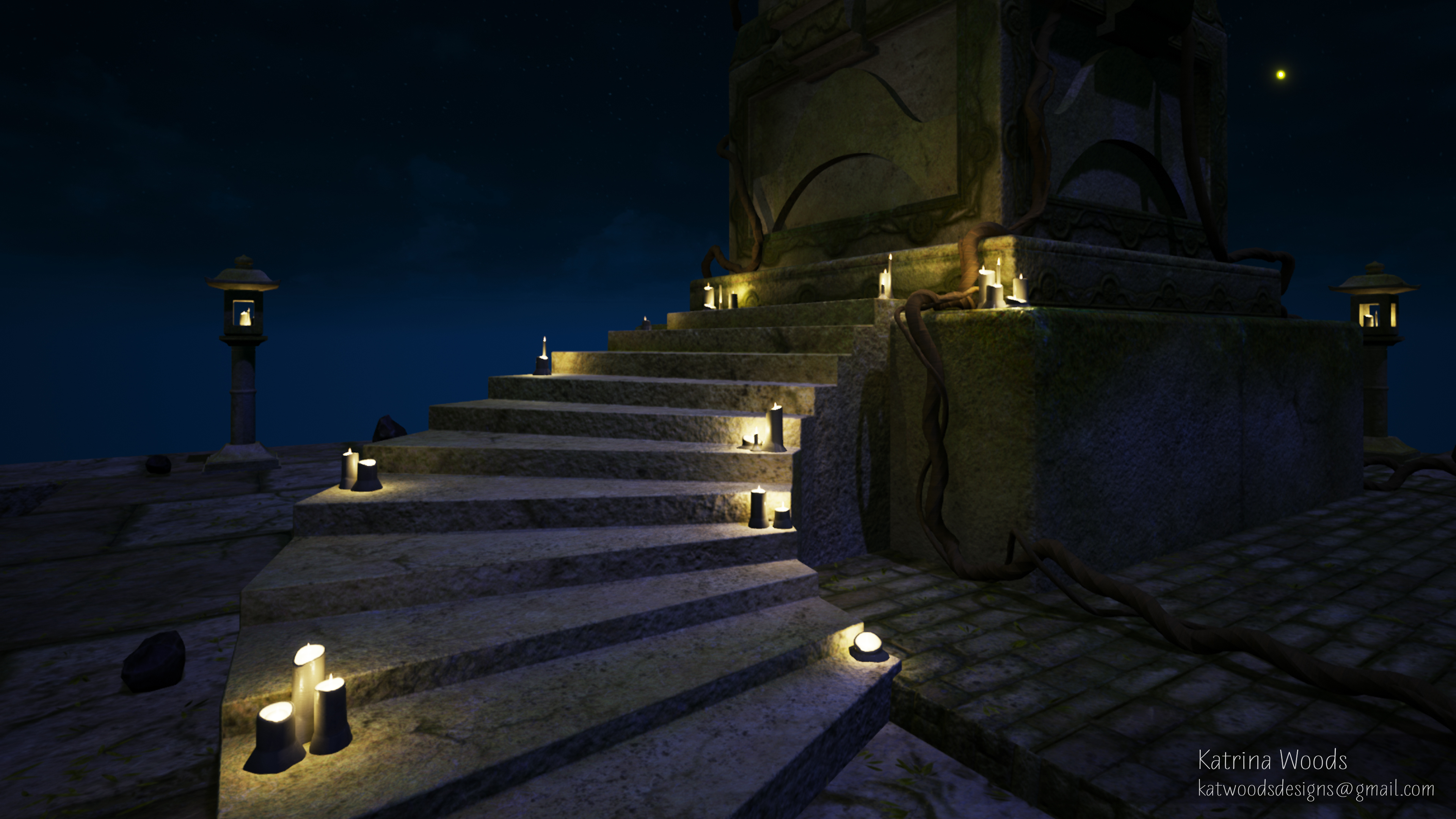
Original Concept art by Becca Hallstedt


This is my first piece using Trim Sheets, I have never used the workflow before. Everything except the rocks uses the trim. I plan to add more variation to the trim sheets and fix the seams in a few places as well as add many more layers of depth. This is my initial base texture placement and first pass at lighting ideas. I also plan to add a few more vines. Suggestions are greatly appreciated and thank you so much in advance!
Update: I have worked more on making the trim-sheet more broken up in color and used vertex painting to continue that process. I have added some leaf decals too. I also started my lighting and I have added various lights throughout the scene to highlight areas, but I need to lighten the scene overall, but not sure how to do that and keep the feel. Doing some research and looking for suggestions. Thank you so much for taking the time to offer any suggestions, comments or other critiques.


Original Concept art by Becca Hallstedt
