[WIP] Generic Car for Realtime ArchViz
FINAL UPDATE:

I'm considering this done, the last post has a small post-mortem, thanks to all, see you in the next one.
I'm documenting my process on designing and building a generic car (sedan) as a prop for use in realtime ArchViz, or games I guess, specifically in UE4.
All and any critique is always welcome, be it design, modeling, goal of the project etc.
This is my second time going through this process and I feel I need the exterior input to avoid making mistakes I might not even know I was making.
The goals are as follows:
- Exterior realism as a static prop first, this means good reflections and extra time and geometry (1x Subdiv) spent on reflective areas, which leads to the compromise...
- Simple interior and no moving parts, plastic body panels will follow FWN and medium poly workflow.
- Design wise I intend to focus on creating a generic asset as a background piece to compliment and provide scale to archviz scenes. The frustration with archviz and cars are that you either get flashy hypercars that distract and feel out of place in typical archviz scenes or existing vehicle designs that can be problematic in terms of licensing (and price), or again, distract from your scene.


This is the base shell for the body panels at 3x Subdiv.
I intend to use the method of shrinkwrapping all other panels onto this mesh to control the form of the individual panels.
The design is a mash of mid range sedans out there, modeling over photos of various models of cars as well as just freestyling and building in details I feel will work. Again, the intent is to avoid any specific brand identity.


The wireframe of the Base mesh at 0x Subdiv.
I'm not to sure about the wavyness of the front bottom lip and the amount that it juts out, but I will probably replace it with a plastic panel.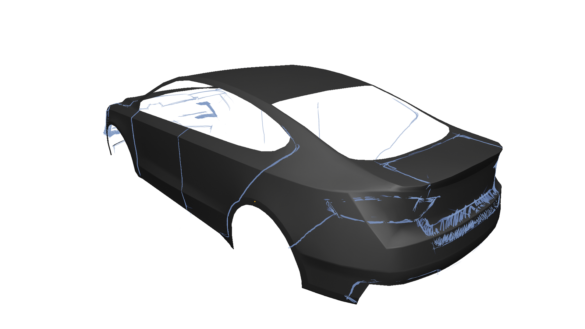
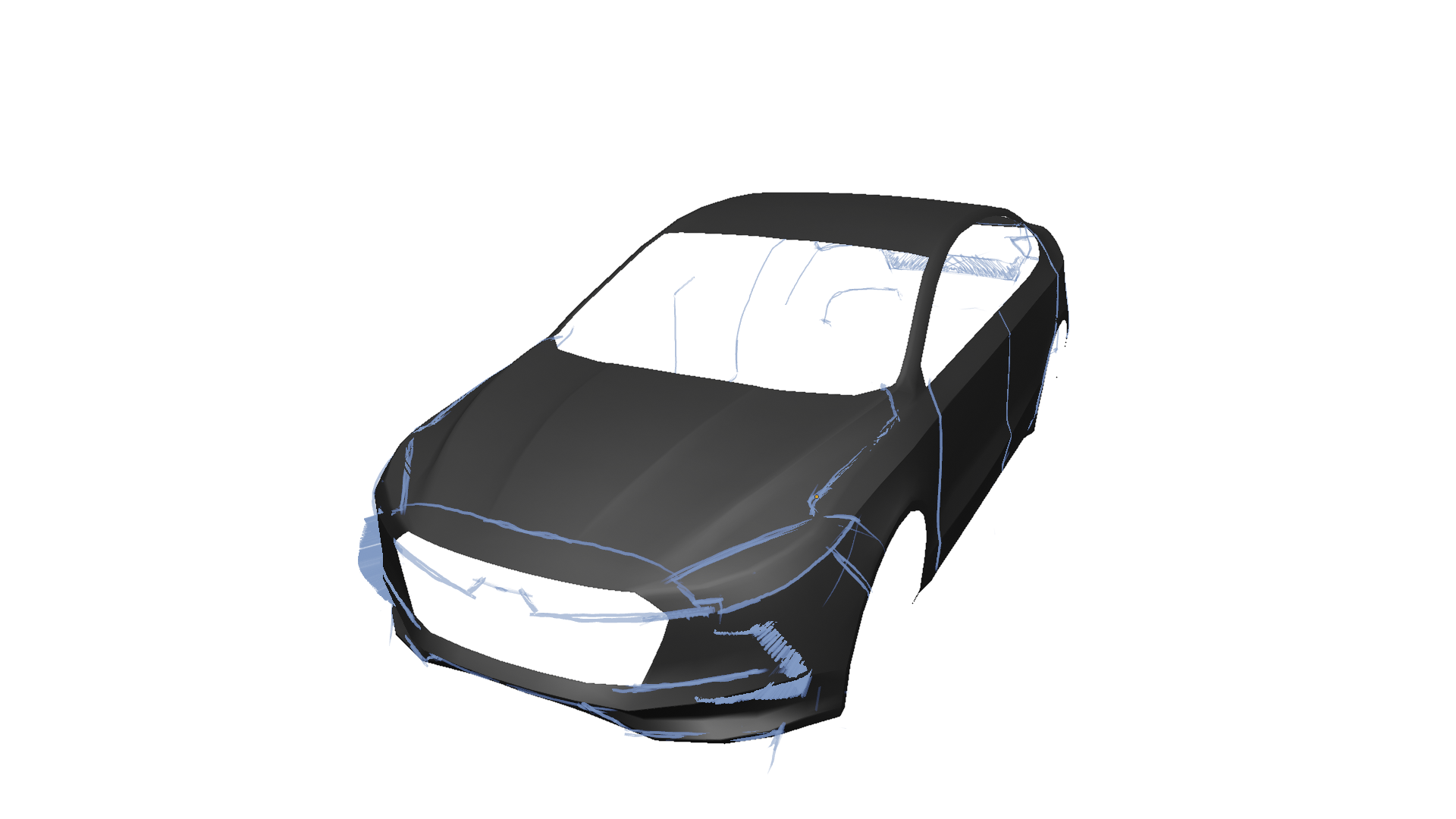


First sketch onto the mesh, setting out the panel gaps and getting a feel for the design and proportions of different elements.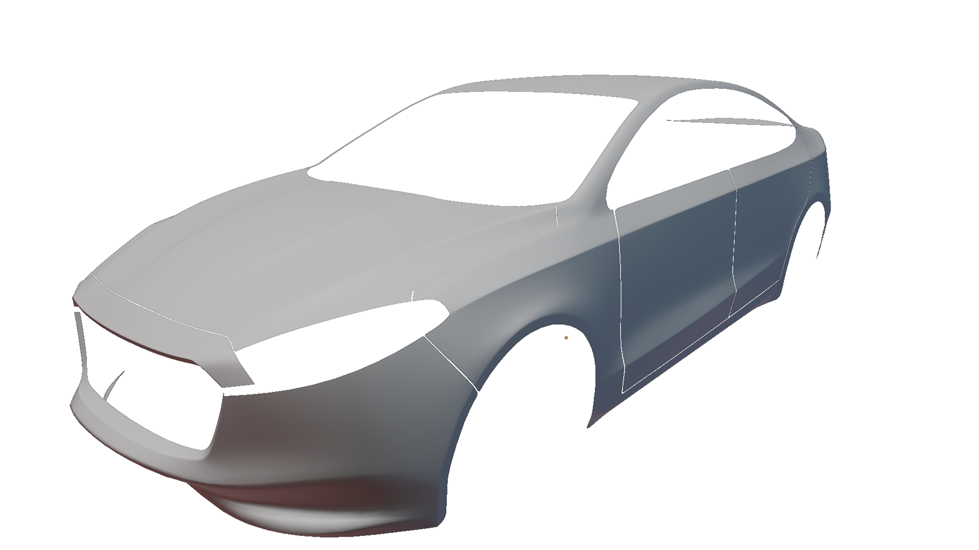
The front does feel Mercedes-y, which is strange
because there is no Merc' in my reference images, I'll see how it looks
when modeled.

The panels with their new edge loops and geometry for most of the car set out, still have to do the back light cutouts and panel gaps for the boot (trunk).
Replies
Looking forward to seeing more
I'm really liking the design, looks generic yet interesting. If anything I'd say that the rear door goes too far back, with that protrusion on the C pillar it looks flimsy.
This is what I mean for the wheel arches https://www.artstation.com/artwork/vzrmY , but here it doesn't seem like he used custom normals.