[WiP] Catacombs Corridor
This thread is to document my progress on a small scene I'm making. The project as a whole is meant as practice in environment art and material art. I hope to speed up my pipeline and iteration process and not get stuck on details. The idea is to not follow a specific piece of concept art, but to piece together several references.

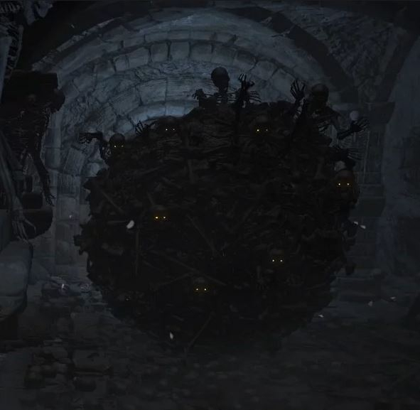
The idea is to add skulls and skeletal appendages that hang from the ceiling and stretch out from the walls and bone splinters on the mud. A wild and more "active" variant of the Paris catacombs, like that Dark Souls skeleton ball, except it's the catacomb's walls:


I also want to add some more hard-surface props and modular assets to the scene. Like a large coffin, busted wide open. Support pillars made of rock and decorated with bones. Maybe some faint, burning candles and other small decor props as well.

Replies
Here's one of the better mockups (not too sure about it though):
Did some rough lighting tests this morning:
Did some sculpting on the coffins today (rough decimated version in image).
Been trying to make a "centerpiece" for the scene a while now, I'm thinking something like this. Maybe more bones?
A stonger lighting to highlight your centerpiece more, or something to make it pop out more, maybe by contrasting it with some color, or a mix of both
You can try changing the color of the wax of your candles (or the flame if you want to go more "surnatural"), you can also change the color of the wall behind so that it will "bleed" color on your centerpiece, you can also add some cult objects, metallic stuff, for reflections (plated bones, mirrors, polished stones, whatever suit your tastes) , again depending on the atmosphere you are going for, you can play with the materials (copper, bronze, silver, gold, dragon glass ^^)
I don't have much time to look for better images, plus my line of thinking might not align with what you are going for but I hope it'll give you some inspirations.
Doing some cloth tests: It's a pain to get right with the distance field shadows, but I think I got something acceptable.
Today I tested adding some colors by making the urns red/green/blue. Also, made the candles a bit warmer and darker ambient lighting:
As for the skeletons
Mostly the ones in the middle. the one laying down and shiva over there with the extra limbs. You can keep them I'd just make it make sense somehow. Even if u put magic or something
Trying a more reserved and less animated variant of this one:
Please, if you have time, take a look and let me know if there's anything you think I should fix and/or change before that. Should I include another angle, remove an image, change the lighting, fix the DOF, tweak the bloom or even revisit some textures / meshes, please call it out.
1:
And again, thanks to everyone who has already given feedback. It means a lot.
These areas look weird though, there wouldn't be a seam on the edges like that since the blocks would be solid blocks.
Other than that I don't have much to complain about!
I brightened up the lighting a bit and fixed some small issues here and there:
This is the thumbnail on my Artstation, so the S-logo needs to be a bit ridiculously oversized :P I'll consider fixing the other images later on, but right now I need a proper weekend.
Though one thing I personally feel is missing right now, even though you are done. Some small flames in the candles and maybe some smoke. I think that would push the scene so much further as it currently distracts me personally that the candles got no flames.
@tynew hmm, I'll have to investigate that