The BRAWL² Tournament Challenge has been announced!
It starts May 12, and ends Oct 17. Let's see what you got!
https://polycount.com/discussion/237047/the-brawl²-tournament
It starts May 12, and ends Oct 17. Let's see what you got!
https://polycount.com/discussion/237047/the-brawl²-tournament
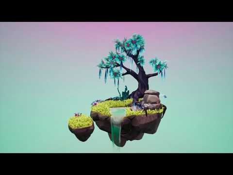
[UE4] Enchanted Island - Diorama
Hi everyone, I'm a 3D artist freelance and this is the first time I'm posting here.
I spent 4 weeks concepting and modelling this project in personal time. I tryed to improve my knowledge about stylized assets creation so I decided to focus on small number of props, planning layout, shapes, colors palette and balancing them.
I would love to hear your feedback, your comments are welcome!
More detail and breakdown on my artstation page.


 https://www.youtube.com/watch?v=CeRAieFmV1M
Replies
You might be right: for the colour palette my inspiration was the "Island Environment Design" by John Nevarez of Angry Birds movie so I guess the yellow grass came from this... Maybe final color correction suggested a different result
Also a note on the foliage: if your intention is real-time/ game use, you'd like want to bake down leaves and grass onto a lowpoly model/ foliage cards
Presentation-wise I'd also maybe take out the Sketchfab player from your Artstation post. It looks so different than your other renders. Or try to closer match it to your renders trough their post processing effects