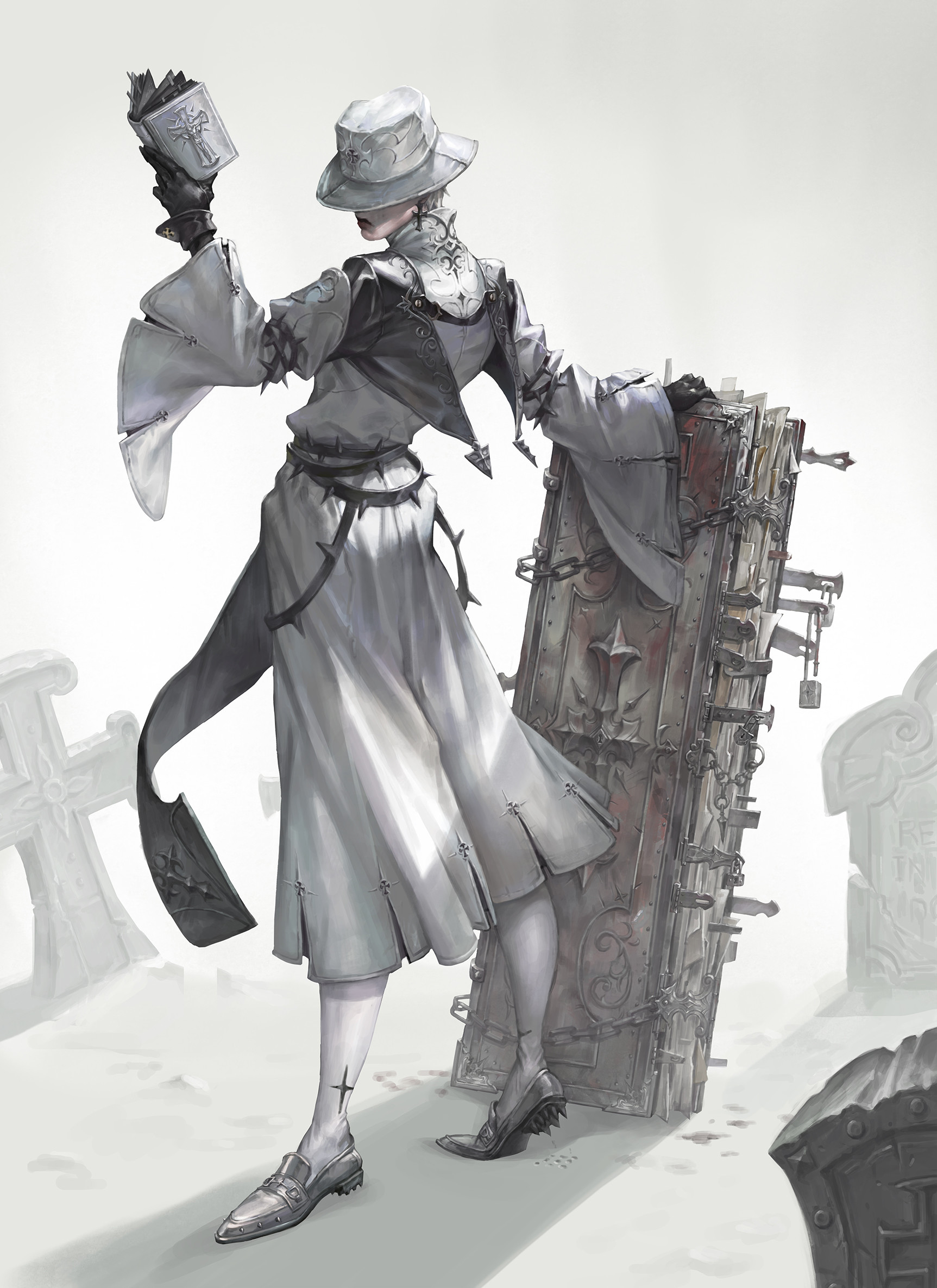
Narcissism Priest Female Version (Realtime Model Portfolio Piece) FINISHED
Latest Progress:

I am over these coming months in my spare time work on a beautiful concept by Hayun Lee, but as a girl instead of a guy. My goal for the project is for the character to be at a quality for a AAA game. Any feedback would be welcome as I really want to push myself as far as I can on this project.


Currently I have as of now blocked in all the major elements, and for the face I have got the base up.
Body Screenshot

Face Closeup

Moving forward my focus will be on the face, hair and the hat. But I will try to work a bit on as many of the elements as possible to keep the quality going up relatively consistent.

I am over these coming months in my spare time work on a beautiful concept by Hayun Lee, but as a girl instead of a guy. My goal for the project is for the character to be at a quality for a AAA game. Any feedback would be welcome as I really want to push myself as far as I can on this project.


Currently I have as of now blocked in all the major elements, and for the face I have got the base up.
Body Screenshot

Face Closeup

Moving forward my focus will be on the face, hair and the hat. But I will try to work a bit on as many of the elements as possible to keep the quality going up relatively consistent.

Replies
Feedback more than welcome.
Are you thinking of either the seam line in red, the folds going down in blue or are you thinking of the entire distance between the fabric between the legs making it look like strousers?
And yea I am looking forward to be making the book as well, a lot of tiny cool details to both make and then texture! Thanks again man
Body
Head
Detail close-ups
What I got left to polish up now:
Shoulders
Arms
Gloves
Socks
Belts
Shoes
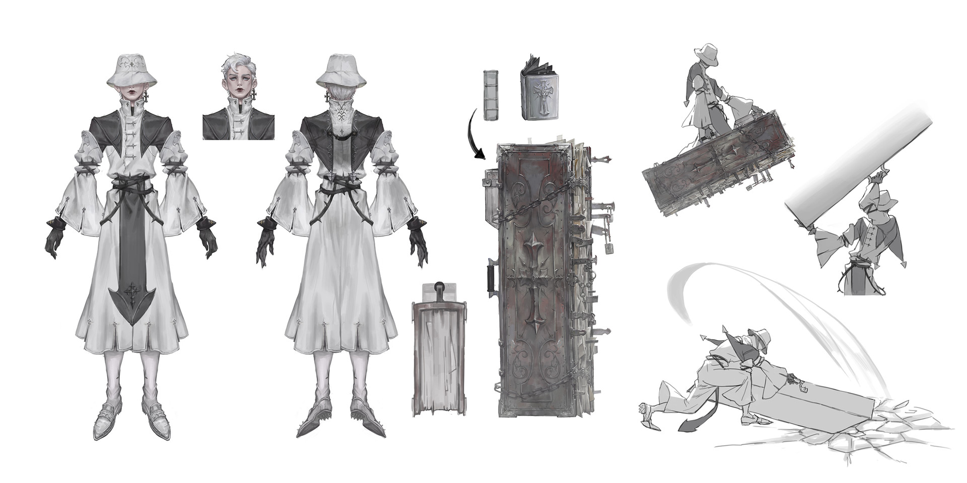
I love the character design and the character sheet layout illustrating all the details.
Right now the spiky belt loops look too thin/small and feel underwhelming
Great work nonetheless, I look forward to seeing the model all textured!
And regarding the details on the back you are entirely correct. I mask details on the semi finalized coat and from that extract with 0 thickness. Then I work on the flat plane and retopo it the fastest way possible, usually zremesher is enough, but I clean some of the spikes up in Maya to get as clean as possibly I can. Then I give it thickness with panel-loops and detail them.
I hope that explains it properly
I have finished up the highpoly of the body now so I have the two books left.
Complete body
Details
The character design page illustrating the use of her book is hilarious. I wonder what's filled in those pages that makes her want to beat up the book over the ground.
For now I have finished the book and I am currently retopologizing the character.
The body is on 2 textures sets of 4K each, divided in to cloth and the other one being leather and details. The face is right now on a 4K texture map.
The body with face is currently at 76K tri
Face Closeup
It is time consuming but well worth it. What are your references? How many different texture strips do you have? Right now your base is good, but there needs to be a variety length and width in the hair cards
My references are these:
And this is currently my diffuse downsampled:
I have also started to texture the leather parts of the outfit. So I will keep up with that and finish up her textures next.
Details:
I got the teeth left to do and also I got to do the rigging to start my work on a final render, I will probably tweak the textures some when I got it posed up. I am thinking of giving it some story elements in the texture with blood splatter and a scene that could be like a diorama. Not sure on the final scene yet.
So I have rigged her and started to pose her.
I have tried two different poses and I am also playing around with different backgrounds. The skinning is not final and the same with some of the texture work, I have noticed some things I want to change now with the textures when I have started to give the scene a more fleshed out lighting.
I will also try a new pose later this weekend one that is a bit more neutral, not super happy with the second one.
I would love feedback on anything you people can find.
Thanks for watching.
background color tests
Pose number 2 test
And I am finally done!
Thanks to everyone who helped me out on this one. It have been a blast.
I have more high-resolution images over at my artstation, breakdowns and the like as well.
You really nailed down the lighting of the scene, your face and hair texture in the last shot are great. I'm curious how did you set up your hair shading? If you can recommend any resources I'd appreciate it! I'm trying to work with white hair as well and it doesn't look too great haha
I'm excited to see your next piece
@bkost Thank you for the nice comment and thank you for helping me out during the process, was damn nice feedback!
Regarding the hair then. I started out by following this tutorial and copying the hair shader right up and down.
But I had to do some tweaks as her hair is dark brown while the one I am making was white. There was a lot of playing with it back and forth to end up with the result I got in the end, but to give you an headstart I can show you my settings and a quick breakdown.
First of all your scale determines a lot of these settings, so before you can even try to mimic my settings you need to match the scale I worked of.
Now when you got that covered here you go on the settings.
I would say that most of the final look comes down to playing with your specular values in conjunction with your Scatter Depth and Translucency Depth.
Scatter depth controls the softness, and if you go to overboard with it it looses all the interesting shadows. But to low and you loose the soft feeling of hair.
Translucency depth helps you get more influence from lights, and the shorter the haircards the lower this value should be. Unless you want the hair to pick up all the light there is. I chose a lower value as the hair looked wonky under her hat with a too high value.
To play with the specular I recommend that you color the hair a bit so you do not have white highlights on a white base. To do that I just changed the albedo tint color.
I hope this helps out Bkost. Just do not forget to play around with the values, it is the best way to learn.
Thank you Nuclear! Cheers
@slosh Wow thanks Slosh, it means a lot to hear that from you!