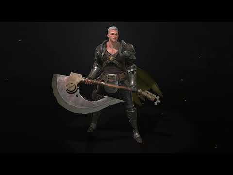
StarMan Character [Completed]
Progress Update - Completed
 https://www.youtube.com/watch?v=LhTK2yqL42I
-------------------------------------
Hi all, here I'll be logging my progress on a brilliant character concept piece by Russell Dongjun Lu.
During this journey I wish to become more comfortable with:
Below is my inital step in digesting the concept and exploring the shapes, material breakup, and gathering reference. After, I did a quick blockout and got a feel for the model in 3d space.


 https://www.youtube.com/watch?v=LhTK2yqL42I
-------------------------------------
Hi all, here I'll be logging my progress on a brilliant character concept piece by Russell Dongjun Lu.
During this journey I wish to become more comfortable with:
- hardsurface
- matching concept work
- outfit varieties (Armor on/off)
- posing (rigged maybe?)
Below is my inital step in digesting the concept and exploring the shapes, material breakup, and gathering reference. After, I did a quick blockout and got a feel for the model in 3d space.


Replies
Are you tackling armour in Maya?
Hey @Lou_ I'm building quick geo in blender then refining in zbrush (boolean/dynamesh detail).
I've also noticed with this workflow that I can work with lowpoly and highpoly almost simultaneously. Once I get to retopo stage, it won't take nearly as long.
I need to continue refining shapes, HP anatomy, and matching face likeness. (note: I don't want an extreme anime face, somewhere in between realistic and the concept)
Trying to work on the face likeness now. I'm running into serious trouble with this face. I'm a little lost in how to nail down likeness from this 2d concept.
edit: focusing on general oval/triangular face shape before diving into details.
In the quarter angle view, the cheekbone to the lips look blocky. I need to figure out the correct plane changes for this Yang Yang guy.
And here's a little peak into my Trello board, it's a great way to stay organized. I recommend creating a to do list when tackling a big project, it helps you keep on track and leaves you feeling less overwhelmed. No need to remember what needs to be done if you have it written down
edit: fixed pose
Now to figure out how to translate proportion edits to a-pose model
Built his axe today. Next are his gloves, sleeves, and finally try and hit his face likeness. Then onto hair cards, retopo, bakes and texture. I've been thinking on how to tackle his short stubbly hair with cards. Maybe something like Del's hair from Gears of War
I think the folds on the leather pants make the leather seem really thin, but if he is a warrior he probably have thicker leather that would create more silhouette changes and heavier creases. Even in the concept his pants have more volume than in your sculpt. His legs are also a tad to thin I think over his thighs, his legs are massive and got a nice tapering shape while your legs are very straight. I did a quick thing in photoshop to illustrate what I mean with the shapes.
I also think the creases on his tank top are to thin, yours read like a cotton tank top while in the concept it seems to be either some kind of thick linen or medium thick leather. Notice the green lines next to his tummy on the concept, he got way more silhouette change there than you have right now.
I think overall your sculpt is lacking curves right now, like subtle curves that give it a bit more of a oumph, I did a quick liquify on the weapon to illustrate.
Thank you Bigtime for the food for thought, giving some backstory and thinking of the character's environment/circumstances is a great way to help flesh out the model.
Hey Nuclear, I appreciate the critique and paintover. I've pushed the forms some more and added some more curves here and there. I need to work on hitting that 'oumph' / study up on shape language. Cheers
@BIGTIMEMASTER
@Nuclear Angel
Here's the glove texture so far, I'd still like to push it further. Any thoughts?
Hey Callum, thank you! Now that I've wrapped up the glove, I've got a few more tweaks with the HP and face sculpt. Then I should be on to retopo/UV and finally texturing!
@AndresZambrano @CallumBaws
My bakes are complete for the Weapons and Armor. Skin/Face retopo needs to be completed and face sculpt still needs to be done. I'm struggling with the face likeness.
Here's my axe texture wip. Working on getting some wear and slashing streaks into the steel blade.
edit: updated
So I think the concept has a lot more contrast in the Axe, especially around the rim of the axe (the blade). Other than that looking quite nice.
I think you could try and highlight the metal edges a bit more with wear to get a bit more shine. Really show off those hard surface forms!
Thank you Lou. That tutorial was all by carvuliero! He has some great anatomy knowledge. Good idea with the axe.
Worked on the head a little bit today, much happier with the results I'm getting after some face and skull studies. (Still lots to learn)
I'm going to move onto the armor texturing and come back to the HP face before I retopo and uv.
@Alex Javor @Lou_
Here is the baked head and clothing texture update.
Any suggestions on the color balance of the character? Cheers
Going to be focusing on the Posing, Hair Shader, Cape, and Lighting in the next couple days. I hope to be done by the end of the week. I'm struggling a bit the hair shader, I need to add in some more to fill in the gaps and figure out a proper shader setup. I'd like to give him white hair to help fit the concept but it doesn't read well.
I think his feet are a bit to small as well.
I would also just add some more loops to break up these holes. They will be to visible on face closups and 100 extra triangles to give your closeups more oumph would go a long way.
High res photos on artstation