The BRAWL² Tournament Challenge has been announced!
It starts May 12, and ends Oct 17. Let's see what you got!
https://polycount.com/discussion/237047/the-brawl²-tournament
It starts May 12, and ends Oct 17. Let's see what you got!
https://polycount.com/discussion/237047/the-brawl²-tournament
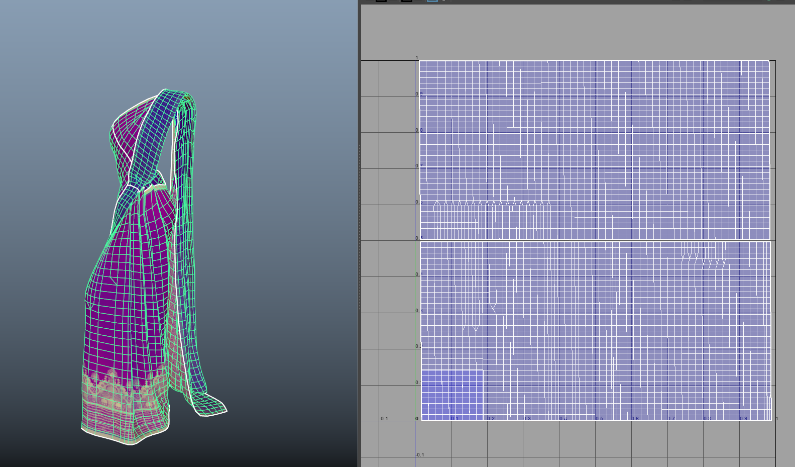
Is this good judgement about topology and mesh design?
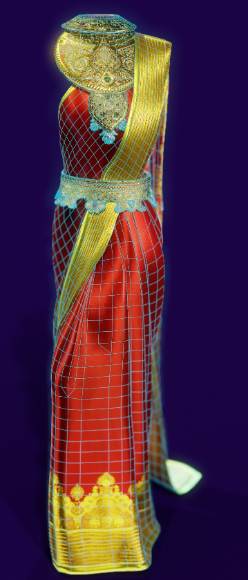
This 3d sari is part of a piece solely for portfolio purposes. However, I am trying to design it as if it were a boss character in a fighting game. As such, the bottom half of this sari I would expect to move dynamically as well as the back part -- a cloth simulation or animations. Imagine a swirling sword attack and the bottom flares out like a whirling dervish.
I draped it in Marvelous Designer following the real life method both for authenticity, but also because this allowed me to use the 2d pattern in maya to get these great UV's. This really made texturing a breeze and allowed for lots of easy prototyping as I could project real world patterns directly.
It also made retopo easy as well. Just subdivide a rectangle and use wrap deformer.
So those are the pro's, but it does seem like it may be denser than necessary, Lacking experience with cloth simulations, I speculate that if these folds were to open and swoosh around dynamically, it would probably need so much geometry if we want to look pretty realistic, or at least a lot of testing would be needed to figure out which area's specifically might be trimmed out. As such, I've only stitched off a few lines and put most importance just on appearance for the final render. Of course I could go in there and trim out a few hundred tri's, but if I was hypothetically moving this forward down a pipeline I think it would be best to thoroughly test with the animations beforehand, right?
Even as is, we are only at 16k tri's which I don't think is outrageous for a AAA boss character. Of course there is more stuff in the scene and quite a few materials... but I have just been really unsure about whether or not the way I've built this would be considered efficient enough by AAA studios. Considering the overall workflow and the pro's coming from building it the way I did, I think it's the smartest possible solution, but I'd really appreciate if anybody can share their opinion. Definitely if it's just straight up a no-go for any reason please tell me -- I'll want to get it fixed ASAP.
Thanks


Replies
Without the pose or animation, the topo looks way overkill.
My 2 cents.