[FINISHED] Stylized Witch House
Hi everyone! I've been doing my final graduation project and wanted to share and document my progress here.The idea is to make a stylized witch house with all interior props, and afterwards exterior environment. Mentor: Ana Perišić
I've started the project by collecting numerous reference photos. I decided to first work on the house itself, then props, and at the end environment of the yard of the house.
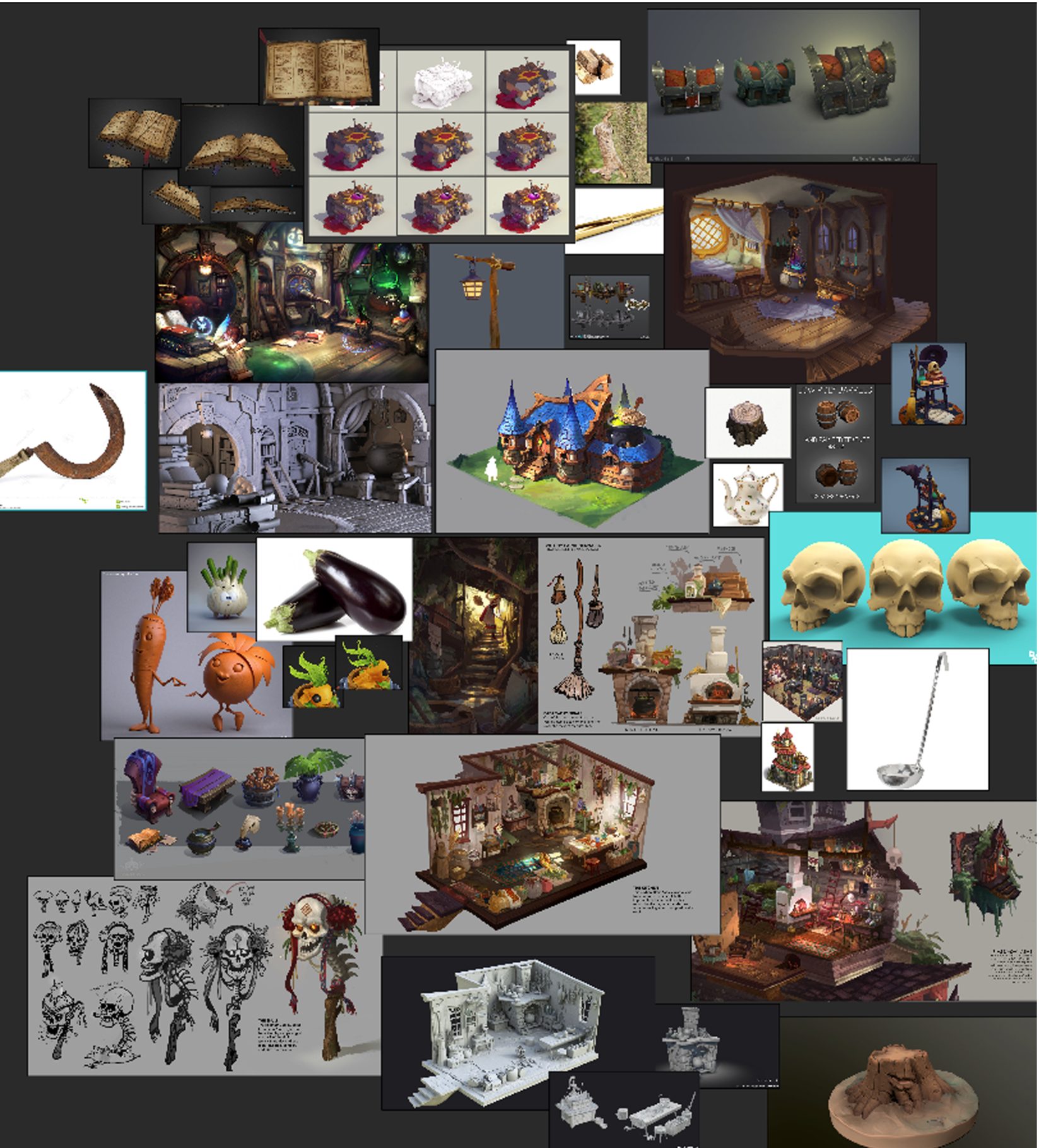
These are some references, missing about 30-40 of them in total:
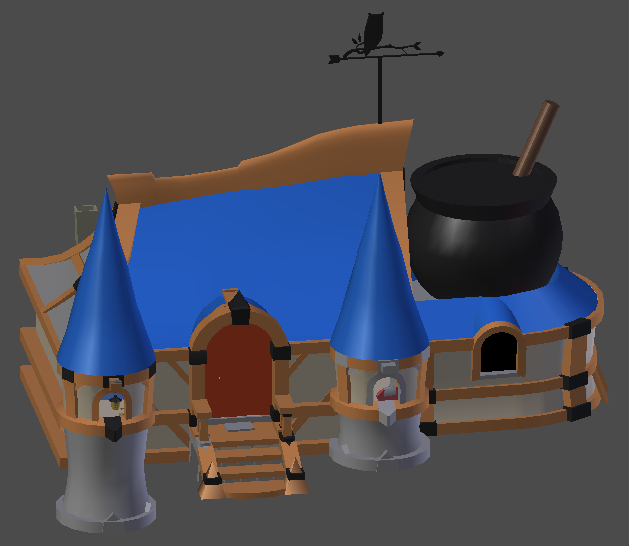
After that, I went straight to work. I started by blocking out, and then modeling the low poly of the house. I used Blender for the block out phase. I made one end of the tower slightly bigger, due to the uneven terrain of the ground in the yard.
Concept art of the house was made by Yiteng Luo.
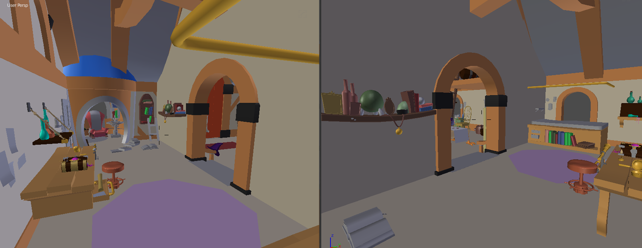
Then, I went on doing the interior of the house. Again, I did the block out phase and started experimenting with the placement of the different props around the house. Most of the low poly objects were again made in Blender.
Concept art used as a main reference for modeling the interior of the house was done by Leia Ham.


Next, I started editing details on objects in Zbrush. These are the current models I managed to finish in Zbrush:


These are some references, missing about 30-40 of them in total:

After that, I went straight to work.
Concept art of the house was made by Yiteng Luo.

Then, I went on doing the interior of the house. Again, I did the block out phase and started experimenting with the placement of the different props around the house. Most of the low poly objects were again made in Blender.
Concept art used as a main reference for modeling the interior of the house was done by Leia Ham.


Next, I started editing details on objects in Zbrush. These are the current models I managed to finish in Zbrush:


Next thing I will be working on is high poly of the house and then baking and texturing all the models.
Comments and crits welcome! Thanks in advance! 

Replies
I made two tileable textures. One for the floor of the house and the other for the wall. I made a low poly in Blender, sculpted high poly in Zbrush and afterwards painted textures in 3Dcoat and Substance Painter.
Then, I started baking and texturing the house. All the baking and the texturing, again, I've done in Substance Painter and in 3dcoat.
I imported it into Unreal Engine, just to see the overall look of the interior of the house.
Next up is modeling the outside of the house and then doing the interior.
Comments and crits welcome! Thanks in advance!
And a little critique:
In my opinion, the wood texture is slightly oversaturated at this point. Also, you can use.. i think World Position in the material, to make the color gradients from violet to light blue on the roof, as it is on the concept
Yes, I see it now, that it really is a bit oversaturated. Will fix that in the next iteration of work.
As for the roof, it consists of 6 different roof tiles, which I then copied and placed in different places, so I can't make a gradient like that.
I started texturing props which I will place outside of the house:
I made three different tileable textures for the ground, which I will then mix:
The next thing I did is, I made one tree bunk and three different tree branches as planes. I also made two tree branches without leaves. I copied these branches, scaled them and placed on different spots. I got a couple of different trees:
Next up is the terrain.
Comments and crits welcome! Thanks in advance!
I did texturing for a few more assets. Some of them are for the exterior, while others are going to be placed inside of the house.
I did the terrain in Zbrush. I started with the basic form and ended up making a part of it slightly higher.
I imported everything done so far in Unreal Engine. I started experimenting with lighting, fog and post processing volume.
Next up is texturing the remaining assets.
Comments and crits welcome! Thanks in advance!
As for the outside, the island I feel should have a little more level or flat space around the building. The immediate slope downward gives an uncomfortable feel like you'll just slide and fall off the floating island upon exiting the house. esp on left side of house.
The reflections seem a bit intense on the wood and roofing material.
As for the inside there are only a few things I immediately noticed,
1 being the fireplace is location in-front of a window?
2nd would be something about the walls doesn't feel right. Either not enough texture or something. Maybe try a "wallpaper".
3rd, the area around the ladder, fireplace,and props feels a bit crowded and uncomfortable. I would suggest laying those out differently, making the ladder more accessible.
I love the details you modeled and textured. Great job, your hard work is paying off!
I published the high poly assets on artstation: https://www.artstation.com/artwork/nQBAar
Hope you like it and thank you for your time!
Thank you everyone for the comments and support, it was a long but fun journey!
Artstation link: https://www.artstation.com/artwork/lVQWlJ
Made also a walkthrough video of the scene: https://www.youtube.com/watch?v=HdUn5qtEZqM
Hope you like it and thank you for your time!