Forgotten Temple
Looking for feedback on this!
I've been wanting to do an environment on unreal engine 4 for a long time, so her it is
Beauty render.


Props & Rocks.


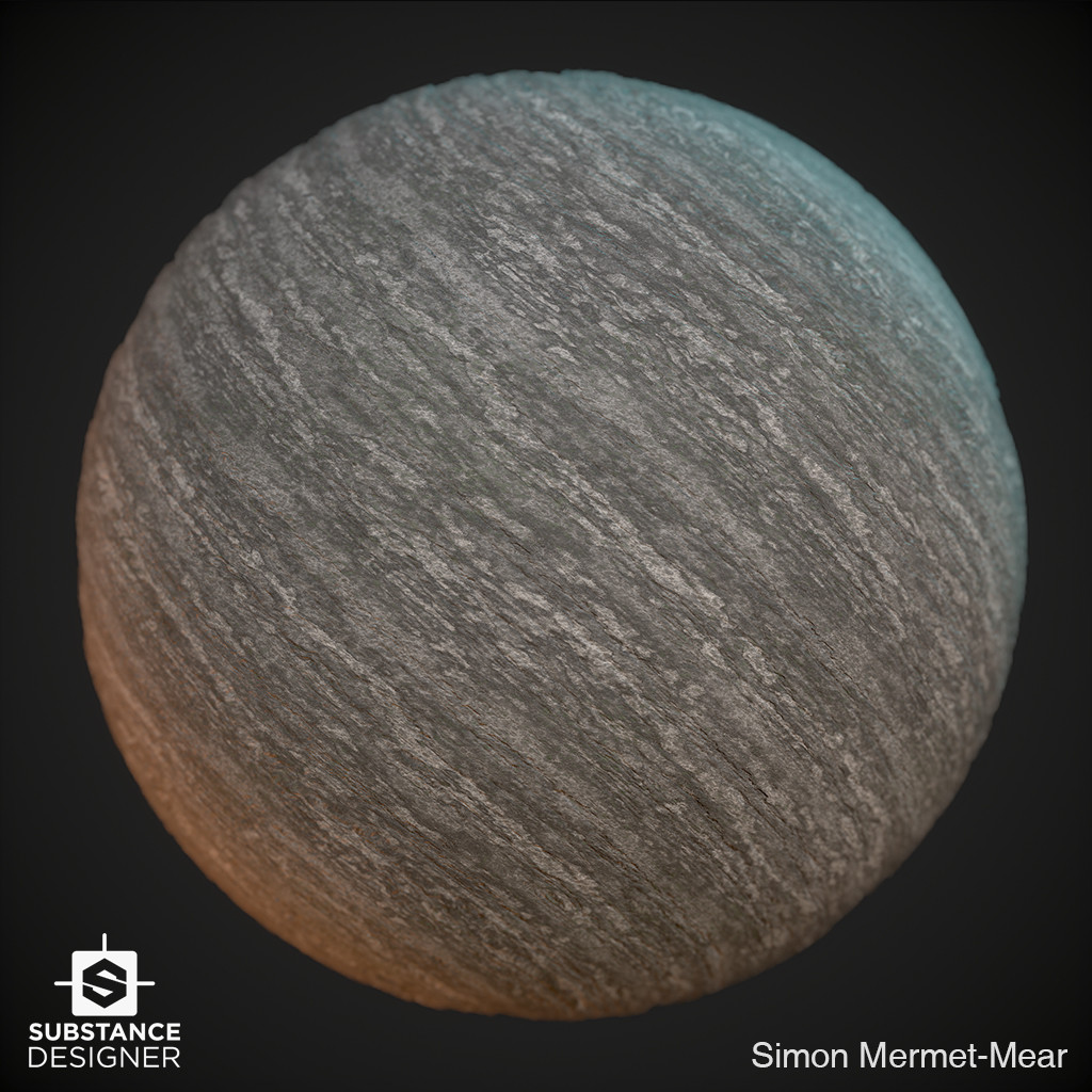
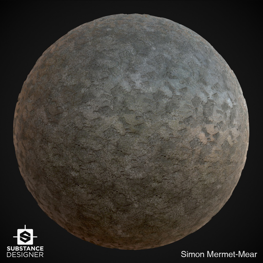
Textures.
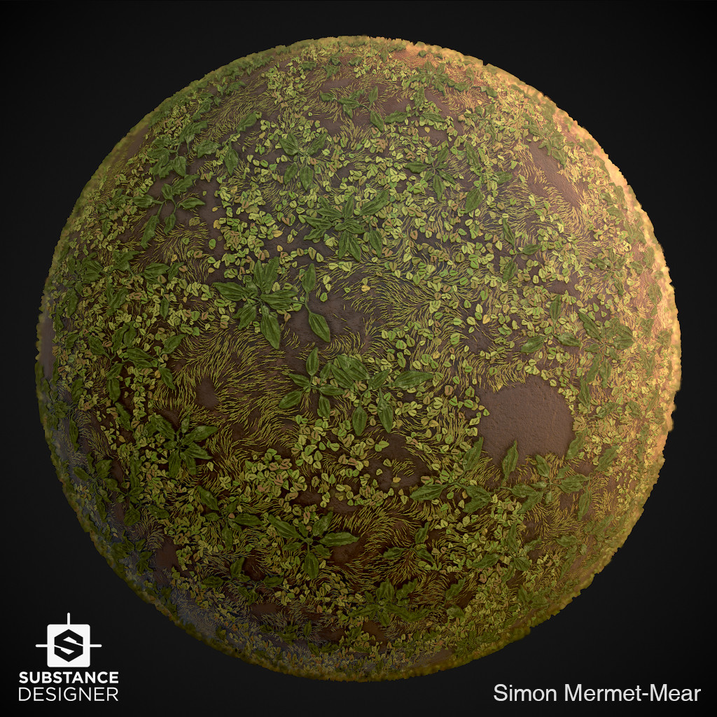
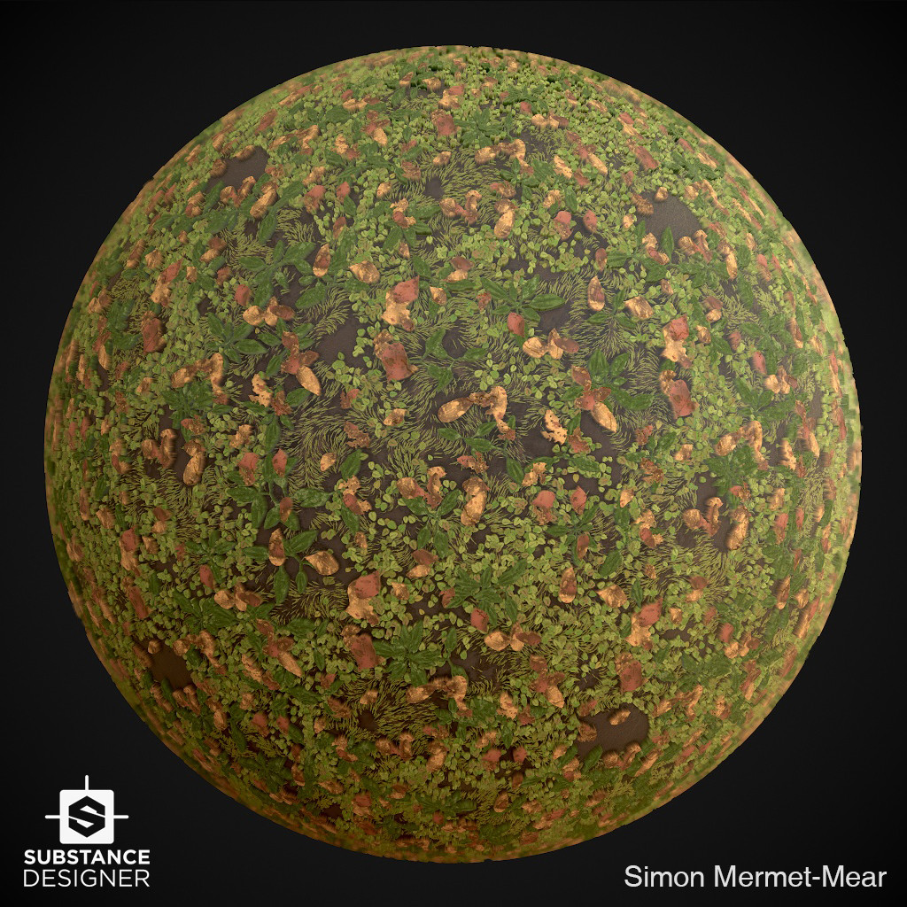

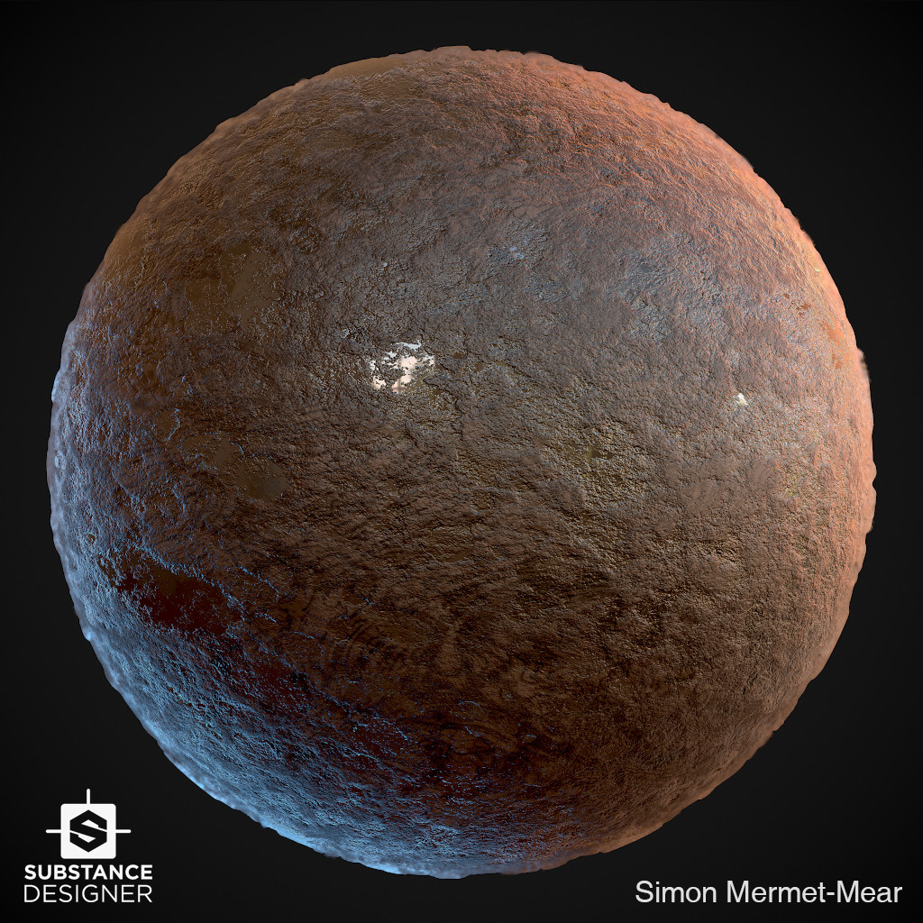
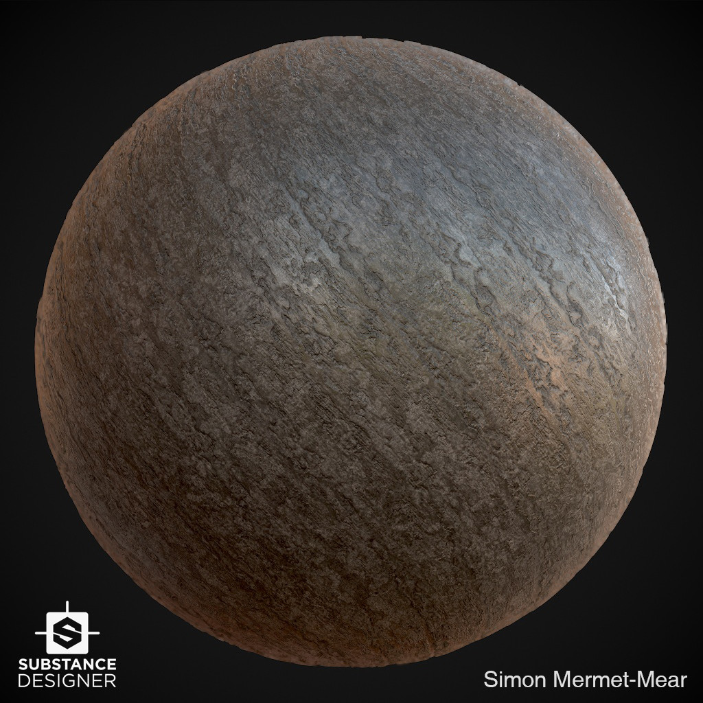
I've been wanting to do an environment on unreal engine 4 for a long time, so her it is
Done in unreal engine 4 with maya, zbrush, speedtree, substance painter and designer.
A link to my artstation if you want to see more : https://www.artstation.com/droswing
Beauty render.


Foliages.


Props & Rocks.


Textures.


Thanks for your help 

Replies
Looks good overall, I think your individual assets need a bit of work, floor foliage feels a bit stiff - the hanging stuff looks nice from what I can tell (no breakdown shot). Bricks are a bit boring, and rock textures feel a bit low res? just a bit blobby compared to everything else. Your Designer work is pretty good though!
But as a scene I think its good! Nice job!
2.The foliage texture could use more color/value variation and some more rotational variation.
3.The arch and the brick walls seem to have no normal map detail, they look sort of late PS2-ish, which is strabge cause in isolation the Substance materials look pretty cool. I'd make sure you export presets work fine, and in general increase the normal depth and maybe make them less rough regardless.