Zbrush - Adaptive skin not looking like Zspheres
Hello All,
I'm having issues with Zspheres. Could anyone help tell me what I'm doing wrong?
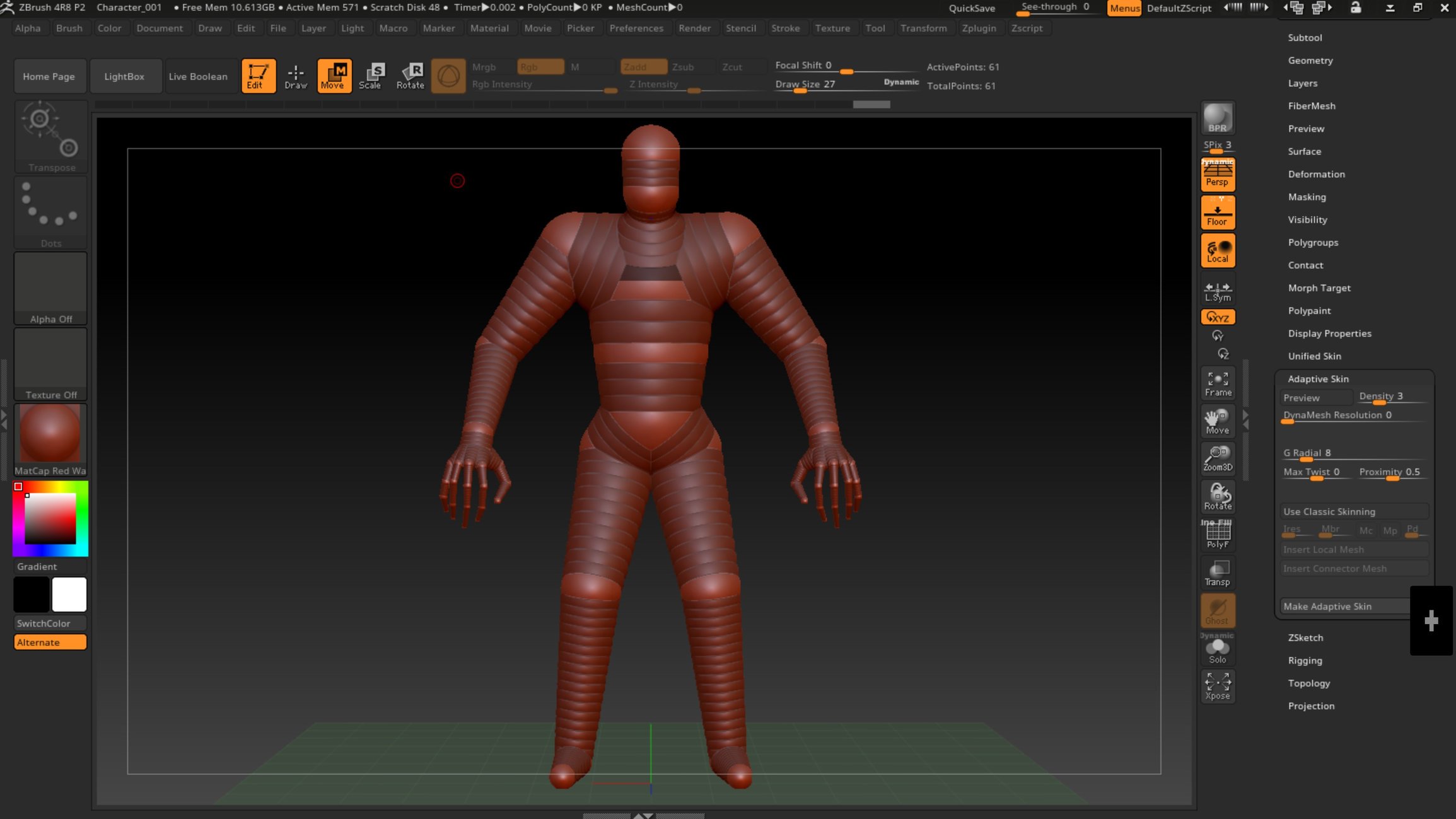
Here is my zspheres:

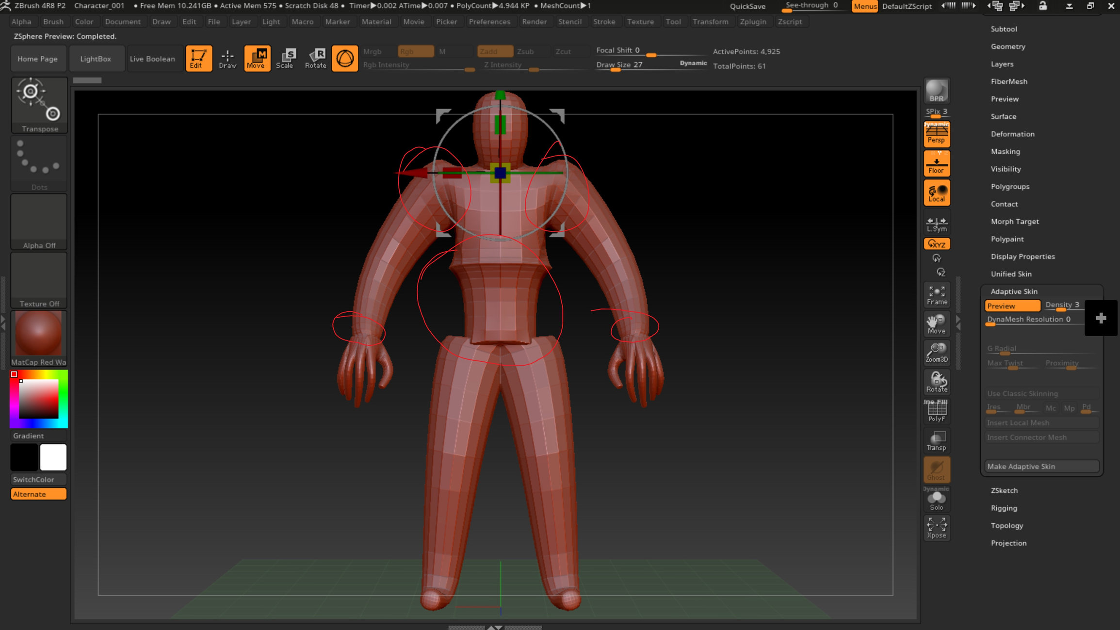
Here is the adaptive skin preview with a density of 3:

I've spent some time digging through forums and reading on pixologic on how Zspheres work. I've made sure they aren't rotated in any funky ways and increased the size. I'm sure it's something simple that I'm missing, but after several hours of looking for the answer I wanted to ask for help. Thank you in advance for any suggestions/solutions.
I'm having issues with Zspheres. Could anyone help tell me what I'm doing wrong?
Here is my zspheres:

Here is the adaptive skin preview with a density of 3:

I've spent some time digging through forums and reading on pixologic on how Zspheres work. I've made sure they aren't rotated in any funky ways and increased the size. I'm sure it's something simple that I'm missing, but after several hours of looking for the answer I wanted to ask for help. Thank you in advance for any suggestions/solutions.
Replies
If you are getting those sharp shapes just move the zspheres farther apart. Remember you want a sketch of the form to start your character, you can manipulate its exact proportions while sculpting. With zspheres you are really after the base structure. Here is one of mine below.
I really love zspheres but they are not perfect so I usually sculpt out the main form then take the base mesh into a 3d app, delete half the mesh then align the center verts and use a symmetry modifier to make the base perfectly balanced. At that stage you can alter the mesh if you need to. Then take it back into zBrush and get going.
Cheers
I cant get that pinch. maybe someone will rock up with the answer. In the meantime though try make another figure using the minimum number of zspheres just as a test. Here is a basic one, but it will give you everything you need.
Alright so I broke it down to the simplest I could, two Zspheres.
Zsphere:
Adaptive Skin Preview:
I've read this on pixologic's documentation:
So the root Sphere has no geometry, I understand that, but I do not see that type of pinch in your meshes or any that I've looked at online. The documentation also says the root sphere will only be skinned (adaptive) if it has a sphere on both ends which my character model has.
I BELIEVE my issue is that my link spheres intersect a lot as you mentioned in your first reply regarding the groin area. I didn't have time to redo that model today, but I will try to replicate your character with this in mind and see what results I get. I still do not understand the sharp pinching in the torso in my first post, but will give it another shot and hope for the best.
Thank you again.
Cheers