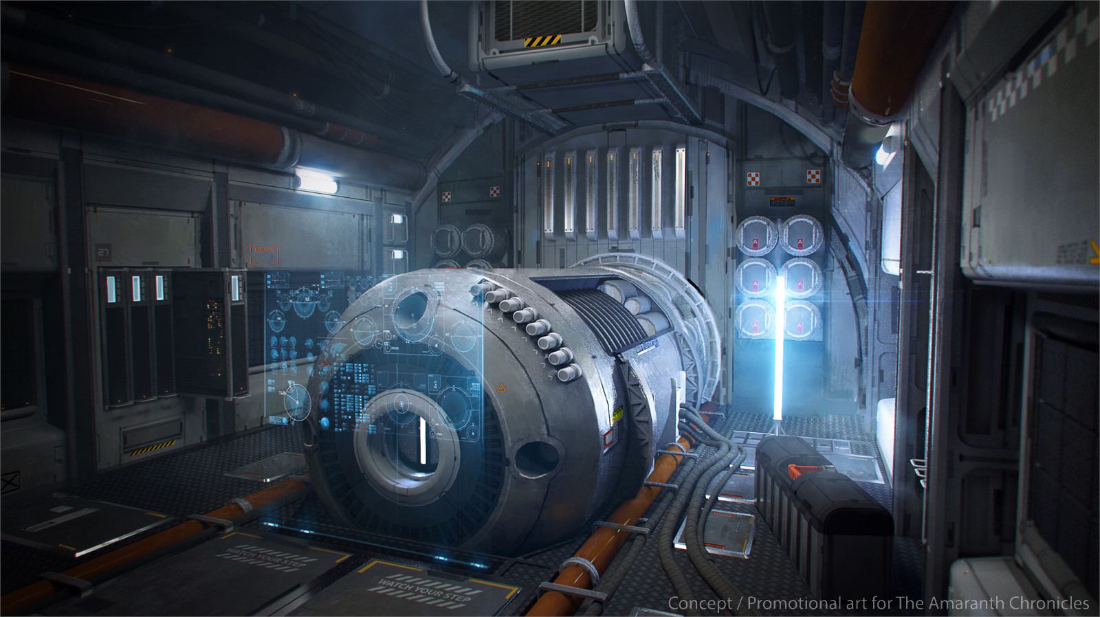
Sci-FI Corner Room Scene
Hey everybody. I have been wanted to make a good Sci-fi portfolio piece for a while. Did some looking around the internet which lead me to this concept piece by Alexey Yakovlev. Really loved the look and feel of the piece and was sold on it instantly.
Got started on the low poly and tried to break off a few sections so it can be more modular for Unreal. However on some parts i was having fun making and so i might have made it a bit more detailed than i intended at the initial stage of the project but oh well.


Got started on the low poly and tried to break off a few sections so it can be more modular for Unreal. However on some parts i was having fun making and so i might have made it a bit more detailed than i intended at the initial stage of the project but oh well.


Replies
I see you have many black corners in your scene. Try to increase the base color values of your objects to mid-range or brighter values, it will help the GI to be more visible. They affect how much visible the lighting will be. For example, darker values make the lighting less noticeable.
If anybody has any crit on my lighting or anything about my scene tbh i would be more than happy to hear it
How did you make the piping and wires on the floor?
For the actual renders i am primarily going to still try match it up with the concept and have a few other angles.
Making one of the panels popped up and at an angle to make it look like its being worked on.
Adding a corridor to help give the scene a little more focal interest by turning one of the wall panels 90 degrees, could also add a door trim to it to make it look like its got a shut off safety door?
Apart from that going to be calling this portfolio piece finished now, was a great fun scene to work on and actually gained a lot from it.
Quick breakdown shot of all the models used in my scene.
And congratulations on the frontage
orig:
Updates:
I'd also really consider making that railing a color or steel or something with a bit more contrast. As it's the focal point of the scene. A spotlight on the elevator from above would be good too. (If done, I'd reduce the amount of light from the wall panels).
https://img-new.cgtrader.com/items/1895809/663b1e6d3e/stainless-steel-railings-high-and-low-poly-3d-model-obj-mtl-3ds-fbx-dxf-stl-dae.jpg