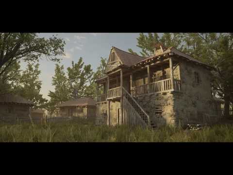
[UE4] The Old Village
This is a personal project I've been working on in my spare time based off an old picture of a house.
All tileable material were hand-sculpted in Zbrush and textured inside Substance Designer. running in Unreal Engine 4.Hope you like it!
https://www.artstation.com/artwork/DqzlA
80lvl Interview: https://80.lv/articles/romanian-village-production-in-ue4/

[ame=" https://www.youtube.com/watch?v=XeBT6EfhMXg[/ame]


All tileable material were hand-sculpted in Zbrush and textured inside Substance Designer. running in Unreal Engine 4.Hope you like it!
https://www.artstation.com/artwork/DqzlA
80lvl Interview: https://80.lv/articles/romanian-village-production-in-ue4/

[ame="
 https://www.youtube.com/watch?v=XeBT6EfhMXg[/ame]


Replies
@nini Thanks man, by the way i love your works!
@FreneticPonies Its look really cool more detail have been shown up. Thank you for your feedback!
@stilobique Yeah it will look scaaary hhh, I'll see what I can do!
I really want to emphasize how much I'm really loving this lighting, I can feel the warmth and the cozy vibe of a small village. I like how you controlled how dark the pixels may get at any given point in the histogram, getting away from that very busy look you see so often with these lighting setups, with this post processing you're really selling the pastel and soft vibe of a sunrise time of day.
I think the house could benefit from some sort of foundation trim where the exterior walls meet the floor, even a little trim of rocks making a skirt around the house would blend it with the floor a little better. Or maybe even a small sidewalk around the house.
Also, usually shrubs grow on these spots so a bit of greenery in the floor next to the house would make it even more believable.
My edits on how more life could be brought to the scene. Bring the white balance back to get rid of the global yellow tone and utilize the value range better while slightly boosting contrast.
@[HP] Thank you so much! I really appreciate your feedback!
Yes you right in those spots its need more works, I did add a ground texture in those areas of the house to match the floor, but I think it didn't help much, the shrubs and little bit of greenery it will help much more. Thanks again and also your works are always stunning, keep it up!
PixelMasher Yes true its need some variation in the wood, some forms need to show up more,Thank you for your suggestion!
@MattN Thank you for the reference, yes it will look more believable and it will help to blend between the floor and the house. Thanks again!
@somedoggy Cool you gave it another look, Thanks man!
Much like HP I really love the lighting and mood of this piece. Honestly the only thing I would adjust in that regard is trying to get more red orange in the lower part of the sky to really sell that warm late afternoon feel. Great work though!
The orange and teal you almost have now is perhaps overused but it's a classic for color contrast. Just stick with it.
@Autocon Thank you very much for your feedback!
Your breakdown for the Madagascar environment was really inspiring!
@FreneticPonies Yes sure, Thanks again!
@macoll Hhh Thanks for the comparison!
@m4dcow Thanks man!
However, if the yellower global tint is wanted it needs to have that complimented by a change in sky/atmospheric conditions to better match the desired look, followed by a brighter sun that's reigned back in with a nicely weighted tonemap. The current sun/sky environment suggest an average bright clear day whereas the overall tonemapped scene is much more muted and yellow. There's a conflict to be resolved and both lighting and tonemapping tweaks could be used in tandem to fix it.