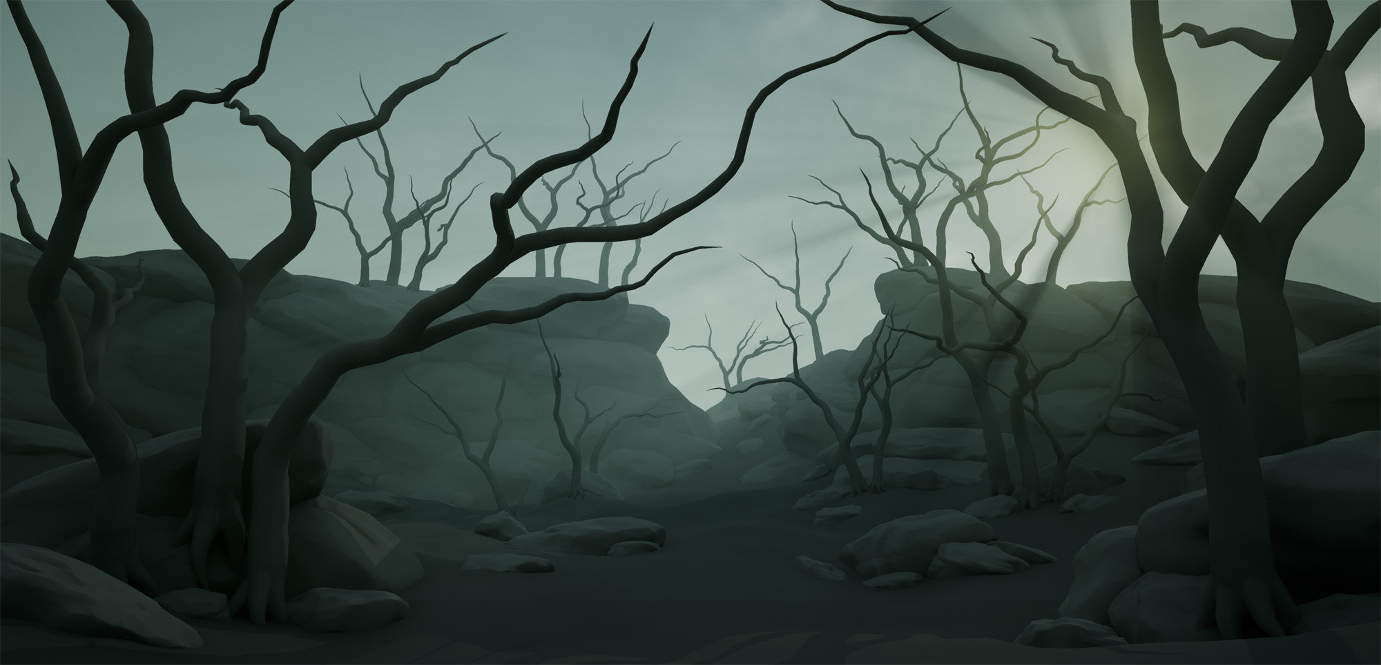
[UE4] Mossy Swampland (Feedback Welcome!)
Lastest:

I recently participated in Jeremy Huxley's vegetation course from CGMA and this was the outcome. Critique more than welcome
I kind of got stuck with my initial composition since the course moves fairly fast and I didn't have time to revisit, but I'm not in love with it. As I polish/ re-work assets and textures, I may just scrap the layout and start fresh, but I would love feedback on the composition, lighting, and anything else.
I still have some wishlist items I'd light to get in there, roots, fog cards.

And some WIPs from the last few weeks


I recently participated in Jeremy Huxley's vegetation course from CGMA and this was the outcome. Critique more than welcome
I kind of got stuck with my initial composition since the course moves fairly fast and I didn't have time to revisit, but I'm not in love with it. As I polish/ re-work assets and textures, I may just scrap the layout and start fresh, but I would love feedback on the composition, lighting, and anything else.
I still have some wishlist items I'd light to get in there, roots, fog cards.

And some WIPs from the last few weeks


Replies
And also maybe add some taller and dense trees
Good luck!
It's rough, and the foliage is quickly placed, but I'd love feedback on the composition. I realize looking at it now I need to break up the arch the branches create at the top.
I also got fog cards working in the original scene
Can you go into some detail about how you did the hanging moss? I tried that with a recent project and it looked pretty bad.
@Ashervisalis I'd love to at least get a couple more screenshots or a zoom-in gif, bit for now I have to put this on the back burner. I wasn't really able to find alternative screenshots/compositions I liked because it was 100% intended to be viewed from this angle alone. And it starts to look really messy when I get up close. As for the moss, I used fibermesh in zbrush. I've made similar moss before in speedtree but fibermesh is 100 times easier and faster imo. I ended up only using one mesh, combining the two narrow pieces. Each cluster is made up of 3 cards. I hand placed the trees so that the foliage tool could still be used to paint on them.
@Shyralon the trees are hand done with splines and a tapered cylinder in max (later cleaned up for optimization/ tri count). I also added a twist modifier to the cylinder. The spline itself, I gave it a good number of points and used a noise modifier to get the gnarliness of oaks. There's only one "branch" mesh and it's actually just the last 1/3 of one of the trunks with branch cards added to it. I hand placed the same branch on all three tree variants.
The actual branch cards were in fact made in speedtree. I love the leaf map maker tool (branch map maker is more accurate), but the premise is the same. Anything done in speedtree can be done just as well in max or maya, it just takes longer.
Personally I found that, in the latest render, the hanging plants (like moss) on the branch of the trees don't support very well the overall composition of the scene since they are very vertical and dark. Maybe you shouldn't place them in bright zone of your scene and limited them for the darkest area or lower the opacity. This was my only advice, otherwise it's a awesome masterpiece
personally I think I prefer This version to your latest one. I think there is something really beautiful going on there with the warmers colors and overall better read without that much fog.
https://80.lv/articles/creating-mossy-swamplands-in-ue4/