D&D Stuff Sketchbook
I've been drawing characters and locations for my cousins D&D campaigns recently. I haven't played a ton of D&D myself but I am enjoying learning about all of the classes and races. That said, I'm sure that I will inevitably mis-represent some of the classes. Please feel free to call out an inconsistencies. I'll try to include the descriptions I get with the drawings I share on here.
I'm trying to keep these to an evening or an afternoon. Keepin' things fun and loose because I need practice quickly roughing in figures. I usually rush to the rendering/polishing phase.
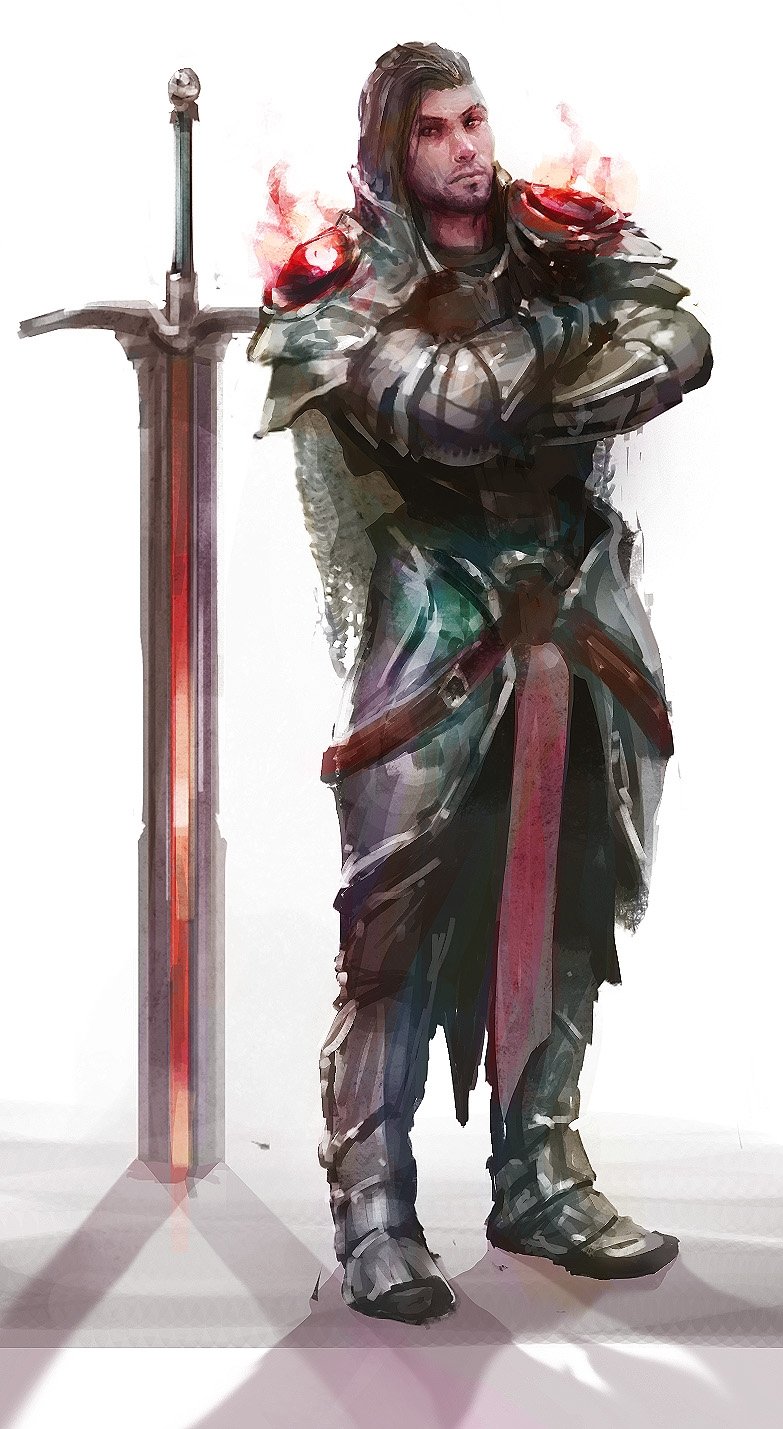
Here's the first drawing I did for my brother, I didn't get much of a description beyond Fire Paladin. I am making a point of asking for more detailed descriptions in the future hehe.


Replies
So I looked for another generator and one item that caught my eye was this "Wedge of Cheese" so I did this one at lunch today.
And gud stuff overall a well
I wish I posted more often. I have still been working away just been keeping it to Facebook.
So let's dump the art. First, Dave's Cat
I did this shortly after the Crow Monk actually. It's a bit more Monochromatic than I would like in retrospect. I'm trying to be Dynamic. There was a description somewhere but I can't find it. My brother Dave had a golden Bow in mind and he also mentiond that the character wore a robe and some kind of ring of power.
The next thing I believe was this guy Assimar,
Assimar, aside from being the butt of a few jokes.... was this stoic, angel kind of guy. I didn't get very much of a description but I think the key thing was that he was this winged swordsman. I wasn't really diligent about copying the descriptions at the time but I'm starting to take it more seriously. Dont cut your wings off there! I'll admit the wings were dropped in lazily here, defnitely more of an abandoned piece than a finished piece.
This ogre was kind of a speed paint with the intent to practice painting faces from imagination. The result was something probably too human looking. I am still struggling with Eye placement at 3/4 angles which was something I really tried to improve with Brenda's Dwarf from above. Sorry for the lack of chronology.
The most recent character I have been working on is this futuristic design. I am trying to stay loose and just use one brush for everything. I have a hard textured brush that I combine with the sharpen tool to boost surface contrast and that's basically it. You can see I probably sharpened far too much on the shoulder. Lots to correct but I felt I should move on to something new.
Lastly, I just made a couple of items during #lunchcrunch. A poison vial and a common dagger. The vial was made in more of my cleaner, almost airbrushed style. Where as the knife is loose and chunky like my most recent paintings. I should probably try and stick to one but I don't know, I'm ok with a little dispairity.
Funny side note, Some of the responses on facebook said the vial looked a bit like a butt plug but I swear I just wanted it to be a mean looking triangle
I'm thinking about going through the D&D players handbook to get a nice list of common items but I also want to do some 3D work to take a stab at printing some figs so who knows.
A friend of mine is running a campaign and needs a stone sword with a keyhole in it. His party also discovered a magic key that had a lightning bolt incorporated into the grip design.
I have really been focussing on building up textures without photos. So I'm using a gritty brush and a dotted spackley brush to try and get the feel of stone on the sword. The key is supposed to be silver but slightly aged.
I did a big sweep through all of my art in my folder and compiled this collection of items I've created of the past few months. I"m not 100% decided on the look of the card but I'd like to get prints made as a final goal. Right now the plan is to paint each item in the D&D players handbook and to also make any interesting items that appear in my friends' campaigns.
I took what I liked best a few of these and came up with a composite design and wanted to see what other items might look like. I think I still like some of the other style frames but I made save them for other types of cards. I think the oval frame would work well for portraits, maybe the arch could be reserved for locations. I also decided to refine how I'm describing rarity. Still not 100 percent locked into a frame desiign yet. I want to iterate a bit more on the ornate swirl around the orb in the corner. and I'm not sur ehow best to display really long items such as sword and staffs.
Any preferences or subjective gut feel feedback is welcomed.
Cheers,
Alex